


A vanilla JavaScript library which uses moment.js to create beautiful, Material Design styled pickers for easy date and time selection.
How to use it:
Load the required CSS file component.css in the document’s head section.
<link rel="stylesheet" href="css/component.css">
Build the date picker dialog.
<div id="md-picker__date" class="md-picker md-picker-date md-picker--inactive animated">
  <div id="md-date__header" class="md-picker__header">
    <h4 id="md-date__subtitle" class="md-picker__subtitle"></h4>
    <h2 id="md-date__title" class="md-picker__title">
      <span id="md-date__titleDay"></span>
      <span id="md-date__titleMonth"></span>
    </h2>
  </div>
  <div class="md-picker__body">
    <div id="md-date__viewHolder" class="md-picker__viewHolder animated">
      <ul class="md-picker__views">
        <li id="md-date__previous" class="md-picker__view">
          <div class="md-picker__month"></div>
          <div class="md-picker__grid">
            <div class="md-picker__th">
              <span>
                S
              </span>
              <span>
                M
              </span>
              <span>
                T
              </span>
              <span>
                W
              </span>
              <span>
                T
              </span>
              <span>
                F
              </span>
              <span>
                S
              </span>
            </div>
            <div class="md-picker__tr"></div>
          </div>
        </li>
        <li id="md-date__current" class="md-picker__view">
          <div class="md-picker__month"></div>
          <div class="md-picker__grid">
            <div class="md-picker__th">
              <span>
                S
              </span>
              <span>
                M
              </span>
              <span>
                T
              </span>
              <span>
                W
              </span>
              <span>
                T
              </span>
              <span>
                F
              </span>
              <span>
                S
              </span>
            </div>
            <div class="md-picker__tr"></div>
          </div>
        </li>
        <li id="md-date__next" class="md-picker__view">
          <div class="md-picker__month"></div>
          <div class="md-picker__grid">
            <div class="md-picker__th">
              <span>
                S
              </span>
              <span>
                M
              </span>
              <span>
                T
              </span>
              <span>
                W
              </span>
              <span>
                T
              </span>
              <span>
                F
              </span>
              <span>
                S
              </span>
            </div>
            <div class="md-picker__tr"></div>
          </div>
        </li>
      </ul>
      <button id="md-date__left" class="md-button md-picker__left" type="button"></button>
      <button id="md-date__right" class="md-button md-picker__right" type="button"></button>
    </div>
    <ul id="md-date__years" class="md-picker__years md-picker__years--invisible animated"></ul>
    <div class="md-picker__action">
      <button id="md-date__cancel" class="md-button" type="button">cancel</button>
      <button id="md-date__ok" class="md-button" type="button">ok</button>
    </div>
  </div>
</div>
Load moment.js and md-date-time-picker.js at the end of the document.
<script src="js/moment.js"></script>
<script src="js/md-date-time-picker.js"></script>
Initialize the date picker.
var myDatepicker = new mdDateTimePicker('date');Toggle the date picker with a custom trigger.
document.getElementById('trigger').addEventListener('click', function() {
  myDatepicker.toggle();
});
Available parameters for the mdDateTimePicker() function.
- type: [type of dialog] [‘date’,’time’]
- init = moment(): [initial value for the dialog date or time, defaults to today] [@default value of today]
- past = moment(): [the past moment till which the calendar shall render] [@default value of exactly 21 Years ago from init]
- future = moment(): [the future moment till which the calendar shall render] [@default value of init]
- mode = false: [this value tells whether the time dialog will have the 24 hour mode (true) or 12 hour mode (false)] [@default 12 hour mode – false]
- orientation = ‘LANDSCAPE’ or ‘PORTRAIT’: [force the orientation of the picker @default = ‘LANDSCAPE’]
- trigger: [element on which all the events will be dispatched e.g var foo = document.getElementById(‘bar’), here element = foo]
- ok = ‘ok’: [ok button’s text]
- cancel = ‘cancel’: [cancel button’s text]
- colon = true: [add an option to enable quote in 24 hour mode]
- autoClose = false: [close dialog on date/time selection]
- inner24 = false: [if 24-hour mode and (true), the PM hours shows in an inner dial]
- prevHandle = <div class=”mddtp-prev-handle”></div>: [The HTML content of the handle to go to previous month]
- nextHandle = <div class=”mddtp-next-handle”></div>: [The HTML content of the handle to go to next month]
Changelog:
08/14/2018
- v2.3.0
See Also:
 Material Inspired Date & Time Picker – simplePicker
 Google Material Inspired Time Picker Component – timepicker-ui
 Persian Jalali & Gregorian Date Picker in Vanilla JS – Azar Datepicker
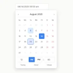 Accessible Customizable Date/Time/Date Picker for Modern Web App – FDatepicker
 Vanilla DateTime Picker: Zero-Dependency JS Date-Time Input
 Vanilla JS Date & Time Picker for Moderb Web Apps – Tuncxys DatePicker
 Versatile Datetime Picker For Bulma – bulma-calendar
 Material Design-style Time Picker Web Component – clock-timepicker