


This is a tiny JavaScript library for creating circular and/or top horizontal progress bars animated with the tween.js library.
How to use it:
Load the necessary tween.js and ProgressBar.js files in the document.
<script src="/path/to/Tween.js"></script>
<script src="/path/to/progressBar.js"></script>
Create a horizontal progress bar that displays at the top of the webpage.
<div class="progress"></div>
let topProgress = new progressBar({
    type: "top",
    targetClass: "progress",
    value: 100,
    duration: 2000,
    completeDuration: 500
});
Create a circular progress bar with percentage display.
<div class="text">0%</div>
<div class="svg">
  <svg height="100%" width="100%">
    <circle class="round-progress" cx="50" cy="50" r="45" />
  </svg>
</div>
let circleProgress = new progressBar({
type: "circle", //top, circle
targetClass: "round-progress",
textClass: "text",
value: 100,
duration: 2000,
completeDuration: 500
});Apply your own CSS styles to the progress bars.
.progress {
  position: absolute;
  top: 0;
  left: 0;
  width: 0;
  height: 3px;
  background: #29d;
  box-shadow: 0 0 3px #29d;
}
.text {
  position: absolute;
  top: 50%;
  left: 50%;
  color: #000;
  border: none;
  width: 100px;
  height: 100px;
  margin-top: -50px;
  margin-left: -50px;
  text-align: center;
  line-height: 100px;
}
.round-progress {
  fill: none;
  stroke: #29d;
  stroke-width: 5;
  stroke-dasharray: 1000;
}
.svg {
  position: absolute;
  top: 50%;
  left: 50%;
  width: 100px;
  height: 100px;
  margin-top: -50px;
  margin-left: -50px;
  transform: rotate(-90deg);
}
All default configuration options.
{
  type: "top", //top, circle
  targetClass: "progress",
  textClass: "text",
  value: 100,
  duration: 1000, //ms
  completeDuration: 500, //ms
  circle: {
      r: 45
  }
}
See Also:
 Pure CSS Progress Bar Library with Custom Themes – progress-bar.css
 Modern TypeScript Progress Bar Library – BProgress
 3D Liquid Progress Bar in Pure CSS/CSS3
 Easy Scroll Position Tracking – ScrollProgress.js
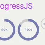 Visualize Progress Data With Animated, Circular Progress Bars – ProgressJS
 Radial Progress Indicator For Click-and-hold Actions – HoldCircleJS
 Simple Scroll Progress Indicator For Long Pages – PageBar.js
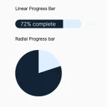 Generate Linear & Radial Progressbars Using CSS – Progress.css