


A minimal Vanilla JavaScript modal library that uses CSS3 transitions and transforms for the open / close animations. Fully styleable via CSS/SCSS.
How to use it:
Insert the main javascript file into the webpage.
<script src="modal.js"></script>
Create a button to toggle the modal window.
<button id="modal-window">Click me to open modal</button>
var btn = document.getElementById('modal-window');
btn.addEventListener('click', openModalWindow);
Create content to be displayed in the modal window and then create a modal instance and pass in child elements:
function openModalWindow(e) {
var child = document.createElement('div');
child.className = "inside";
var text = document.createElement('h1');
text.className = "inside-text";
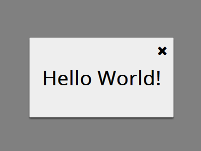
text.innerHTML = "Hello Worlds";
child.appendChild(text);
var modal = new Modal(child, true);
modal.show(); //open the modal window
}Remove the modal window.
modal.unmount();
The basic CSS styles for the modal window.
.modal {
  position: fixed;
  opacity: 0;
  display: table;
  width: 100%;
  height: 100%;
  top: 0;
  left: 0;
  z-index: 5000;
}
.modal-backdrop {
  display: table-cell;
  vertical-align: middle;
  text-align: center;
  background-color: rgba(0, 0, 0, .5);
}
.modal-inner {
  display: inline-block;
  text-align: left;
  background-color: #eee;
  color: #000;
  padding: 20px;
}
#close-modal {
  position: absolute;
  right: 10px;
  top: 10px;
  font-size: 1.3em;
  cursor: pointer;
}
Apply the fade animations to the modal using CSS3.
.modal.fade .modal-inner {
  transform: translateY(-100px);
  transition: all .3s ease-in-out;
}
.modal.fade.in {
  opacity: 1;
  transition: all .3s ease-in-out;
}
.modal.fade.in .modal-inner {
  transform: translateY(0);
  height: auto;
  box-shadow: 0 2px 3px 0 #303030;
  border-radius: 2px;
  transition: all .3s ease-in-out;
  width: auto;
  max-width: 80%;
  padding: 20px;
}
See Also:
 CSS Only Syntax Highlighter
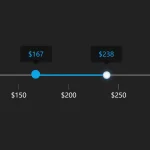 Smooth Dual Range Slider With Tooltips
 Interactive Split Screen Slider With JavaScript And CSS3
 Lightweight Any Content Slider In Vanilla JavaScript – vanillaSlider
 Lazy Load iFrame Embedded Content With JavaScript – lazyframe.js
 Customizable & Interactive Diagram Maker In JavaScript
 Canvas Based QR Code Generator with Pure JavaScript – VanillaQR.js
 Accordion-like Expanding Card With JavaScript And CSS