


A lightweight yet highly customizable context menu component that provides an easy way to manage the Website’s right-click context menu and improve the Website’s usability.
The custom context menu can be attached to any DOM element (not only the whole page) and allows triggering it on mobile devices with a long press.
How to use it:
1. Install and import the context menu component.
# NPM
$ npm i pure-context-menu
import PureContextMenu from "./pure-context-menu.js";
2. Define the menu items in a JS array as follows:
const items = [
      {
        label: "Item 1",
        callback: () => {
          // do something
        },
      },
      "-", // Separator
      {
        label: "Item 2",
        callback: (e) => {
          if (e.target.id) {
            alert("You clicked on target " + e.target.id);
          } else {
            alert("You didn't click on a target");
          }
        },
      },
      {
        label: "Item 3",
        preventCloseOnClick: true,
        callback: () => {
          // do something
        },
      },
      // more items here
];
3. Attach the context menu to a specific container.
let myMenu = new PureContextMenu(document.querySelector("#container"), items, {
    // options here
});
4. All default options.
let myMenu = new PureContextMenu(document.querySelector("#container"), items, {
    contextMenuClass: "pure-context-menu",
    dropdownClass: "dropdown-menu",
    dividerClass: "dropdown-divider",
    menuItemClass: "pure-context-menu-item",
    itemClass: "dropdown-item pure-context-menu-item",
    disabledClass: "disabled",
    zIndex: "9999",
    preventCloseOnClick: false,
    useLists: false,
    listClass: "list-group",
    listItemClasses: ["list-group-item", "list-group-item-action"],
    fastClick: false,
    closeIfOpen: false,
    minWidth: "120px",
    maxWidth: "240px",
    popover: false, // Use popover api if available. Allows backdrops.
    show: event => true,
});
Changelog:
v1.2.8 (09/30/2024)
- Add min/max sizes in option
- Optional popover api support
v1.2.7 (11/08/2023)
- Cancel callback and user-selection if item is disabled
v1.2.6 (10/30/2023)
- Add basic keyboard support (esc)
v1.2.5 (09/20/2023)
- Add option close if already open
v1.2.4 (09/06/2023)
- configurable fastclick
v1.2.3 (07/22/2023)
- Consistent options for multiple classes
v1.2.2 (07/20/2023)
- Fix null target
- Allow multiple holder classes
v1.2.1 (07/19/2023)
- Add disabled items
v1.2.0 (07/18/2023)
- Add list group support
- Refactor event handling
- Allow adjusting items dynamically
- Html support in label
- Custom item classes
v1.1.1 (02/26/2023)
- mobile fixes
See Also:
 Navbar-Synced Context Menu for Bootstrap 5 – BRC JS
 Create Contextual Right-Click Menus with Vanilla JavaScript
 Multi-level Custom Context Menu Made Easy – ctxmenu.js
 Custom Context Menus for Touch & Desktop – ContextMenu
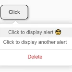 Customizable Context Menus and Dropdowns With Vanilla JS – Tiny Popup Menu
 Themeable Context Menu Library – Contextify
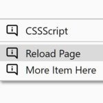 Custom Right-click Menu (Context Menu) In Vanilla JavaScript – CtxMenu
 Add Custom Context Menus To Any HTML Element – vanilla-context-menu