


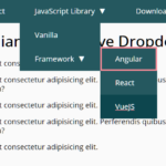
A mobile-friendly and fully responsive navigation that uses JavaScript and CSS3 to convert the horizontal menu into a toggleable dropdown list when the screen size is less than a specific breakpoint.
How to use it:
Create a normal site navigation like this:
<nav>
<div id="menu_button_wrapper">
<div id="menu_button">
Menu
<div id="hamburger">
<span></span>
<span></span>
<span></span>
</div>
</div>
<div class="clearfix"></div>
</div>
<ul id="menu_list">
<li class="current_page"><a href="#">Home</a></li>
<li><a href="#">Audio</a></li>
<li><a href="#">Video</a></li>
<li><a href="#">About Us</a></li>
<li><a href="#">Contacts</a></li>
</ul>
</nav>Load the core JavaScript at the end of the document.
<script src="js/script.js"></script>
Style the navigation.
nav {
  font-family: Helvetica;
  text-align: right;
  text-transform: uppercase;
  background-color: #222;
}
nav ul {
  width: 90%;
  max-width: 1024px;
  margin: 0 auto;
  list-style-type: none;
}
nav ul li { display: inline-block; }
nav ul li a {
  color: #9d9d9d;
  font-weight: bold;
  text-decoration: none;
  display: inline-block;
  padding: 1em;
  box-sizing: border-box;
}
nav ul li a:hover { color: white; }
.current_page { background-color: black; }
.current_page a { color: white; }
#menu_button_wrapper { display: none; }
.hidden { display: none; }
Responsive CSS styles for smaller screens.
@media (max-width: 760px) {
  #menu_button_wrapper {
    display: block;
    padding: 1em;
    color: #9d9d9d;
    border-bottom: 1px solid #101010;
    -webkit-box-shadow: 0 1px 0 rgba(255,255,255,.1);
    box-shadow: 0 1px 0 rgba(255,255,255,.1);
    margin-bottom: .5em;
  }
  #menu_button {
    box-sizing: border-box;
    float: right;
    padding: .5em 1em;
    border: 1px solid #333;
    border-radius: 5px;
    color: white;
    -webkit-touch-callout: none;
    -webkit-user-select: none;
    -khtml-user-select: none;
    -moz-user-select: none;
    -ms-user-select: none;
    user-select: none;
  }
  #menu_button:hover {
    cursor: pointer;
    background-color: #333;
  }
  #hamburger {
    float: right;
    padding-top: .15em;
  }
  #menu_button span {
    display: block;
    background-color: #fff;
    width: 1.2em;
    height: .15em;
    border-radius: 1px;
    margin-bottom: .2em;
  }
  nav ul {
    width: 100%;
    margin: 0 auto;
    padding: 0;
    box-sizing: border-box;
  }
  nav ul li { display: block; }
  nav ul li a { width: 100%; }

}
Changelog:
08/18/2018
- completely rewrote
See Also:
 WCAG Compliant Responsive Dropdown Navigation – accessible-menu
 Accessible Dropdown Nav With Vanilla JavaScript – Clicky Menus
 Responsive Accessible Dropdown Menu Template with Vanilla JavaScript
 Modern One Page Scroll Web Template with Responsive Nav
 Responsive Dropdown/Off-canvas Navigation In Vanilla JavaScript – Menue
 Responsive Sliding Hamburge Menu System
 Responsive Sticky Mega Menu – SnazzyMenu.js
 Responsive Dropdown Mega Menu In JavaScript