


A lightweight yet robust JavaScript library for creating customizable, nice-looking popups that can be used for a variety of purposes (e.g. alert boxes, confirm dialogs, notification messages, etc.).
How to use it:
1. Import the PopupManager class from a CND.
import PopupManager from 'https://cdn.jsdelivr.net/gh/jorgeabrahan/popup_library@67068b1/popup/Popup.js'
2. Create a new PopupManager instance.
// custom close button
const btnClose = '<span class="material-symbols-outlined">close</span>'
// custom styles
const style = 'border-width: 2px; border-style: solid; border-color: gray'
// init
const Popup = new PopupManager({ btnClose, style })
3. Create a basic alert box.
Popup.display({
  title: 'Welcome {user}!',
  content: "It's nice having you onboard! Checkout all the great features we've prepared for you",
  buttons: {
    elements: [{ text: 'Ok', type: 'confirm', handler: () => InfoPopup.close() }],
    position: 'right'
  }
})
4. Create a confirmation dialog.
Popup.display({
  title: 'Delete file',
  content: 'Are you sure you want to delete ${this} file?',
  buttons: {
    elements: [
      { text: 'Confirm', type: 'confirm', handler: onFileDelete },
      { text: 'Cancel', type: 'error', handler: () => ConfirmationPopup.close() }
    ]
  }
})
5. Create a popup slider where users can navigate between pages with custom controls.
Popup.display({
  title: 'MultiPage Popup',
  content: 'This is the first page of our multipage popup',
  buttons: {
    elements: [
      { text: 'First', handler: () => MultiPagePopup.goFirst() },
      { text: 'Previous', handler: () => MultiPagePopup.goBack() },
      { text: 'Next', handler: () => MultiPagePopup.goNext() },
      { text: 'Last', handler: () => MultiPagePopup.goLast() }
    ]
  }
})
.update({ content: 'This is page two!' })
.update({ content: 'This is page three!' })
.update({ content: 'This is the last page!' })
.goFirst()
6. Create a custom popup window.
Popupd.display({
  title: 'Custom popup',
  content:
    "This popup won't allow you to select content inside it, it won't close if you click outside of it, it has a maxWidth of 500px and it is positioned in the center of the viewport"
}).options({
  allowSelect: false,
  preventExternalClose: true,
  position: 'center',
  maxWidth: 500
})
7. All possible options for the display method.
Popup.display({
  title: '',
  content: '',
  buttons: {
    elements: [],
    sharedHandler: () => {},
    sharedStyles: '',
    position: 'left', // 'left | center | right'
  },
  allowClosing: true,
})
8. All possible configuration options.
Popup.display({
  // ...
}).options({
  allowSelect: true,
  preventExternalClose: false,
  position: 'top', // 'top | center | bottom'
  maxWidth: 450,
  margin: '1rem',
})
See Also:
 Create Dynamic Draggable Alert/Confirm Popups – webcimes-modal
 Customizable Alert/Confirm Modal Library – modal-alert.js
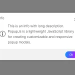 Minimal Alert & Confirmation Modals in JavaScript – PopupJs.js
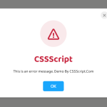 Create Custom Stylish Dialogs with SnapDialog JavaScript Library
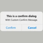 Create iOS-Style Popups & Notifications With Popup JS Library
 Elegant Notification Popup JavaScript Library – Notiflix
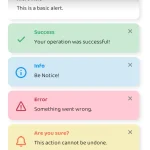 Simple & Stylish JavaScript Alert Notifications – SnapAlert.js
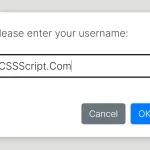 Async, Promise-based Alert/Confirm/Prompt Dialogs – Prompts.js