


Just another radio input based interactive rating control built using pure CSS.
How to use it:
1. Create 5 radio buttons for the rating control.
<div class="rating effect">
  <input type="radio" name="rating_stars" value="star_one" id="star_one" />
  <label for="star_one" class="stars">One star</label>
  <input type="radio" name="rating_stars" value="star_two" id="star_two" />
  <label for="star_two" class="stars">Two stars</label>
  <input type="radio" name="rating_stars" value="star_three" id="star_three" />
  <label for="star_three" class="stars">Three stars</label>
  <input type="radio" name="rating_stars" value="star_four" id="star_four" />
  <label for="star_four" class="stars">Four stars</label>
  <input type="radio" name="rating_stars" value="star_five" id="star_five" />
  <label for="star_five" class="stars">Five stars</label>
</div>
2. The core CSS styles for the rating control.
.rating {
  background: white;
  border-radius: 25px;
  padding: 10px;
  cursor: pointer;
  display: flex;
  align-items: center;
  justify-content: space-around;
  width: 90%;
  margin: 30px auto 0;
}
.rating input {
  display: none;
}
.rating label {
  font-size: 0;
}
.rating label.stars::before, .rating label.hearts::before {
  content: '';
  display: block;
  width: 20px;
  height: 20px;
  cursor: pointer;
}
/* Hover effect */
.rating.effect input:checked + label ~ label.stars::before, .rating.effect:hover input:hover + label ~ label.stars::before {
  background: url(icons/star-regular.svg) no-repeat center center;
  background-size: 20px;
  opacity: .3;
}
.rating.effect:hover input + label ~ label.stars::before {
  background: url(icons/star-solid.svg) no-repeat center center;
  background-size: 20px;
}
.rating.effect input:checked + label ~ label.hearts::before, .rating.effect:hover input:hover + label ~ label.hearts::before {
  background: url(icons/heart-regular.svg) no-repeat center center;
  background-size: 20px;
  opacity: .3;
}
.rating.effect:hover input + label ~ label.hearts::before {
  background: url(icons/heart-solid.svg) no-repeat center center;
  background-size: 20px;
}
3. Add custom symbols to the rating control.
.rating label.stars::before {
  background: url(icons/star-solid.svg) no-repeat center center;
  background-size: 20px;
}
.rating label.hearts::before {
  background: url(icons/heart-solid.svg) no-repeat center center;
  background-size: 20px;
}
See Also:
 Five-Star Rating Web Component in JavaScript
 Select Box Based Star Rating JavaScript Library – star-rating.js
 Customizable 5-Star Rating System In Pure CSS/SCSS
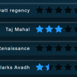 CSS Only Animated Rating Bar
 Tiny Star Rating System In Vanilla JavaScript
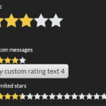 Interactive Star Rating Component With Pure JavaScript – rater-js
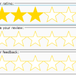 Accessible Star Rating Control Using Radio Buttons
 Radio And SVG Based Inline Selector With Pure CSS