


CodeHim Menu is a responsive navigation system for all devices. Written in HTML and CSS.
It converts the original horizontal dropdown menu into a drawer navigation on mobile devices.
More features:
- 5 built-in themes.
- Glossy background colors.
- Text shadow.
- Fixed on the top.
How to use it:
Load the core, theme, effect CSS styles in the head section of the document.
<!--Menu CSS-->
<link rel="stylesheet" href="css/menu/menu.css" />
<!--Menu Effects CSS-->
<link rel="stylesheet" href="css/menu/effects.css" />
<!--Menu Themes CSS-->
<link rel="stylesheet" href="css/menu/themes.css" />
Load the Font Awesome for the icons (OPTIONAL).
<link href="https://stackpath.bootstrapcdn.com/font-awesome/4.7.0/css/font-awesome.min.css" rel="stylesheet" integrity="sha384-wvfXpqpZZVQGK6TAh5PVlGOfQNHSoD2xbE+QkPxCAFlNEevoEH3Sl0sibVcOQVnN" crossorigin="anonymous">
The HTML to create a default navigation system.
<input type="checkbox" name="checkbox" id="menu-trigger" class="trigger">
<label for="menu-trigger">
<div class="codehim-menu-trigger"> </div>
</label>
<nav>
  <ul class="codehim-menu cute-theme">
    <li> <a href="#"> <i class="fa fa-home icon"></i> </a> </li>
    <li class="dropdown has-four-item"> <a href="#Bros"> Browsers
      <div class="arrow"> </div>
      </a>
      <ul>
        <li><a href="#">Chrome</a></li>
        <li><a href="#">Firefox</a></li>
        <li><a href="#">Safari</a></li>
        <li><a href="#">Opera</a></li>
      </ul>
    </li>
    <li class="dropdown has-five-item"> <a href="#Web">Web Development
      <div class="arrow"></div>
      </a>
      <ul class="large">
        <li><a href="#">CSS3</a></li>
        <li><a href="#">HTML5</a></li>
        <li><a href="#">JavaScript</a></li>
        <li><a href="#">Bootsrap</a></li>
        <li><a href="#">Jquery </a></li>
      </ul>
    </li>
    <li class="dropdown has-six-item"> <a href="#Pro">Products
      <div class="arrow"></div>
      </a>
      <ul class="large">
        <li><a href="#">Item Name 1</a></li>
        <li><a href="#">Item Name 2</a></li>
        <li><a href="#">Item Name 3</a></li>
        <li><a href="#">Item Name 4</a></li>
        <li><a href="#">Item Name 5 </a></li>
        <li><a href="#">Item Name 6 </a></li>
      </ul>
    </li>
    <li class="more-item">
      <label for="menu-trigger">
      <span></span>
      <div class="touch"></div>
      </label>
    </li>
    <span class="codehim-more">
    <li> <a href="#"> About</a></li>
    <li> <a href="#"> Contact</a></li>
    <li> <a href="#"> Tour</a></li>
    </span>
  </ul>
</nav>
Change the default theme by overriding the theme class:
- cute-theme
- orange-theme
- blue-theme
- pink-theme
- green-theme
<ul class="codehim-menu cute-theme">
  ...
</ul>
Make the navigation stick to the top on scroll.
<ul class="codehim-menu blue-theme fixed-top">
  ...
</ul>
See Also:
 CSS Only Responsive Drawer Navigation – sz-navbar
 Responsive Drawer Navigation In Pure CSS
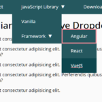 WCAG Compliant Responsive Dropdown Navigation – accessible-menu
 Accessible Dropdown Nav With Vanilla JavaScript – Clicky Menus
 Multi-Direction Offcanvas Drawers with Smooth Sliding Animations
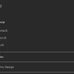 Responsive Accessible Dropdown Menu Template with Vanilla JavaScript
 Modern One Page Scroll Web Template with Responsive Nav
 Responsive Dropdown/Off-canvas Navigation In Vanilla JavaScript – Menue