


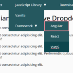
A responsive, CSS only priority navigation that automatically collapse overflowing menu items in a toggleable dropdown menu in mobile view.
How to use it:
Create a long navigation menu from a nav list.
<nav id="menu">
<ul id="menu-closed">
<li><a href="#">Menu Item 1</a></li>
<li><a href="#">Menu Item 2</a></li>
<li><a href="#">Menu Item 3</a></li>
<li><a href="#">Menu Item 4</a></li>
<li><a href="#">Menu Item 5</a></li>
<li><a href="#">Menu Item 6</a></li>
<li><a href="#">Menu Item 7</a></li>
<li><a href="#menu-closed">× Close menu</a></li>
<li><a href="#menu">☰ Menu</a></li>
</ul>
</nav>The core CSS rules for the priority navigation.
nav {
  font-size: 12px;
  background-color: rgb(19, 51, 61);
  box-shadow: 0 1px 2px rgba(19, 51, 61, 0.5);
  margin: 3em 0 6em;
  padding: 0 1em;
  height: 44px; /* Menu height */
  overflow: hidden; /* Don't show anything outside the nav */
}
nav ul {
  margin: 0;
  padding: 0;
  list-style-type: none;
  max-height: 88px; /* Menu height x 2 */
  position: relative; /* Position the menu button relative to this item */
}
nav li { display: inline-block; }
nav a {
  display: inline-block;
  padding: 0 1em;
  color: rgb(236, 236, 236);
  font-weight: 700;
  letter-spacing: 0.1em;
  text-decoration: none;
  text-transform: uppercase;
  white-space: nowrap;
  line-height: 44px; /* Menu height */
  height: 44px; /* Menu height */
}
nav a:hover { background-color: rgba(255, 255, 255, 0.08); }
nav li:last-child { /* The menu button */
  position: absolute; /* Move the menu button out of flow */
  right: 0;
  bottom: 44px; /* Move upwards, the same distance as the menu height */
  background-image: linear-gradient(to right, rgba(19, 51, 61, 0) 0, rgba(19, 51, 61, 1) 2em);
  padding-left: 3em;
}
nav li:nth-last-child(2) { /* The close button */ display: none; }
nav#menu:target {
  height: auto;
  padding: 0;
}
nav#menu:target ul { max-height: none; }
nav#menu:target li { display: block; }
nav#menu:target a {
  display: block;
  padding: 0 2em;
  background-color: rgba(255, 255, 255, 0.05);
}
nav#menu:target a:hover { background-color: rgba(255, 255, 255, 0.08); }
nav#menu:target li:not(:first-child) { margin-top: 2px; }
nav#menu:target li:last-child { display: none; }
nav#menu:target li:nth-last-child(2) {
  display: inline-block;
  position: absolute;
  top: 0;
  right: 0;
  margin: 0;
  border-left: 2px solid rgb(19, 51, 61);
}
See Also:
 WCAG Compliant Responsive Dropdown Navigation – accessible-menu
 Accessible Dropdown Nav With Vanilla JavaScript – Clicky Menus
 Responsive Accessible Dropdown Menu Template with Vanilla JavaScript
 Modern One Page Scroll Web Template with Responsive Nav
 Responsive Dropdown/Off-canvas Navigation In Vanilla JavaScript – Menue
 Responsive Sliding Hamburge Menu System
 Responsive Sticky Mega Menu – SnazzyMenu.js
 Responsive Dropdown Mega Menu In JavaScript