


Select.js is a JavaScript library that upgrades the default <select> box into a fully customizable and styleable dropdown list. Things like colors, borders, buttons and more can be customized with CSS. The selected option(s) will be displayed as tokens/chips inside the dropdown.
Additionally, Select.js has built-in support for the Bootstrap framework, so your dropdowns automatically blend into Bootstrap projects. It also fires useful events like “render” and “change” that you can hook into to trigger custom logic.
How to use it:
1. Download the package and include the following files on the page.
<link rel="stylesheet" href="/dist/select.js.css" />
<script src="/dist/select.js"></script>
2. Pass the following options via the data-select-options attribute:
- render: Determine whether to render the elelement. Default: true.
- dropDownShowDelay: The time to wait before displaying the dropdown list. Default: 50.
- showDropDownButton: Determine whether to show the open/close button. Default: true.
- showRemoveButtonOnLeft: Show the remove button on the left.
- text.removeText: Text for the remove button. Default: “✖”.
- noItemsSelectedText: Text to show when no items are selected. Default: “There are no items selected”
<select multiple="multiple" data-select-js="{'render': true, 'dropDownShowDelay':50, 'showDropDownButton': true, 'text': {removeText: "Remove Text"}}">
  <option value="1" selected="selected">Option 1</option>
  <option value="2">Option 2</option>
  <option value="2">Option 3</option>
  ...
</select>
3. Callback functions:
- onSelectedItemsChanged(values)
- onRenderComplete(element)
- onDropDownShow(element)
- onDropDownHide(element)
<select multiple="multiple" data-select-js="{'onRenderComplete': myFunction, 'onSelectedItemsChanged': myFunction}">
  <option value="1" selected="selected">Option 1</option>
  <option value="2">Option 2</option>
  <option value="2">Option 3</option>
  ...
</select>
4. Change the style of the custom select by overriding the default CSS varaibles as follows:
:root {
    // Fonts
    --select-js-default-font: system-ui, -apple-system, "Segoe UI", Roboto, "Helvetica Neue", "Noto Sans", "Liberation Sans", Arial, sans-serif, "Apple Color Emoji", "Segoe UI Emoji", "Segoe UI Symbol", "Noto Color Emoji";
    // Colors
    --select-js-color-black: #3b3a3a;
    --select-js-color-white: #F5F5F5;
    --select-js-color-gray: #AAAAAA;
    --select-js-color-light-gray: #CCCCCC;
    // Containers
    --select-js-container-background-color: #e8e6e6;
    --select-js-container-border-color: #3b3a3a;
    --select-js-container-background-color-drop-down: #e8e6e6;
    --select-js-container-border-color-drop-down: #3b3a3a;
    // Borders
    --select-js-border-radius: 0.5rem;
    --select-js-border-style-scrollbar: inset 0 0 6px --color-dark-gray;
    --select-js-border-size: 0.5px;
    // Transitions
    --select-js-transition: all .3s;
    // Spacing/Sizing
    --select-js-spacing-shadow-size: 4px;
    --select-js-spacing: 8px;
}
Changelog:
v1.0.0 (09/06/2024)
- Added more options
- Renamed the CSS class “button” to “open-close-button”
v1.0.0 (09/06/2024)
- Rewritten in TypeScript
- Renamed the binding attribute “data-select-options” to “data-select-js”.
v0.5.0 (02/25/2024)
- CSS improvements
- Bugfixes
v0.4.0 (01/17/2024)
- CSS improvements
v0.3.0 (01/04/2024)
- Pressing escape in the document will close all opened drop-down menus.
- Added new callback
v0.2.3 (12/19/2023)
- Doc updated
See Also:
 Tagging & Searchable Dropdown with Multi-Select – Searchdown.js
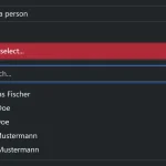 Bootstrap 5 Select Dropdown Enhancer – AvalynxSelect
 Fast Touch-Friendly Picker Library for JavaScript & React – Quickpick UI
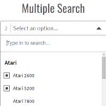 Powerful Single & Multiple Select Library – tail.select
 Convert HTML Lists into Custom Dropdowns – Simple Select
 Advanced Select Boxes For Bootstrap 5 With use-bootstrap-select
 Pretty Accessible Custom Select Box Library – EasyDropDown
 Bootstrap Style Searchable Dropdown Plugin – fstdropdown