


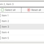
FancySelect is a JavaScript library that turns a single select element into a customizable, fully accessible dropdown list.
More Features:
- Supports icons.
- Auto re-position to prevent overflowing.
- Allows to add new options dynamically.
How to use it:
1. Import the stylesheet fancyselect.min.css and JavaScript fancyselect.min.js.
<script type="text/javascript" src="fancyselect.min.js"></script>
<link rel="stylesheet" type="text/css" href="fancyselect.min.css" />
2. That’s it. The library will automatically apply custom styles to the native select elements found within the document.
<select id="default">
  <option>Option 1</option>
  <option>Option 2</option>
  <option>Option 3</option>
  ...
</select>
3. Apply your own styles to the select.
<select id="custom">
  <option>Option 1</option>
  <option>Option 2</option>
  <option>Option 3</option>
  ...
</select>
.custom {
  --fsb-border: 0;
  --fsb-radius: 2em;
  --fsb-color: #fff;
  --fsb-background: #2F86A6;
  --fsb-font-size: 1em;
  --fsb-shadow: 0 1px 1px rgba(0, 0, 0, .1);
  --fsb-padding: .75em 1.5em;
  --fsb-arrow-padding: 1.5em;
  --fsb-arrow-size: .5em;
  --fsb-arrow-color: currentColor;
  --fsb-icon-color: currentColor;
  --fsb-list-height: 200px;
  --fsb-list-border: var(--fsb-border);
  --fsb-list-radius: .75em;
  --fsb-list-color: var(--fsb-color);
  --fsb-list-background: #34BE82;
  --fsb-hover-color: var(--fsb-color);
  --fsb-hover-background: #2FDD92;
}
4. Add icons to options.
<select id="default">
  <option data-icon="1.svg">Option 1</option>
  <option data-icon="2.svg">Option 2</option>
  <option data-icon="3.svg">Option 3</option>
  ...
</select>
5. Add new options to the custom element.
const mySelect = document.getElementById('my-select');
const newItems = ['Option4', 'Option5', 'Option6'];
newItems.forEach(item => {
  const option = document.createElement('option');
  option.textContent = item;
  mySelect.appendChild(option);
});
// Update the custom select
FancySelect.update(mySelect);
6. Disable the native select element.
mySelect.disabled = true;
Changelog:
v0.7.0 (09/08/2024)
- Add support for disabled options
v0.6.1 (03/20/2024)
- Remove inline styles to conform to a strict a Content Security Policy (CSP) header
v0.6.0 (05/11/2023)
- Fix font-size, add max-height, reduce z-index
v0.5.0 (02/14/2023)
- Open the list box on click on the native select’s label element
- Improve the styling of options that have a long label
- Fix list box overflowing inside a flex parent
v0.4.0 (02/02/2023)
- Improve the display of long labels
- Add support for an optional custom item label renderer
- Fix a bug where the list box occupies space when closed
v0.3.3 (01/01/2023)
- Add type=”button” to button elements
v0.3.2 (10/31/2022)
- Bugfix
v0.3.1 (10/26/2022)
- Fix a bug when closing the list box on a second click
v0.3.0 (10/24/2022)
- Close the list box on a second click
See Also:
 Feature-rich Custom Select JavaScript Library – SimpSelect
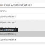 High Performance Select Box with Virtual Scroll (Vanilla JS) – Virtual Select
 Tagging & Searchable Dropdown with Multi-Select – Searchdown.js
 Bootstrap 5 Select Dropdown Enhancer – AvalynxSelect
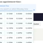 Fast Touch-Friendly Picker Library for JavaScript & React – Quickpick UI
 Advanced Draggable & Selectable Library – DragSelect
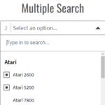 Powerful Single & Multiple Select Library – tail.select
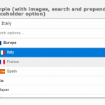 Enhanced Dropdown Select In Pure JavaScript – LC-select