


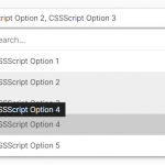
cSelect is a custom select JavaScript library that replaces the native select elements with customizable, filterable dropdowns.
How to use it:
1. Import the cSelect.
import CSelect from './cselect.js';
2. Transform an exiting select element into a custom dropdown.
<select class="custom-select" name="testSelect" id="c-select" placeholder="Please select an option">
  <option disabled selected value> -- select an option -- </option>
  <option value="walls">The walls were shaking</option>
  <option value="earth">The earth was quaking</option>
  <option disabled value="mind">My mind was aching</option>
  <option value="cause-you">Cause you</option>
  <option value="shook">SHOOK ME ALL NIGHT LONG!</option>
</select>
const select = document.querySelector('.custom-select');
const cSelect = new CSelect(select, {
      // options here
});
3. Determine whether to enable the open/close animations.
const cSelect = new CSelect(select, {
      animated: true,
});
4. Determine whether to enable the live search functionality
const cSelect = new CSelect(select, {
      search: true,
});
5. Apply custom styles to the dropdown.
.cSelect {
  position: relative;
}
.cSelect * {
  box-sizing: border-box;
}
.cSelect:focus {
  outline: 2px solid #2686f4;
}
.cSelect__default {
  display: flex;
  align-items: center;
  border-radius: 3px;
  font-size: 14px;
  height: 50px;
  padding: 16px 2em;
  background: #fff;
  box-shadow: 0px 1em 2em -1.5em rgba(0, 0, 0, 0.5);
  cursor: pointer;
}
.cSelect__label-arrow {
  position: relative;
  margin-left: auto;
}
.cSelect__label-arrow::after {
  content: '';
  position: absolute;
  top: 50%;
  right: 50%;
  width: 8px;
  height: 8px;
  border-top: 2px solid #999;
  border-right: 2px solid #999;
  transform: translateY(-65%) rotate(135deg);
}
.cSelect__drop {
  position: absolute;
  width: 100%;
  height: 0;
  max-height: 300px;
  left: 0;
  top: 57px;
  transition: height, 0.25s;
}
.cSelect__results {
  height: 100%;
  overflow-y: auto;
}
.cSelect__search {
  position: relative;
  height: 0;
  overflow: hidden;
  outline: none;
}
.cSelect__search--animated {
  transition: height, 0.25s;
}
.cSelect__drop--open .cSelect__search {
  height: 50px;
}
.cSelect__search-input {
  width: 100%;
  padding: 16px 2em;
  background-color: #fff;
  font-size: 14px;
  height: 50px;
  border: none;
}
.cSelect__search-input:focus {
  border: 2px solid #2686f4;
}
.cSelect__search-icon {
  position: absolute;
  right: 1.75em;
  top: 50%;
  transform: translateY(-50%) rotate(-45deg);
  width: 16px;
  height: 16px;
}
.cSelect__search-icon::before,
.cSelect__search-icon::after {
  content: '';
  display: block;
  box-sizing: border-box;
  transition-property: background-color, border-color;
  transition-duration: 0.25s;
}
.cSelect__search-icon::before {
  width: 100%;
  height: 100%;
  border-radius: 50%;
  border: 2px solid #999;
}
.cSelect__search-icon::after {
  margin: 0 auto;
  width: 2px;
  height: 6px;
  background-color: #999;
}
.cSelect__search-input:focus ~ .cSelect__search-icon::before {
  border-color: #9226f4;
}
.cSelect__search-input:focus ~ .cSelect__search-icon::after {
  background-color: #9226f4;
}
.cSelect__option {
  padding: 16px 2em;
  background: #fff;
  border-top: 1px solid rgba(0, 0, 0, 0.05);
  cursor: pointer;
  font-size: 14px;
  min-height: 17px;
}
.cSelect__option:hover {
  background-color: rgb(236, 236, 236);
}
.cSelect__option.selected {
  color: #fff;
  background-color: #9226f4;
}
/* needs to be after selected */
.cSelect__option.disabled {
  color: #c6c6c6;
  background-color: #f8f8f8;
  cursor: not-allowed;
}
Changelog:
04/26/2022
- refactor isElement utility fn
10/25/2021
- minor heading/button adjustments
10/21/2021
- initialize multiple CSelect elements
- include rest of functions into main class
10/12/2021
- minor refactoring and fixing issues after review
See Also:
 High Performance Select Box with Virtual Scroll (Vanilla JS) – Virtual Select
 Tagging & Searchable Dropdown with Multi-Select – Searchdown.js
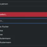 Bootstrap 5 Select Dropdown Enhancer – AvalynxSelect
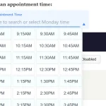 Fast Touch-Friendly Picker Library for JavaScript & React – Quickpick UI
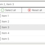 Feature-rich Custom Select JavaScript Library – SimpSelect
 Advanced Draggable & Selectable Library – DragSelect
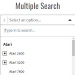 Powerful Single & Multiple Select Library – tail.select
 Enhanced Dropdown Select In Pure JavaScript – LC-select