


This is a pure CSS Segmented Control implementation that recreates iOS and macOS-style animated tab controls using radio buttons and CSS/CSS3.
It’s great for tabbed interfaces, form controls, or any place users need to select one option from a mutually exclusive group.
Key Features:
- Smooth Animations: CSS transitions with cubic-bezier easing.
- Accessibility: Proper focus states and keyboard navigation through radio buttons.
- Dark Mode: Uses
light-dark()function for automatic theme switching. - Anchor Positioning: Modern CSS anchor API for precise element positioning.
- Customizable Styling: CSS custom properties for easy theming and sizing adjustments.
See It In Action:
How to use it:
1. Create the html for the segmented control. Wrap each radio button in a <label> element, which makes the entire text area clickable. All radio buttons must share the same name attribute to form a mutually exclusive group. A key detail here is that the radio inputs themselves are visually hidden. The label acts as the visible button and controls the state of its associated input.
<div class="segmented">
  <label class="segmented-button">
    <input type="radio" name="segmented" checked>
    jQuery
  </label>
  <label class="segmented-button">
    <input type="radio" name="segmented">
    JavaScript
  </label>
  <label class="segmented-button">
    <input type="radio" name="segmented">
    Angular
  </label>
  <label class="segmented-button">
    <input type="radio" name="segmented">
    React.js
  </label>
</div>
2. Add the following CSS styles to your document. The CSS styles the container, hides the default radio buttons visually (but keeps them accessible), and creates the animated sliding background.
.segmented {
  --padding: 0.25rem;
  display: flex;
  padding: var(--padding);
  border-radius: 9999px;
  anchor-name: --segmented-button-hover;
}
.segmented::before,
.segmented::after {
  content: "";
  position: absolute;
  border-radius: inherit;
  transition: inset 250ms cubic-bezier(0.4, 0, 0.2, 1);
  inset:
    calc(anchor(start) + var(--padding))
    calc(anchor(end) + var(--padding))
    calc(anchor(end) + var(--padding))
    calc(anchor(start) + var(--padding));
}
.segmented::before {
  background-color: light-dark(#E8E9E9, #1A1C20);
  position-anchor: --segmented-button-hover;
}
.segmented::after {
  background-color: light-dark(white, #333537);
  position-anchor: --segmented-button-checked;
  box-shadow:
    0 0 0 1px light-dark(#C7C8C8, #484A4C),
    0 1px 3px 0 rgb(0 0 0 / 0.1),
    0 1px 2px -1px rgb(0 0 0 / 0.1);
}
.segmented-button {
  background-color: transparent;
  border: none;
  border-radius: inherit;
  padding: 0.65rem 1.3rem;
  font-size: inherit;
  cursor: default;
  z-index: 1;
  anchor-name: var(--anchor-name-1, --a), var(--anchor-name-2, --b);
}
.segmented-button:hover {
  --anchor-name-1: --segmented-button-hover;
}
.segmented-button:has(:checked) {
  --anchor-name-2: --segmented-button-checked;
}
.segmented-button:has(:focus-visible) {
  outline: 2px solid #007acc;
}
.segmented-button input {
  position: absolute;
  width: 1px;
  height: 1px;
  padding: 0;
  margin: -1px;
  overflow: hidden;
  clip: rect(0, 0, 0, 0);
  white-space: nowrap;
  border-width: 0;
}
3. Customize the semented control:
- Padding Adjustment: Modify the
--paddingcustom property to change spacing around buttons. - Animation Timing: Adjust the
250ms cubic-bezier(0.4, 0, 0.2, 1)values for different animation feels. - Colors: Update the
light-dark()color values for custom themes. - Border Radius: Change the
border-radius: 9999pxfor different corner styles. - Button Sizing: Modify padding values in
.segmented-buttonfor larger or smaller touch targets.
How It Works:
The parent .segmented container has two pseudo-elements, ::before and ::after. The ::after pseudo-element acts as the visible “selected” highlight, and ::before creates the hover effect.
Each .segmented-button (the label) is designated as a potential anchor. When you hover over a button, its state changes via the :hover pseudo-class. This dynamically assigns it an anchor-name of --segmented-button-hover.
Similarly, when a button’s radio input is selected, the :has(:checked) selector fires and assigns it an anchor-name of --segmented-button-checked.
The ::before and ::after pseudo-elements on the main container are then told to “listen” to these anchors using the position-anchor property. The ::after element, for example, has position-anchor: --segmented-button-checked;. This tethers it to whichever button is currently checked.
The inset property on the pseudo-elements uses the anchor() function to position itself exactly over the active anchor. When you click a new radio button, the anchor changes, and the transition: inset property animates the pseudo-element’s movement to its new position.
FAQs:
Q: Can I use this with form submissions?
A: Yes, the radio buttons work exactly like standard form inputs. The selected value will be included in form submissions using the radio button’s name and value attributes.
Q: How do I handle the selected state programmatically?
A: Since these are standard radio buttons, you can use document.querySelector('input[name="segmented"]:checked').value to get the selected option or change selection with JavaScript.
Q: Why use anchor positioning instead of transform animations?
A: Anchor positioning automatically handles button width differences and dynamic content changes without JavaScript calculations. Transform-based solutions require manual position updates when content changes.
Q: Can I add more than four buttons?
A: Yes, but consider usability on mobile devices. More than five options might work better as a dropdown or vertical list on smaller screens.
Q: How do I customize the animation easing?
A: Modify the cubic-bezier(0.4, 0, 0.2, 1) values in the transition property. Try ease-out for snappier animations or ease-in-out for more gentle transitions.
Related Resources:
- 10 Best Toggle Switch JavaScript And CSS Libraries
- 10 Best Checkbox And Radio Input Replacement Libraries
- 10 Best Toggle Button Plugins In JavaScript & CSS
See Also:
 Create Segmented Controls With Radio Buttons – Toggle Radios
 Create Smooth Toggle Button Animations with View Transition API
 Build OpenAI.fm-style Button Groups with Pure CSS
 Simple CSS Toggle Switch Library – a8z
 12 Animated Accessible Toggle Controls – Theme Toggles
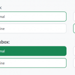 Convert Checkboxes & Radio Buttons Into Grouped Buttons – boxed-check.css
 Create Custom Switches With Checkboxes – Toggle Switchy
 iOS Style Segmented Controls In JavaScript & CSS