


A CSS library that converts normal checkboxes and radio buttons into checkable (toggleable) elements (like buttons and cards) for better UX.
See Also:
- Create Segmented Controls With Radio Buttons – Toggle Radios
- Radio Input Based Toggle Button Group With Pure CSS
- 10 Best Checkbox And Radio Input Replacements
How to use it :
1. To get started, include the boxed-check.min.css on the page.
<link rel="stylesheet" href="css/boxed-check.min.css" />
2. Create grouped toggle buttons from a series of checkboxes or radio buttons.
<!-- Radio Buttons -->
<div class="boxed-check-group">
    <label class="boxed-check">
      <input class="boxed-check-input" type="radio" name="radio-overview" checked>
      <div class="boxed-check-label">Normal</div>
    </label>
    <label class="boxed-check">
      <input class="boxed-check-input" type="radio" name="radio-overview">
      <div class="boxed-check-label">Normal</div>
    </label>
    <label class="boxed-check">
      <input class="boxed-check-input" type="radio" name="radio-overview" disabled>
      <div class="boxed-check-label">Disabled</div>
    </label>
</div>
<!-- Checkboxes -->
<div class="boxed-check-group">
<label class="boxed-check">
<input class="boxed-check-input" type="checkbox" name="checkbox-overview" checked>
<div class="boxed-check-label">Normal</div>
</label>
<label class="boxed-check">
<input class="boxed-check-input" type="checkbox" name="checkbox-overview">
<div class="boxed-check-label">Normal</div>
</label>
<label class="boxed-check">
<input class="boxed-check-input" type="checkbox" name="checkbox-overview" disabled>
<div class="boxed-check-label">Disabled</div>
</label>
</div><!-- Custom layout -->
<div class="boxed-check-group boxed-check-success">
<label class="boxed-check">
<input class="boxed-check-input" type="radio" name="radio-overview-custom" checked>
<div class="boxed-check-label" style="text-align:center;">
<h2>Breakfast</h2>
<span>Good Morning</span>
</div>
</label>
<label class="boxed-check">
<input class="boxed-check-input" type="radio" name="radio-overview-custom">
<div class="boxed-check-label text-center">
<h2>Lunch</h2>
<span>Good Afternoon</span>
</div>
</label>
<label class="boxed-check">
<input class="boxed-check-input" type="radio" name="radio-overview-custom">
<div class="boxed-check-label text-center">
<h2>Supper</h2>
<span>Good Evening</span>
</div>
</label>
</div>3. Apply additional styles to the toggle buttons.
- boxed-check-default
- boxed-check-secondary
- boxed-check-primary
- boxed-check-success
- boxed-check-danger
- boxed-check-warning
- boxed-check-info
- boxed-check-dark
- boxed-check-outline-default
- boxed-check-outline-secondary
- boxed-check-outline-primary
- boxed-check-outline-success
- boxed-check-outline-danger
- boxed-check-outline-warning
- boxed-check-outline-info
- boxed-check-outline-dark
<div class="boxed-check-group boxed-check-outline-default">
  ...
</div>
4. Set the size of the toggle buttons.
<div class="boxed-check-group boxed-check-default boxed-check-lg">
  ...
</div>
<div class="boxed-check-group boxed-check-default boxed-check-sm">
  ...
</div>
5. Make the toggle buttons displayed inline.
<label class="boxed-check boxed-check-inline">
  <input class="boxed-check-input" type="radio" name="radio-overview" checked>
  <div class="boxed-check-label">Normal</div>
</label>
Changelog:
11/24/2021
- v1.0.7
06/30/2021
- Added size & inline options.
See Also:
 Custom Checkboxes And Radio Buttons For Bulma Framework
 Create Stunning Checkboxes And Radio Buttons With Magic-Input CSS Library
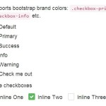 Pretty Checkbox & Radio Inputs with Bootstrap and awesome-bootstrap-checkbox.css
 Create Custom Switches With Checkboxes – Toggle Switchy
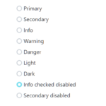 Custom Checkboxes, Radio Buttons, Switches In Pure CSS
 Custom Checkbox And Radio Inputs In Pure CSS
 Pretty Checkbox & Radio Button Replacement – Pretty.css
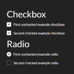 Animated Checkbox & Radio Button With Custom Marker