


Just another CSS library that appends hover-triggered tooltips to any DOM element using pure CSS/CSS3.
How to use it:
Download and insert the stylesheet tooltip.css into the document.
<link rel="stylesheet" href="tooltip.css">
Or you can copy CSS form below.
*[data-tooltip] { position: relative; }
*[data-tooltip]:hover:after, *[data-tooltip]:hover:before {
  opacity: 1;
  visibility: visible;
}
*[data-tooltip]:after, *[data-tooltip]:before {
  position: absolute;
  top: auto;
  bottom: 100%;
  left: 50%;
  opacity: 0;
  visibility: hidden;
  -webkit-transition: 0.15s ease-in;
  transition: 0.15s ease-in;
  z-index: 5;
}
*[data-tooltip]:after {
  content: attr(data-tooltip);
  background: rgba(0, 0, 0, 0.8);
  padding: 2px 7px;
  text-align: center;
  color: #fff;
  font-size: 12px;
  line-height: 16px;
  white-space: nowrap;
  border-radius: 4px;
  -webkit-transform: translate(-50%, -8px);
  transform: translate(-50%, -8px);
}
*[data-tooltip]:before {
  content: '';
  top: auto;
  bottom: 100%;
  border: 4px solid transparent;
  -webkit-transform: translateX(-50%);
  transform: translateX(-50%);
  border-top-color: rgba(0, 0, 0, 0.8);
}
*[data-tooltip][data-position="bottom"]:after {
  top: 100%;
  bottom: auto;
  -webkit-transform: translate(-50%, 8px);
  transform: translate(-50%, 8px);
}
*[data-tooltip][data-position="bottom"]:before {
  top: 100%;
  bottom: auto;
  border-color: transparent;
  border-bottom-color: rgba(0, 0, 0, 0.8);
}
*[data-tooltip][data-position="left"]:after {
  left: 0;
  bottom: auto;
  top: 50%;
  margin-left: -8px;
  -webkit-transform: translate(-100%, -50%);
  transform: translate(-100%, -50%);
}
*[data-tooltip][data-position="left"]:before {
  left: 0;
  bottom: auto;
  top: 50%;
  -webkit-transform: translate(-100%, -50%);
  transform: translate(-100%, -50%);
  border-color: transparent;
  border-left-color: rgba(0, 0, 0, 0.8);
}
*[data-tooltip][data-position="right"]:after {
  left: 100%;
  bottom: auto;
  top: 50%;
  -webkit-transform: translate(8px, -50%);
  transform: translate(8px, -50%);
}
*[data-tooltip][data-position="right"]:before {
  left: 100%;
  top: 50%;
  bottom: auto;
  -webkit-transform: translate(0, -50%);
  transform: translate(0, -50%);
  border-color: transparent;
  border-right-color: rgba(0, 0, 0, 0.8);
}
Append a tooltip to an element you specify:
<a href="#" data-tooltip="I am a tooltip!">Hover me</a>
Change the default tooltip position.
<a data-placement="left" data-tooltip="Tooltip on left">Tooltip on left</a>
<a data-placement="top" data-tooltip="Tooltip on top">Tooltip on top</a>
<a data-placement="bottom" data-tooltip="Tooltip on bottom">Tooltip on bottom</a>
<a data-placement="right"  data-tooltip="Tooltip on right">Tooltip on right</a>
See Also:
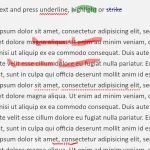 Underline/Highlight/Strike Text With The textAnnotator Library
 12+ Lightweight CSS Loading Animations – NanoLoader
 slot-text.js: Text Roll Animation for UI Labels
 Easy Progress Bar Engine With Promise Support – Rsup Progress
 Generate Random Abstract Backgrounds Using Vanilla JavaScript
 Accessible CSS Only Toggle Switches
 Export JavaScript Array To XLS And CSV – xlsexport
 Advanced Date & Time Input JavaScript Library – Timescape