


A smooth pure Html / css content filter, for a simpler effect with fewer lines of CSS, trade the width, height, padding, margin, and opacity properties in each checked input style for “display:none;” — these styles were just set to have a nice tranisition between filters.
How to use it:
Create blocks of contents you want to filter.
<div class="tile blue">1</div>
<div class="tile red">2</div>
<div class="tile blue">3</div>
<div class="tile green">4</div>
<div class="tile blue">5</div>
<div class="tile red">6</div>
<div class="tile red">7</div>
<div class="tile green">8</div>
<div class="tile blue">9</div>
<div class="tile green">10</div>
<div class="tile red">11</div>
<div class="tile green">12</div>
<div class="tile blue">13</div>
<div class="tile blue">14</div>
<div class="tile green">15</div>
<div class="tile red">16</div>
Create radio & label based filter buttons to filter blocks of content.
<input type="radio" id="blue" name="color" />
<label for="blue">BLUE</label>
<input type="radio" id="red" name="color"/>
<label for="red">RED</label>
<input type="radio" id="green" name="color"/>
<label for="green">GREEN</label>
<input type="radio" id="reset" name="color"/>
<label for="reset">RESET</label>
Style the blocks & filters.
input[type="radio"] { display: none; }
label {
  width: 23%;
  float: left;
  text-align: center;
  background: #ffffff;
  box-shadow: 0 1px 3px rgba(0,0,0,0.12), 0 1px 2px rgba(0,0,0,0.24);
  color: #222222;
  padding: 0.5%;
  margin: 0.5%;
  margin-bottom: 30px;
  cursor: pointer;
}
.tile {
  width: 23%;
  height: 100px;
  float: left;
  transition: all 1s;
  margin: 0.5%;
  padding: 0.5%;
}
.green { background: #1ABC9C; }
.blue { background: #3498DB; }
.red { background: #ED5565; }
Enable the filters.
input[type="radio"][id="blue"]:checked + label { background: #6666ff; }
input[type="radio"][id="blue"]:checked ~ .red,
input[type="radio"][id="blue"]:checked ~ .green {
  width: 0;
  height: 0;
  padding: 0;
  margin: 0;
  opacity: 0;
}
input[type="radio"][id="red"]:checked + label { background: #ff4466; }
input[type="radio"][id="red"]:checked ~ .blue,
input[type="radio"][id="red"]:checked ~ .green {
  width: 0;
  height: 0;
  padding: 0;
  margin: 0;
  opacity: 0;
}
input[type="radio"][id="green"]:checked + label { background: #66dd99; }
input[type="radio"][id="green"]:checked ~ .blue,
input[type="radio"][id="green"]:checked ~ .red {
  width: 0;
  height: 0;
  padding: 0;
  margin: 0;
  opacity: 0;
}
See Also:
 Fuzzy Search Library for Client-Side JavaScript – Fuse.js
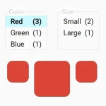 High-Performance Element Filtering Library – Filtering.js
 Filter & Sort DOM Elements with Advanced Filter System
 Add Instant Search Filtering to Web Pages with DropSearchJS
 Fast Fuzzy Search In Pure JavaScript – fuzzysort
 Fast Filtering (Fuzz-search) JavaScript Library – instafilter.js
 Filter An HTML List Alphabetically – alphaListNav.js
 CSS Only Filterable Gallery With Tabs