Off-canvas Mobile Menu In Pure CSS/CSS3

A pure CSS/CSS3 mobile menu system that slides out from the right side and pushes the content to the right.


A pure CSS/CSS3 mobile menu system that slides out from the right side and pushes the content to the right.

Omega.js uses CSS media queries to detect the screen size and collapse the regular navbar into a hamburger sidebar navigation (aka. off-canvas navigation).

A project contains 5 off-canvas hamburger navigation variations from which you can choose to bring the native app navigation experience to your webpage.

A responsive, cross-platform hamburger header navigation written in vanilla JavaScript and CSS/CSS3.

tinyDrawer.js is a small, zero-dependency drawer navigation component to slide in an off-screen menu from the left when toggled.
Yet another responsive, cross-platform navigation system that converts the horizontal menu into an off-screen hamburger navigation on the mobile device.

hy-drawer is a JavaScript library that makes it easy to create mobile-friendly, high-performant drawer navigation for your mobile/desktop web app.

A tilted sliding drawer navigation (off-canvas menu) with an animated hamburger button, built using JavaScript, CSS3 animations and clip path.

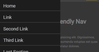
A pure CSS, mobile-friendly off-canvas navigation system built using plain HTML/CSS/CSS3 and :focus-within CSS pseudo-class.

A pure JavaScript/CSS based hamburger navigation that allows you to toggle an off-screen sidebar menu when you click on the hamburger trigger.