


webcimes-tooltip is a vanilla JavaScript library that creates animated and accessible tooltips for clickable elements (like buttons) or any elements with title attribute.
Features:
- Intelligent positioning: Uses Floating UI dependency for automatic tooltip placement that adapts to viewport constraints.
- Full accessibility: Includes ARIA labels, keyboard navigation, and screen reader compatibility out of the box.
- Custom animations: Configurable delay, duration, and easing for tooltip show/hide transitions.
- Custom CSS properties: Uses CSS variables for easy theming without JavaScript configuration.
- Event system: Provides beforeShow, afterShow, beforeHide, and afterHide callbacks.
How to use it:
1. Install webcimes-tooltip and import it into your project.
# NPM
$ npm install webcimes-tooltip
// ES Module
import { WebcimesTooltip } from "webcimes-tooltip";
// UMD
<link rel="stylesheet" href="/dist/css/webcimes-tooltip.css">
<script src="/dist/js/webcimes-tooltip.udm.js"></script>
// ES Module (Browser)
<link rel="stylesheet" href="/dist/css/webcimes-tooltip.css">
<script type="module">
  import { WebcimesTooltip } from "./dist/js/webcimes-tooltip.esm.js";
</script>
2. Attach a custom tooltip to a trigger element on click.
<!-- The button that triggers the tooltip -->
<button id="my-button">My button</button>
<!-- The content for the tooltip, hidden by default -->
<div style="display:none;">
  <p>This is the content inside the tooltip.</p>
</div>
document.addEventListener("DOMContentLoaded", function() {
  const tooltipButton = new WebcimesTooltip({
    type: "button",
    element: document.querySelector("#my-button")
  });
});
3. Or attach the tooltip to all elements with title attributes:
<span title="My <span style='color:red;'>Tooltip</span><br>With some <i>html</i>">
  My Element
</span>
document.querySelectorAll("[title]").forEach((el) => {
  const tooltipTitle = new WebcimesTooltip({
    type: "title",
    element: el,
  });
});
4. The library is configured through an options object passed to the constructor. Here are the available parameters:
type:string– Can be"button"(for dropdowns) or"title"(for hover tooltips). Default is"button".element:string|HTMLElement– The trigger element for the tooltip.content:string|HTMLElement– A selector or element for the tooltip’s content. Ifnull, it defaults to the element after the trigger (buttontype) or thetitleattribute (titletype).setId:string– A specific ID to add to the tooltip element.setClass:string– A specific class to add to the tooltip element.placement:string– The position of the tooltip. Accepts values like'top','bottom','right','left', and variations like'top-start'. Default is'bottom'for buttons and'top'for titles.delay:number– Time in milliseconds before the tooltip appears. Default is0for buttons,400for titles.duration:number– The animation duration in milliseconds. Default is600.arrow:boolean– Toggles the visibility of the tooltip’s arrow. Default istrue.style:string– A string of inline CSS to apply directly to the tooltip.ariaLabel:string– Sets anaria-labelon the tooltip itself for screen readers.hideOnHover:boolean– Iftrue, the tooltip will hide when you hover over it (fortitletype only). Default istrue.beforeShow:function– A callback that runs before the show animation starts.afterShow:function– A callback that runs after the show animation finishes.beforeHide:function– A callback that runs before the hide animation starts.afterHide:function– A callback that runs after the hide animation finishes.
new WebcimesTooltip({
  type: "button",
  element: null,
  content: null,
  setId: null,
  setClass: null,
  placement: : "bottom",
  delay: 0,
  duration: 600,
  arrow: true,
  style: null,
  ariaLabel: null,
  hideOnHover: true,
  beforeShow: () => {console.log("before show");},
  afterShow: () => {console.log("after show");},
  beforeHide: () => {console.log("before hide");},
  afterHide: () => {console.log("after hide");},
});
5. You can also override placement, delay, duration, arrow, and hideOnHover for individual elements using data-tooltip-* attributes in your HTML.
<span
  title="My <span style='color:red;'>Tooltip</span><br>With some <i>html</i>"
  data-tooltip-placement="top"
  data-tooltip-delay="400"
  data-tooltip-duration="600"
  data-tooltip-arrow="true"
  data-tooltip-hide-on-hover="true">
  My content
</span>
6. DOM element access.
const myTooltip = new WebcimesTooltip({...});
// Access the tooltip element
console.log(myTooltip.tooltip);
// Access the reference element
console.log(myTooltip.tooltipRef);
// Access the arrow element
console.log(myTooltip.tooltipArrow);
7. Events can be handled via callbacks or standard addEventListener calls on the instance reference.
myTooltip.tooltipRef.addEventListener("afterShow", () => {
  console.log("Tooltip is now visible.");
});
8. Create your own tooltip styles by overriding the default CSS variables.
.webcimes-tooltip {
  --tooltip-color: #fff;
  --tooltip-background: #222;
  --tooltip-border-color: #888;
  --tooltip-arrow-width: 8px;
  --tooltip-arrow-height: 8px;
  --tooltip-duration: 0s;
}
FAQs
Q: Can I put HTML content inside a tooltip?
A: Yes. For button type tooltips, the content is an HTML element, so you can put anything you want inside it. For title type tooltips, the content is derived from the title attribute.
Q: How do I style a single, specific tooltip differently?
A: You can use the setId or setClass options when creating the WebcimesTooltip instance. This lets you add a unique ID or class to the tooltip element, which you can then target with your own CSS rules to override the default styles.
Q: Can I use webcimes-tooltip with dynamically created elements?
A: Yes, but you need to initialize tooltip instances after the elements are added to the DOM. The library does not automatically detect new elements, so call new WebcimesTooltip() for each dynamically created element that needs tooltips.
Q: What happens if I have multiple tooltips open simultaneously?
A: Button tooltips can coexist since they are click-activated, but title tooltips are designed for hover interactions and only one appears at a time. The library manages z-index stacking to prevent visual conflicts.
Changelog:
v3.0.2 (05/05/2026)
- enhance tooltip visibility handling
v3.0.1 (10/24/2025)
- UPDATE
v2.6.4 (10/03/2025)
- update tooltip handling
v2.6.1 (09/21/2025)
- Improve tooltip cleanup logic in destroy method
v2.6.0 (09/20/2025)
- Added new methods to WebcimesTooltip class.
- Refactored existing code to utilize the new event handling methods for better maintainability.
See Also:
 Reading Compressed Files With Pure JavaScript – uncompress.js
 Validating Credit Card Numbers With Pure JavaScript – credicard.js
 Vanilla JavaScript Marquee Library
 Dynamic Form Group Cloning Library – Repeater-Field.js
 CSS Only Responsive Fixed Sidebar Navigation
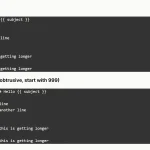 Add Numbering to Pre and Textarea – line-numbers Web Component
 Fullscreen Overlay Menu In JavaScript Library
 Zoom & Drag Images Using Mouse Drag And Pinch Gestures – HoverPinchZoom.js