


A beautiful, flexible, responsive, multi-language, multi-theme date & time picker library implemented in pure JavaScript.
See also:
How to use it:
Install the Window Date Picker.
# NPM
$ npm install window-date-picker --save
Import the Window Date Picker.
import WindowDatePicker from 'window-date-picker';
<!-- Or -->
<link href="dist/css/window-date-picker.css" rel="stylesheet">
<script src="dist/js/window-date-picker.js"></script>
Create a placeholder element for the date & time picker.
<div id="picker"></div>
Create an input field to accept the date & time values.
<input id="demo">
Create a trigger element to toggle the date & time picker.
<button id="toggle">Lanuch</button>
Initialize the date & time picker and done.
const picker = new WindowDatePicker({
      el: '#picker',
      toggleEl: '#toggle',
      inputEl: '#demo'
});
Enable time picker only.
const picker = new WindowDatePicker({
      el: '#picker',
      toggleEl: '#toggle',
      inputEl: '#demo',
      type: 'HOUR'
});
All default configuration options.
const picker = new WindowDatePicker({
      // initial value
      value: null,
      // selectors
      el: null,
      inputEl: null,
      toggleEl: null,
      // or 'HOUR', 'DATEHOUR'
      type: "DATE",
      // date format
      dateType: "DD/MM/YYYY",
      // or '24'
      hourType: "12",
      // allows empty value
      allowEmpty: true,
      // shows the button
      showButtons: false,
      // toggles the date & time picker when clicking input
      inputToggle: false,
      // language
      lang: 'en',
      // if it is set true, up arrow increases value, down arrow decreases
      orientation: false,
      // shows arrow buttons
      showArrowButtons: false

});
Localize the date & time picker as follows:
export default {
    DAYS_ABBR: ['', 'Mon', 'Tue', 'Wed', 'Thu', 'Fri', 'Sat', 'Sun'],
    MONTHS: ['', 'January', 'February', 'March', 'April', 'May', 'June', 'July', 'August', 'September', 'October', 'November', 'December'],
    MONTHS_ABBR: ['', 'Jan', 'Feb', 'Mar', 'Apr', 'May', 'Jun', 'Jul', 'Aug', 'Sep', 'Oct', 'Nov', 'Dec'],
    AM_PM: ['AM', 'PM'],
    BUTTONS: ['CANCEL', 'OK'],
    INVALID_DATE: 'Invalid Date'
};
API methods.
// gets the current value
picker.get();
// sets the value
picker.set(value);
// opens the picker
picker.open();
// closes the picker
picker.close();
// toggles the picker
picker.toggle();
// store the selection
picker.save();
// cancels the selection
picker.cancel();
// destroys the picker
picker.destroy();
Event handlers.
picker.el.addEventListener('wdp.open', () => {
  // when the picker opens
});
picker.el.addEventListener('wdp.close', () => {
  // when the picker closes
});
picker.el.addEventListener('wdp.save', () => {
  // when the picker saves the selection
});
picker.el.addEventListener('wdp.cancel', () => {
  // when the picker cancels the selection
});
picker.el.addEventListener('wdp.destroy', () => {
  // when the picker destroys
});
picker.el.addEventListener('wdp.change', () => {
  // when the value changed
});
Changelog:
04/13/2019
- add show arrow buttons option
See Also:
 Persian Jalali & Gregorian Date Picker in Vanilla JS – Azar Datepicker
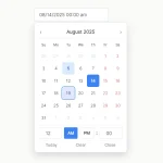 Accessible Customizable Date/Time/Date Picker for Modern Web App – FDatepicker
 Vanilla DateTime Picker: Zero-Dependency JS Date-Time Input
 Vanilla JS Date & Time Picker for Moderb Web Apps – Tuncxys DatePicker
 Versatile Datetime Picker For Bulma – bulma-calendar
 Powerful, Customizable JavaScript Date Picker – Datelite
 Easy Datetime & Date Range Pickers in Vanilla JavaScript
 Minimal Multilingual Datetime Picker Component – input-dt
Hello,
Im planning to integrate your component into the new company website and I was wondering how can I limit max and min dates that the user can select. Should I use the events or are there other properties Im missing?
Thank you for creating this and your effort!
how to disable previous dates