


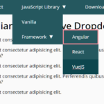
A lightweight, accessible, simple-to-use drop-down menu component written in vanilla JavaScript (ES6).
Fully accessible to WAI-ARIA specification:
- Enter or Space key to close/unfold the dropdown menu.
- Escape key to close the drop-down menu and move the focus.
- Up and Down Arrow keys to navigate between menu items.
- Home key to move the focus to the first item in the dropdown menu.
- End/kbd> key to move the focus to the last item in the dropdown menu.
How to use it:
Create the dropdown menu from a trigger button and a regular HTML unordered list.
<div class="c-dropdown">
  <button
    type="button"
    id="dropdown-trigger-demo"
    class="c-btn u-p"
    data-component="dropdown"
    data-target="dropdown-demo">
    Open dropdown demo
  </button>
  <ul id="dropdown-demo" class="c-dropdown__menu">
    <li data-item><a href="#" class="c-dropdown__link" data-focus><span>Option 1</span></a></li>
    <li data-item><a href="#" class="c-dropdown__link" data-focus>Option 2</a></li>
    <li data-item><a href="#" class="c-dropdown__link" data-focus>Option 3</a></li>
  </ul>
</div>
Import the a11y-dropdown-component into the document and initialize the dropdown menu.
document.addEventListener('DOMContentLoaded', () => {
  Dropdowns.init();
});
The example CSS for the dropdown menu.
/* buttons */
.c-btn {
  position: relative;
  z-index: 0;
  display: inline-block;
  -webkit-transform: translate3d(0, -0.25em, 0);
  transform: translate3d(0, -0.25em, 0);
  padding: 0.75em 1.5em;
  font-size: 1.6rem;
  line-height: 1.5;
  border: 0;
  border-radius: 0.25em;
  background-color: #f0f0f0;
  vertical-align: top;
  text-decoration: none;
  font-weight: 700;
  color: #e91e63;
  cursor: pointer;
  -webkit-transition: .2s;
  transition: .2s;
}
.c-btn::before,
.c-btn::after {
  content: "";
  position: absolute;
  z-index: -1;
  top: 0;
  right: 0;
  bottom: 0;
  left: 0;
  border-radius: inherit;
  -webkit-box-shadow: 0 0.25em 0 0 #ccc;
  box-shadow: 0 0.25em 0 0 #ccc;
  -webkit-transition: .2s;
  transition: .2s;
}
.c-btn::after {
  -webkit-box-shadow: 0 0.25em 0 0 #aa1145;
  box-shadow: 0 0.25em 0 0 #aa1145;
  background-color: #e91e63;
  visibility: hidden;
  opacity: 0;
}
.c-btn[aria-expanded="true"],
.c-btn:focus,
.c-btn:hover,
.c-btn:active {
  color: #fff;
}
.c-btn[aria-expanded="true"]::after,
.c-btn:focus::after,
.c-btn:hover::after,
.c-btn:active::after {
  visibility: visible;
  opacity: 1;
}
.c-btn--unstyled {
  position: static;
  -webkit-transform: none;
  transform: none;
  padding: 0;
  border-radius: 0;
  background: none;
  font: inherit;
  line-height: inherit;
  color: inherit;
}
.c-btn--unstyled::before,
.c-btn--unstyled::after {
  content: none;
}
/* dropdowns */
.c-dropdown {
  display: inline-block;
  vertical-align: top;
}
.c-dropdown__menu {
  max-height: 20rem;
  margin: 0;
  padding-left: 0;
  border-radius: 0.25em;
  visibility: visible;
  opacity: 1;
  overflow: hidden;
  list-style: none;
  transition: max-height .2s, visibility 0s, opacity 0s;
}
.c-dropdown__menu[aria-hidden="true"] {
  max-height: 0;
  visibility: hidden;
  opacity: 0;
  transition: max-height .2s, visibility .2s .2s, opacity .2s .2s;
}
.c-dropdown__link {
  display: block;
  margin: .25em;
  padding: 0.5em 1.5em;
  text-decoration: none;
  font-size: 1.4rem;
  font-weight: 700;
  color: #e91e63;
  background-color: #f0f0f0;
}
/* utilities */
.u-p {
  margin-top: 2.4rem;
}
Decide whether to show the dropdown menu on init.
Dropdowns.render('dropdown-trigger-demo', {
  isOpen: true
});
Decide whether to auto close the dropdown menu.
Dropdowns.render('dropdown-trigger-demo', {
  autoClose: true
});
Sometimes you might need to destroy the dropdown menu.
Dropdowns.destroy('dropdown-trigger-demo');Changelog:
12/02/2018
- v1.2.0: add auto close parameter
10/27/2018
- v1.1.1
See Also:
 WCAG Compliant Responsive Dropdown Navigation – accessible-menu
 Accessible Dropdown Nav With Vanilla JavaScript – Clicky Menus
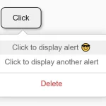 Customizable Context Menus and Dropdowns With Vanilla JS – Tiny Popup Menu
 Responsive Accessible Dropdown Menu Template with Vanilla JavaScript
 Modern Multi-level DropDown Menu – Droppy
 Responsive Dropdown/Off-canvas Navigation In Vanilla JavaScript – Menue
 Accessible Dropdown Menu With Smooth JavaScript Animations
 Stylish Accessible Dropdown Menu With JavaScript And CSS3