


Coloris.js is a vanilla JavaScript library for creating responsive, mobile-friendly, and fully accessible color pickers.
More Features:
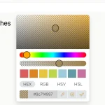
- Allows you to pre-define color swatches.
- Dark and Light themes.
- Supports HEXa, HEX, RGBa, RGB color formats.
- Saturation and Brightness sliders.
How to use it:
1. Import the stylesheet coloris.min.css and JavaScript coloris.min.js into the HTML document.
<link rel="stylesheet" href="coloris.min.css" />
<script src="coloris.min.js"></script>
2. To initialize the color picker automatically, just add the data-coloris attribute to the target input field as follows:
<input type="text" data-coloris />
3. Or initialize the color picker in JavaScript.
<input type="text" class="coloris" />
Coloris({
  el: '.coloris'
});
4. Specify the initial color using the value attribute:
<input type="text" class="coloris" value="rgb(255, 0, 0)" />
5. Change the theme: default, large, polaroid, pill (horizontal).
<input type="text" class="coloris" />
Coloris({
  theme: 'large',
  themeMode: 'light', // light, dark, auto
});
6. Define an array of predefined swatches to display.
Coloris({
  swatches: [
    '#264653',
    '#2a9d8f',
    '#e9c46a',
    '#f4a261',
    '#e76f51',
    '#d62828',
    '#023e8a',
    '#0077b6',
    '#0096c7',
    '#00b4d8',
    '#48cae4',
  ]
});
7. Set the color format:
- hex
- rgb
- auto
- mixed (default)
Coloris({
  format: 'hex',
});
8. Call a function whenever a new color is picked
Coloris({
  onChange: (color) => undefined
});
9. More configurations.
Coloris({
  // parent container
  parent: null,
  // The bound input fields are wrapped in a div that adds a thumbnail showing the current color
  // and a button to open the color picker (for accessibility only).
  wrap: true,
  // enable format toggle button
  formatToggle: true,
  // Margin in px
  margin: 2,
  // Show only the color swatches in the picker dialog
  swatchesOnly: false,
  // disable alpha
  alpha: true,
  // not focus the color value input
  focusInput: true,
  // select the color value input when the picker opens
  selectInput: false,
  // auto close
  autoClose: false,
  // set to true to use the color picker as an inline widget
  inline: false,
  // default colorin inline mode
  defaultColor: '#000000',
  // config the clear button
  clearButton: {
    show: false,
    label: 'Clear'
  },
  // close button
  closeButton: false,
  closeLabel: 'Close',
  // a11y
  a11y: {
    open: 'Open color picker',
    close: 'Close color picker',
    clear: 'Clear the selected color',
    marker: 'Saturation: {s}. Brightness: {v}.',
    hueSlider: 'Hue slider',
    alphaSlider: 'Opacity slider',
    input: 'Color value field',
    format: 'Color format',
    swatch: 'Color swatch',
    instruction: 'Saturation and brightness selector. Use up, down, left and right arrow keys to select.'
  }

});
10. API methods.
// Close the color picker
Coloris.close();
// Close the color picker and reset the color
Coloris.close(true);
11. Event handlers.
- open
- close
- input
- change
Changelog:
v0.25.0 (06/03/2025)
- Keep the picked color and close the picker dialog on press on Enter
- Fix a bug when Coloris is closed inside a dialog
v0.24.0 (04/12/2024)
- Accept an HTMLElement or an array of HTMLElements for the el option
- Accept an HTMLElement for the parent option
- Make right-click on the saturation-brightness area behave identically to a click
- Remove inline styles to conform to a strict a Content Security Policy (CSP) header
v0.23.0 (03/05/2024)
- Remove a workaround for a now fixed Chromium bug where the alpha value is rounded incorrectly
- More CSS hardening to render the hue and alpha sliders correctly in the presence of some overzealous CSS frameworks
v0.22.0 (11/08/2023)
- Expose the DOMReady function in the global Coloris object
v0.21.1 (08/23/2023)
- Fix a occasional race condition on Firefox
v0.21.0 (07/01/2023)
- Allow manually clearing the color by deleting its value
- Mirror selection from the original input field into the color picker’s input field
- Increase the hue and alpha sliders thumb size to improve usability on iOS/iPadOS devices
v0.20.0 (06/05/2023)
- The current input field is now passed to the onChange callback in addition to the selected color
v0.19.0 (02/14/2023)
- Improve focus outline of the transparent close button
v0.18.0 (02/14/2023)
- Add a new onChange callback to the settings
v0.17.0 (01/15/2023)
- Always show focus rings when using keyboard navigation.
- Add an optional visible close button.
- Add a more accessible label to the clear button.
- Bugfixes
v0.16.2 (10/13/2022)
- Fix setting a color manually from text input in inline mode
v0.16.1 (09/20/2022)
- Fix an issue where the change event wasn’t triggered in some cases
v0.16.0 (08/11/2022)
- Add a new “pill” (horizontal) theme
- Do not position the picker above the input if there is not enough space
v0.15.0 (07/20/2022)
- Add support for (virtual) instances
v0.14.1 (07/10/2022)
- Remove unnecessary autoClose setting
v0.14.0 (06/04/2022)
- Added an option to select the color value input when the picker opens
v0.13.0 (06/01/2022)
- Add an option to always include the alpha value in the output color string
- Set the default color format when switching to inline mode
v0.12.2 (05/22/2022)
- Add type=”button” to all button elements to avoid submitting a container form
v0.12.1 (05/01/2022)
- Fix an issue with the calculation of the color area position in inline mode
v0.12.0 (04/26/2022)
- Add a new inline (static) mode
- Trigger an event when a new color is picked
v0.11.0 (04/24/2022)
- Add an “open” and “close” events.
v0.10.3 (04/06/2022)
- Fix a bug where the color swatches are not reset.
v0.10.2 (03/09/2022)
- Mitigate a Chromium bug where the alpha value is rounded incorrectly
v0.10.1 (03/04/2022)
- Add spellcheck=”false” to the color value field.
v0.10.0 (01/05/2021)
- Add an option to show only the color swatches in the picker dialog
v0.9.2 (01/03/2021)
- Fix issue where clear button was not clearing the selected color anymore
v0.9.1 (12/18/2021)
- Improved dark mode alpha gradient
v0.9.0 (12/14/2021)
- Add an option to not focus the color value input
v0.8.0 (11/13/2021)
- Add support for automatic dark mode
v0.7.0 (11/09/2021)
- Add a color format toggle to switch between Hex, RGB and HSL
- Add a new “auto” color format
- Add a new “large” theme
11/03/2021
- Add the ability to disable alpha
10/27/2021
- Fix swatches distribution for the polaroid theme
10/19/2021
- Add a clear button
10/16/2021
- Add an arrow to the polaroid theme that points to the active input field
See Also:
 Modern Feature-Rich Color Picker in Vanilla JavaScript – jscolorpicker
 Modern Color Picker Component: Support for OKLCH, P3, and More – css-color-component
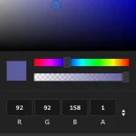 Mobile-friendly & Keyboard Accessible Color Picker – Alwan
 Customizable Color Picker For The Web – Grid Color Picker
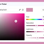 Lightweight & Fast Color Picker Web Component – color-dialog-box
 Elegant Mobile-compatible Color Picker Component – pickr
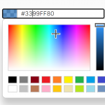 Customizable Mobile-friendly Color Picker – jscolor
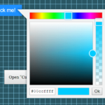 Vanilla JS Color Picker With Alpha Channel – vanilla-picker