


JS ColorPicker is a modern color picker library that supports light/dark themes, predefined swatches, multiple color formats, and CSS color parsing.
You can implement it as a button, input field, or hidden component. It also includes an alpha transparency slider and provides both immediate color application and confirmation modes.
How to use it:
1. Download the JS ColorPicker and import it into your project.
<link rel="stylesheet" href="colorpicker.css" />
// For Browser
<script src="colorpicker.iife.js"></script>
// ES Module
import ColorPicker from 'colorpicker.js'
2. Create an element to launch the color picker interface:
<!-- Trigger Button -->
<button id="picker"></button>
<!-- Or Input Field -->
<input id="picker" />
3. Create a new ColorPicker instance and target your trigger element. That’s it.
const instance = new ColorPicker('#picker', {
  // options here
})
4. All default configuration options:
toggleStyle: ('button'or'input') – Renders as a button or input (default:'button').headless: (boolean) – Run without a visible toggle, useprompt()(default:false).container: (HTMLElementornull) – Element to append the dialog to (default:body). Required when using the ColorPicker inside a Bootstrap OffCanvas or Modal.defaultColor: (stringornull) – Initial color (overrides input/data-color, default:null).swatches: (string[],null, orfalse) – Predefined color swatches (disable withnull/false/[]).swatchesOnly: (boolean) – Show only swatches, hide other inputs (requiresswatches, default:false).enableAlpha: (boolean) – Show/hide the alpha slider (default:true).enableEyedropper: (boolean) – Enable/disable the eyedropper (default:true, browser support limited).formats: (ColorFormat[],null, orfalse) – Allowed color formats (disable withnull/false, default:['hex', 'rgb', 'hsv', 'hsl']).defaultFormat: ('hex','rgb','hsv', or'hsl') – Initial format if multiple are enabled (default:'hex').submitMode: ('instant'or'confirm') – Apply color instantly or on confirmation (default:'confirm').showClearButton: (boolean) – Show the clear button (default:true).dismissOnOutsideClick: (boolean) – Close on outside click (default:true).dismissOnEscape: (boolean) – Close on Escape key press (default:true).dialogPlacement: ('top','bottom','left', or'right') – Dialog position relative to toggle (default:'top').dialogOffset: (number) – Gap between toggle and dialog (in pixels, default:8).
const instance = new ColorPicker('#picker', {
  headless: false,
  toggleStyle: 'button',
  container: null,
  defaultColor: null,
  swatches: null,
  swatchesOnly: false,
  enableAlpha: true,
  enableEyedropper: true,
  formats: ['hex', 'rgb', 'hsv', 'hsl'],
  defaultFormat: 'hex',
  submitMode: 'confirm',
  showClearButton: true,
  dismissOnOutsideClick: true,
  dismissOnEscape: true,
  dialogPlacement: 'top',
  dialogOffset: 8,
})
5. API methods.
// Set a color (various input formats accepted)
picker.setColor('#ff0000', true); // true: emit 'pick' event
// Update swatches
picker.setSwatches(['#f00', '#0f0', '#00f']);
// Change the color format
picker.setFormat('rgb', true); // true: update the selected color
// Clear the color
picker.clear(true); // true: emit 'pick' event
// Open, close, or toggle the picker
picker.open(true);      // true: emit open/opened events
picker.close(true);     // true: emit close/closed events
picker.toggle();       // Toggle open/closed state
// Remove the picker and restore the original element
picker.destroy();
6. Event handlers.
picker.on('pick', (color) => console.log('pick', color))
picker.on('open', () => console.log('open'))
picker.on('opened', () => console.log('opened'))
picker.on('close', () => console.log('close'))
picker.on('closed', () => console.log('closed'))
7. Create a picker without a toggle using headless mode:
const picker = new ColorPicker(target, {
  headless: true,
})
const color = await picker.prompt(true)
8. The pick event provides a Color object with methods to get the color in any format:
picker.on('pick', (color) => {
  if (!color) {
    return console.log('Color cleared')
  }
  console.log(
    'Color picked',
    color.toString(),
    color.string('hex'),
    color.string('rgb'),
    color.string('hsv'),
    color.string('hsl')
  )
})
9. Apply light or dark themes using HTML attributes:
<html data-cp-theme="dark"></html>
<html data-bs-theme="dark"></html>
<html data-cp-theme="light"></html>
<html data-bs-theme="light"></html>
10. You can also create your own themes by modifying the following CSS variables:
:root {
  --cp-size: 2.375rem;
  --cp-border-radius-sm: 0.25rem;
  --cp-border-radius-lg: 0.5rem;
  --cp-swatch-width: 2rem;
  --cp-body-bg: #fff;
  --cp-body-color: #212529;
  --cp-body-color-rgb: 33, 37, 41;
  --cp-border-color: #dee2e6;
  --cp-border-color-translucent: rgba(0, 0, 0, 0.175);
  --cp-tertiary-color: rgba(33, 37, 41, 0.5);
  --cp-box-shadow: 0 0.5rem 1rem rgba(0, 0, 0, 0.15);
  --cp-box-shadow-sm: 0 0.125rem 0.25rem rgba(0, 0, 0, 0.075);
  --cp-delay: 150ms;
}
Changelog:
v1.1.0 (06/09/2026)
- OKLCH format support
- data-color attribute updates now supported on non-input elements
- onchange attribute on target is now respected
- Static placement option for dialogs
- rgba is now a separate explicit format
- Bug Fixes
See Also:
 Modern Color Picker Component: Support for OKLCH, P3, and More – css-color-component
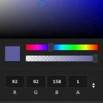 Mobile-friendly & Keyboard Accessible Color Picker – Alwan
 Accessible Color Picker – Coloris.js
 Customizable Color Picker For The Web – Grid Color Picker
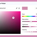 Lightweight & Fast Color Picker Web Component – color-dialog-box
 Elegant Mobile-compatible Color Picker Component – pickr
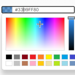 Customizable Mobile-friendly Color Picker – jscolor
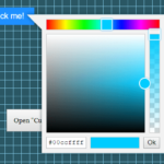 Vanilla JS Color Picker With Alpha Channel – vanilla-picker