


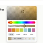
Alwan is a lightweight, touch-enabled, and keyboard-accessible color picker component made in pure Vanilla JavaScript.
More Features:
- Light & Dark themes.
- Supports 3 color formats: rgba, hsl, hsv.
- Custom position.
- Allows you to predefined colors.
- And much more.
How to use it:
1. Install and import the alwan.
# Yarn
$ yarn add alwan
# NPM
$ npm i alwan
// Import javascript.
import alwan from 'alwan';
// Import css.
import 'talwin/dist/css/alwan.min.css';
// Browser
<link rel="stylesheet" href="/dist/css/alwan.min.css">
<script src="/dist/js/alwan.min.js"></script>
// CDN
<link rel="stylesheet" href="https://unpkg.com/alwan/dist/css/alwan.min.css">
<script src="https://unpkg.com/alwan/dist/js/alwan.min.js"></script>
2. Create an element to hold the color picker.
<div id="example"></div>
3. Initialize the Talwin color picker.
const alwan = new Alwan('#example', {
      // Options here
});
4. All available options.
const alwan = new Alwan('#example', {
      // Set the container's (widget) id.
      id: '',
      // One or many classes separated by a white space,
      // to add it to the preset button.
      classname: '',
      // 'dark' or 'light'.
      theme: 'light',
      // Toggle picker's visibility (Show/Hide),
      // Setting this to false keeps the picker visible.
      toggle: true,
      // Display the picker container as a pop-up (a box that floats on top of the page content),
      // if it's false, picker container will be displayed as a block (embeded in the page's content).
      popover: true,
      // Set the position of the popper (if popover is set to true) relative to the reference element,
      // the position has two values seperated by a dash (-),
      // the first value is the direction (top, bottom, right, left),
      // the second value is the alignment (start, center, end), omitting this value will default to center.
      // e.g. 'bottom-start': 'bottom' places the picker below the reference element,
      // and 'start' aligns the left side of the container with the left side of the reference element.
      // Note:
      // If the picker container has no space to be placed, it will auto-position itself.
      // based on the available space.
      position: 'bottom-start',
      // Set the gap (in pixels) between the picker container and the reference element.
      margin: 8,
      // Replace the reference element with a pre-styled button.
      //  In case you set the preset to false (using your own reference element),
      // to access the color to change its background or any other property,
      // add the css custom property to your styles --tw-color.
      preset: true,
      // Initial color.
      color: '#000',
      // Default color.
      default: '#000',
      // Target can be a selector or an HTML element,
      // If the option popover is true, the picker container will be positionned retalive to this element,
      // instead of the reference element.
      // else if popover option is false, the picker container will be appended as a child into this element.
      target: '',
      // Disable the picker, users won't be able to pick colors.
      disabled: false,
      // Initial color format.
      format: 'rgb',
      // For the formats 'hsl' and 'rgb', choose a single input to display the color string,
      // or if false, display an input for each color channel.
      singleInput: false,
      // Choose color formats for the picker input, 'hsl', 'rgb' or 'hex',
      // No input will be displayed if the array is empty.
      inputs: {
        rgb: true,
        hex: true,
        hsl: true,
      },
      // Support alpha channel and display opacity slider.
      opacity: true,
      // Preview the color.
      preview: true,
      // Close color picker when scrolling
      closeOnScroll: false,
      // Add/Remove a copy button.
      copy: true,
      // Array of color strings, invalid color strings will default to rgb(0,0,0).
      swatches: [],
      // Show/Hide swatches container (Make swatches container collapsible).
      toggleSwatches: false,
      // Picker widget shared between multiple instance (this is good if you have many color picker instances).
      shared: false,
      // Close color picker when scrolling (only if the color picker is displayed as a popover and can be closed).
      closeOnScroll: false,

});
5. Events.
alwan.on('open', function() {
  // do something
});
alwan.on('close', function() {
  // do something
});
alwan.on('change', function(colorObject, source) {
  // do something
});
alwan.on('color', function(colorObject, source) {
  // do something
});
6. Color props.
alwan.on('change', function(color) {
  // output: { r: 0, g: 0, b: 0, a: 1}
  color.rgb()
  // output: [0, 0, 0, 0]
  color.rgb(true)
  // output: rgba(0, 0, 0, 1)
  color.rgb().toString()

  // output: #000000
  color.hex()

  // output: { h: 0, s: 0, l: 0, a: 1 }
  color.hsl()
  // output: [0, 0, 0, 0]
  color.hsl(true)
  // output: hsla(0, 0%, 0%, 1)
  color.hsl().toString()

})
7. API methods.
// set color
alwan.setColor(color: string | object);
// get color
alwan.getColor();
// open the color picker
alwan.open();;
// check if the color picker is open
alwan.isOpen();
// toggle the color picker
alwan.toggle();
// set uptions
alwan.setOptions(options: object);
// trigger an event
alwan.trigger(event: string);
// bind/unbind events
alwan.on(event: string, handler: callback);
alwan.off(event: string, handler: callback);
// disable the color picker
alwan.disable();
// enable the color picker
alwan.enable();
// re-position the color picker
alwan.reposition();
// add color swatch(es)
alwan.addSwatches(Array<string | object>);
// remove color from the swatches
alwan.removeSwatches(Array<string | object | number>);
// reset the color
alwan.reset();
// destroy the instance
alwan.destroy();
Changelog:
v2.3.1 (02/19/2026)
- Update
v2.3.0 (10/13/2025)
- Improvements and bugfixes
v2.2.0 (08/30/2025)
- Many bugs with popover behavior.
- Fixed some TypeScript types.
- Popover behavior: if the target element is not visible, the popover cannot be opened/shown.
- Corrected the target option: when popover is false, the picker is appended next to the reference element instead of as a child (use parent option for that).
- Reduced final build size by ~1 KB.
v2.1.1 (05/23/2024)
- minor improvements
v2.1.0 (05/17/2024)
- The # symbol in the hex color is now optional
- Add the option parent so you can append the picker in an element other than the body when it’s displayed as a popover
- Bugfixes
v2.0.2 (01/17/2024)
- Bug fix.
v2.0.1 (01/01/2024)
- Bug fix.
v2.0 (11/15/2023)
- Design improvements.
- Bug fixes and improvements.
- Set a custom height to the color picker widget in popover display if viewport height is lesser than its height.
- When disabled, Disable all interactive controls (buttons, inputs, picker).
- Fix issue where mouse keeps dragging the picker where no button is active.
- Remove shared option.
- Fix compatibility issues.
- Add title and ARIA label for the swatches toggle button.
- Change preset reference button design so it become visible in any background.
v1.4 (09/21/2023)
- Improve accessibility by adding ARIA labels to the unlabeled interactive elements, you can change these labels in the i18n option. also adding title attriubte to the buttons.
- Correct the widget position when toggling swatches panel.
v1.3.1 (06/23/2023)
- add close on scroll option.
v1.3.0 (06/23/2023)
- Fixed issue where color or change events fire without color change.
- Added new option closeOnScroll.
- Changed color value (color picker output object) to be more simple and detailed.
- Changed the methods addSwatch and removeSwatch to addSwatches and removeSwatches, it can add/remove multiple color swatches.
e.g. alwan.addSwatches(‘red’, ‘green’, ‘blue’) - Prefix custom properties with a namespace alwan
v1.2.1 (06/11/2023)
- Bug fixes.
v1.2.0 (04/25/2023)
- Fixed issue with the color selection area.
- Removed HSV color format (Not supported in the web).
- Minor improvements.
v1.1.2 (03/22/2023)
- Fix bugs and issues.
- Little Improvements to the design.
- Fix issue where clicking the label of the reference button doesn’t open/close the picker.
- Improve keyboard accessiblity.
v1.1.1 (03/10/2023)
- Fix a lot of bugs and minor issues.
- Added a type declaration file.
- Add new options: toggleSwatches and shared.
- Design improvements.
- Code optimization
v1.0.5 (10/26/2022)
- Bugfix
See Also:
 Modern Feature-Rich Color Picker in Vanilla JavaScript – jscolorpicker
 Modern Color Picker Component: Support for OKLCH, P3, and More – css-color-component
 Accessible Color Picker – Coloris.js
 Customizable Color Picker For The Web – Grid Color Picker
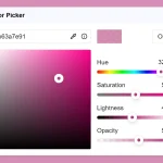 Lightweight & Fast Color Picker Web Component – color-dialog-box
 Elegant Mobile-compatible Color Picker Component – pickr
 Customizable Mobile-friendly Color Picker – jscolor
 Vanilla JS Color Picker With Alpha Channel – vanilla-picker