


A CSS only approach to creating a star rating widget on your webpage using plain HTML and CSS / CSS3.
How to use it:
Create a set of radio buttons with labels for the 5-star rating widget.
<div class="rate">
  <input type="radio" id="star5" name="rate" value="5" />
  <label for="star5" title="text">5 stars</label>
  <input type="radio" id="star4" name="rate" value="4" />
  <label for="star4" title="text">4 stars</label>
  <input type="radio" id="star3" name="rate" value="3" />
  <label for="star3" title="text">3 stars</label>
  <input type="radio" id="star2" name="rate" value="2" />
  <label for="star2" title="text">2 stars</label>
  <input type="radio" id="star1" name="rate" value="1" />
  <label for="star1" title="text">1 star</label>
</div>
The core CSS for the star rating widget. Tweak the CSS styles as shown below as per your need.
.rate {
  border: 1px solid #cccccc;
  float: left;
  height: 46px;
  padding: 0 10px;
}
.rate:not(:checked) > input {
  position: absolute;
  top: -9999px;
}
.rate:not(:checked) > label {
  float: right;
  width: 1em;
  overflow: hidden;
  white-space: nowrap;
  cursor: pointer;
  font-size: 30px;
  color: #ccc;
}
.rate:not(:checked) > label:before { content: '★ '; }
.rate > input:checked ~ label { color: #ffc700; }
.rate:not(:checked) > label:hover, .rate:not(:checked) > label:hover ~ label { color: #deb217; }
.rate > input:checked + label:hover, .rate > input:checked + label:hover ~ label, .rate > input:checked ~ label:hover, .rate > input:checked ~ label:hover ~ label, .rate > label:hover ~ input:checked ~ label { color: #c59b08; }
See Also:
 Five-Star Rating Web Component in JavaScript
 Select Box Based Star Rating JavaScript Library – star-rating.js
 Customizable 5-Star Rating System In Pure CSS/SCSS
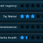 CSS Only Animated Rating Bar
 Tiny Star Rating System In Vanilla JavaScript
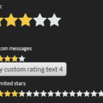 Interactive Star Rating Component With Pure JavaScript – rater-js
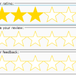 Accessible Star Rating Control Using Radio Buttons
 Accessible Star Rating System In Pure CSS – Starability.css