


The Native HTML Dialog Modal is a progressive enhancement solution that uses the HTML <dialog> element to create fully animated, accessible modal dialogs without JavaScript.
This implementation combines the semantic HTML dialogs with smooth CSS3 animations and the Invoker Command API to deliver a robust modal experience. Works across modern browsers while gracefully degrading for older ones.
Key Features
- Zero JavaScript requirement: Core functionality works entirely through HTML and CSS using the native dialog element and Invoker Command API.
- Smooth CSS animations: Implements modern CSS transition properties, including
allow-discretebehavior for open and close animations. - Progressive enhancement: Includes polyfills for browsers that don’t yet support the Invoker Command API while maintaining full functionality.
- Built-in accessibility: Leverages native dialog focus trapping, screen reader support, and keyboard navigation without additional code.
- Template injection support: Optional JavaScript enhancement allows dynamic content loading through HTML template elements.
- Backdrop blur effects: Modern CSS backdrop filters create professional-looking modal overlays with blur and transparency effects.
How to use it:
1. Create the modal dialog structure using the HTML dialog element with the custom is attribute for enhanced functionality. Notice the commandfor attribute on the buttons points to the id of the dialog. The command attribute tells the browser what action to perform—show-modal or close. This is the Invokers API in action.
<dialog id="contact-modal" class="modal" is="dialog-controller">
  <div class="dialog:contents">
    Dialog Modal Content Here
     <!-- Dynamic content for lazy-loading -->
    <template>
      <iframe width="560" height="315" src="https://www.youtube.com/embed/QsRobvGrY-Q?si=GCdmRRFoagHNHkCX" title="YouTube video player" frameborder="0" allow="accelerometer; autoplay; clipboard-write; encrypted-media; gyroscope; picture-in-picture; web-share" referrerpolicy="strict-origin-when-cross-origin" allowfullscreen></iframe>
    </template>
    Moda Content Here
  </div>
  <button commandfor="contact-modal" class="dialog:close" command="close" aria-label="Close dialog">
    <span>Close</span>
  </button>
</dialog>
2. Create a trigger button that references the modal through the commandfor attribute:
<button commandfor="contact-modal" command="show-modal">Launch</button>
3. The CSS implementation uses CSS custom properties for easy customization and includes modern transition properties for smooth animations:
:root {
  --dialog-translate-offset: 1rem;
  --dialog-translate-enter: 0 var(--dialog-translate-offset);
  --dialog-translate-leave: 0 calc(-1 * var(--dialog-translate-offset));
  --dialog-translate-duration: 0.4s;
  --dialog-gap: 2rem;
  --dialog-content-max-width: 1080px;
  --dialog-content-background-colour: white;
  --dialog-backdrop-colour: rgba(0, 0, 0, 0.5);
}
dialog.modal {
  border: none;
  overflow: initial;
  flex-direction: column;
  opacity: 0;
  translate: var(--dialog-translate-enter);
  background-color: transparent;
  transition-property: overlay, display, translate, opacity;
  transition-duration: var(--dialog-translate-duration);
  transition-timing-function: ease-in-out;
  transition-behavior: allow-discrete;
  margin:0;
  z-index:999;
  min-width: 100%;
  min-height: 100%;
  place-items:center;
  place-content:center;
  *,*::before,*::after, & {box-sizing:border-box}
  &::-webkit-backdrop {
    -webkit-transition-property: overlay, display, opacity;
    transition-property: overlay, display, opacity;
    transition-duration: var(--dialog-translate-duration);
    transition-behavior: allow-discrete;
    -webkit-backdrop-filter: blur(2px);
            backdrop-filter: blur(2px);
    background-color: var(--dialog-backdrop-colour);
    opacity: 0;
  }
  &::backdrop {
    transition-property: overlay, display, opacity;
    transition-duration: var(--dialog-translate-duration);
    transition-behavior: allow-discrete;
    -webkit-backdrop-filter: blur(2px);
            backdrop-filter: blur(2px);
    background-color: var(--dialog-backdrop-colour);
    opacity: 0;
  }
  .dialog\:contents {
    overflow: auto;
    direction: ltr;
    border-radius: 0.6em;
    max-height: 100dvh;
    padding: calc(0.5 * var(--dialog-gap)) var(--dialog-gap);
    background-color: var(--dialog-content-background-colour);
    width:min(100%, var(--dialog-content-max-width));
    -ms-scroll-chaining: none;
        overscroll-behavior: contain;
  }
  &[open] {
    opacity: 1;
    translate: 0 0;
    display:flex;
    @starting-style {
      opacity: 0;
      translate: var(--dialog-translate-leave);
    }
    &::-webkit-backdrop {
      opacity: 1;
      @starting-style {
        opacity: 0;
      }
    }
    &::backdrop, button.dialog\:close {
      opacity: 1;
      @starting-style {
        opacity: 0;
      }
    }
  }
  button.dialog\:close {
    all: unset;
    cursor: pointer;
    -webkit-margin-before: calc(0.5 * var(--dialog-gap));
            margin-block-start: calc(0.5 * var(--dialog-gap));
    place-content: center;
    place-items: center;
    color:white;
    margin-inline:auto;
    transition:opacity 0.3s ease-in-out;
    transition-delay : var(--dialog-translate-duration);
    span { transition:color 0.3s ease-in-out; }
    span:hover { color:#7FCFF3; }
    &::before {
      content: "";
      position: fixed;
      top: 50%;
      left:50%;
      border-radius: 0;
      height: calc(100dvh + var(--dialog-translate-offset));
      width: calc(100dvw + var(--dialog-translate-offset));
      translate: -50% -50%;
      z-index: -1;
      opacity: 0;
    }
  }
  :root:has(&[open]) [data-modal] {
    pointer-events: none;
  }
}
4. For browsers that don’t yet support the Invoker Command API, include the necessary polyfills:
<script src='https://unpkg.com/@ungap/custom-elements'></script>
<script src='https://github.com/keithamus/invokers-polyfill'></script>
5. OPTIONAL. Add the DialogController class definition. This code extends the base HTMLDialogElement with the logic to handle <template> injection.
class DialogController extends HTMLDialogElement {
  // Static WeakMap to track injected nodes per dialog instance
  static #nodeMap = new WeakMap();

  // Private instance properties
  #cleanupTimeout = null;
  #originalShowModal = null;
  /** Parse options from data-options attribute with fallback to empty object */
  get #options() {
    try {
      return JSON.parse(this.dataset.options || "{}");
    } catch {
      return {};
    }
  }
  /** Delay before removing injected content on close (milliseconds) */
  get #closeActionDelay() {
    return this.#options.closeActionDelay ?? 1000;
  }
  /** Whether to remove templates after first use and skip cleanup */
  get #once() {
    return this.#options.once ?? false;
  }
  /**
   * Initialize the dialog controller when connected to DOM
   * Sets up appropriate event handling based on browser capabilities
   */
  connectedCallback() {
    // Always listen for close events
    this.addEventListener("close", this.#handleClose);
    // Check if browser supports native Invoker Command API
    const hasInvokerAPI = 'commandForElement' in HTMLButtonElement.prototype;

    if (hasInvokerAPI) {
      // Modern browsers: use native beforetoggle event
      this.addEventListener("beforetoggle", this.#handleBeforeToggle);
    } else {
      // Fallback for browsers without native support (Safari, older browsers)
      this.#setupInvokerFallback();
    }
  }
  /**
   * Fallback implementation for browsers without native Invoker Command API
   * Manually wires up command buttons and overrides showModal method
   */
  #setupInvokerFallback() {
    const dialogId = this.id;

    // Dialog must have an ID for command targeting to work
    if (!dialogId) {
      console.warn("Dialog needs an ID for invoker fallback");
      return;
    }
    // Override showModal to inject templates when dialog opens
    this.#originalShowModal = this.showModal;
    this.showModal = () => {
      this.#originalShowModal.call(this);
      this.#handleOpen();
    };
    // Find and wire up command buttons for this dialog
    const showButtons = document.querySelectorAll(`button[commandfor="${dialogId}"][command="show-modal"]`);
    const closeButtons = document.querySelectorAll(`button[commandfor="${dialogId}"][command="close"]`);

    // Wire up show buttons to call showModal
    showButtons.forEach(button => {
      button.addEventListener("click", () => this.showModal());
    });
    // Wire up close buttons to call close
    closeButtons.forEach(button => {
      button.addEventListener("click", () => this.close());
    });
  }
  /**
   * Handle dialog opening - find and inject eligible templates
   * Called by fallback showModal override or native beforetoggle event
   */
  #handleOpen() {
    // Find all templates that should be cloned (exclude data-clone="false")
    const templates = this.querySelectorAll('template:not([data-clone="false"])');

    // Inject each eligible template
    templates.forEach(template => this.#injectTemplate(template));
  }
  /**
   * Handle beforetoggle event for browsers with native Invoker Command API
   * Only processes when dialog is opening and event hasn't been cancelled
   */
  #handleBeforeToggle = (event) => {
    // Respect event cancellation
    if (event.defaultPrevented) return;
    // Only process when dialog is opening
    const template = this.querySelector("template");
    if (!template || this.open) return;
    // Inject the template content
    this.#injectTemplate(template);
  };
  /**
   * Clone template content and inject it into the dialog
   * Tracks nodes for cleanup unless in "once" mode
   */
  #injectTemplate(template) {
    // Clone the template content
    const fragment = template.content.cloneNode(true);
    const nodes = [...fragment.childNodes];
    // Track injected nodes for cleanup (unless in "once" mode)
    if (!this.#once) {
      DialogController.#nodeMap.set(this, nodes);
    }
    // Insert the cloned content after the template
    template.after(fragment);
    // Remove template in "once" mode to prevent re-injection
    if (this.#once) {
      template.remove();
    }
  }
  /**
   * Cleanup when element is removed from DOM
   * Immediately removes any injected content and clears timeouts
   */
  disconnectedCallback() {
    // Clear any pending cleanup timeouts
    if (this.#cleanupTimeout) {
      clearTimeout(this.#cleanupTimeout);
      this.#cleanupTimeout = null;
    }

    // Immediately remove any tracked injected nodes
    const nodes = DialogController.#nodeMap.get(this);
    if (nodes) {
      nodes.forEach((node) => node.parentNode?.removeChild(node));
      DialogController.#nodeMap.delete(this);
    }
  }
  /**
   * Handle dialog close event
   * Schedules cleanup of injected content after configurable delay
   */
  #handleClose = (event) => {
    // Respect event cancellation
    if (event.defaultPrevented) return;
    // Skip cleanup in "once" mode since content should remain
    if (this.#once) return;
    // Get tracked nodes for this dialog instance
    const nodes = DialogController.#nodeMap.get(this);
    if (!nodes) return;
    // Schedule delayed cleanup to allow for closing animations
    this.#cleanupTimeout = setTimeout(() => {
      // Remove each injected node from the DOM
      nodes.forEach((node) => node.parentNode?.removeChild(node));

      // Clean up tracking
      DialogController.#nodeMap.delete(this);
      this.#cleanupTimeout = null;
    }, this.#closeActionDelay);
  };
}
// Register the custom element if not already defined
if (!customElements.get("dialog-controller")) {
  customElements.define("dialog-controller", DialogController, {
    extends: "dialog",
  });
}
5. You can also pass options to the controller via a data-options attribute for things like controlling the cleanup delay after closing.
<dialog is="dialog-controller" data-options='{"closeActionDelay": 500, "once": true}'>
  ...
</dialog>
FAQs:
Q: What happens if JavaScript is disabled?
A: The basic modal functionality still works through the Invoker Command API polyfill, but the template injection features require JavaScript. The core open/close behavior and styling remain functional even without JavaScript in supported browsers.
Q: Can I have multiple modals open simultaneously?
A: The native dialog element follows a modal stack approach where only one modal dialog can be active at a time. Opening a new modal while another is open will close the previous one, which is generally the expected behavior for modal interfaces.
Q: How do I handle form submissions within the modal?
A: Form submissions work normally within dialog elements. You can use the method="dialog" attribute on forms to automatically close the modal when submitted, or handle form submission through JavaScript for more complex interactions.
See Also:
 WAI-ARIA Compliant Dialog Box In JavaScript – a11y-dialog
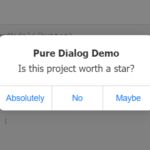 iOS Style Dialog Web Component – pure-dialog
 Create Custom Stylish Dialogs with SnapDialog JavaScript Library
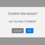 Easily Build Confirmation Popups with the confirmDialog.js Library
 Create Bootstrap 5 Modals Programmatically With JavaScript – bs_dialogs.js
 Moden Modal Window Using Dialog Element and CSS @starting-style
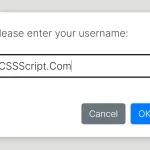 Async, Promise-based Alert/Confirm/Prompt Dialogs – Prompts.js
 Flexible Web-Based Window System Using Window Manager