


A super tiny yet highly customizable emoji picker component written in vanilla JavaScript.
With this component, users can select emoji from a popover attached to the input field you specify.
Note that the Emoji Popover JavaScript library doesn’t include any emoji, which means that you must define your own emoji list during init. See below for more details.
How to use it:
1. Install & import the Emoji Popover component with NPM.
# NPM
$ npm i emoji-popover --save
import EmojiPopover from 'emoji-popover'
import '/node_modules/emoji-popover/dist/style.css'
2. Or include the necessary JavaScript and Stylesheet in the document.
<link rel="stylesheet" href="dist/style.css" />
<script src="dist/emoji-popover.umd.js"></script>
3. Create a button to toggle the emoji picker popover.
<button class="picker">Pick An Emoji</button>
4. Create an input field to display the selected emoji. OPTIONAL.
<input class="emoji-picker" />
5. Initialize the emoji picker and done.
const el = new EmojiPopover({
  button: '.picker',
  targetElement: '.emoji-picker',
  emojiList: [
    {
      value: '🤣',
      label: 'laugh and cry'
    },
    // more emoji here
  ]
})
6. Get the selected emoji.
el.onSelect(l => {
  document.querySelector(".emoji-picker").value+=l
    console.log(value);
})
7. More configuration options.
const el = new EmojiPopover({
  // the emoji picker should be appended to this container
  container: 'body',
  // custom wrapper class
  wrapClassName: '',
  // open/close animation
  wrapAnimationClassName: 'anim-scale-in'
})
8. Toggle the emoji picker popover manually.
el.toggle();
9. Customize the appearance of the emoji picker.
:root {
  --e-color-border: #e1e1e1;
  --e-color-emoji-text: #666;
  --e-color-border-emoji-hover: #e1e1e1;
  --e-color-bg: #fff;
  --e-bg-emoji-hover: #f8f8f8;
  --e-size-emoji-text: 16px;
  --e-width-emoji-img: 20px;
  --e-height-emoji-img: 20px;
  --e-max-width: 288px;
}
See Also:
 Lightweight Emoji Picker with Search – Faceclick
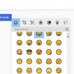 Customizable JavaScript Emoji Picker – vanillaEmojiPicker.js
 Convenient Emoji Picker In Vanilla JavaScript – Picmo
 Tiny Emoji Picker In Pure JavaScript – EmojiButtonList.js
 Emoji Picker With Autocomplete In JavaScript
 Convert Text Emoticons to Emoji – smile2emoji
 Replace Emojis with Crisp SVG Images with Nomoji JS Library
 Fix Broken Emojis with Emoji-Fallback.js Library