


A pure CSS solution to create an animated placeholder and make it behave like a floating label above the input field when focused. Inspired by Gmail’s login input.
How to use it:
1. Add a custom placeholder to your input field as follows:
<div class="input-block">
  <input type="text" name="input-text" id="input-text" required spellcheck="false">
  <span class="placeholder">
    Placeholder
  </span>
</div>
2. The required CSS for the animated placeholder.
div.input-block {
  position: relative;
}
div.input-block input {
  font-size: 1.6rem;
  color: #495055;
  width: 350px;
  padding: 15px 15px;
  border-radius: 1rem;
  border: 2px solid #D9D9D9;
  outline: none;
}
div.input-block span.placeholder {
  position: absolute;
  margin: 17px 0;
  padding: 0 4px;
  color: #6c757d;
  display: flex;
  align-items: center;
  font-size: 1.6rem;
  top: 0;
  left: 17px;
  transition: all 0.2s;
  transform-origin: 0% 0%;
  background: none;
  pointer-events: none;
}
div.input-block input:valid+span.placeholder,
div.input-block input:focus+span.placeholder {
  transform: scale(0.8) translateY(-30px);
  background: #fff;
}
div.input-block input:focus {
  color: #284B63;
  border-color: #284B63;
}
div.input-block input:focus+span.placeholder {
  color: #284B63;
}
See Also:
 Pure CSS Floating Label Pattern For Bootstrap
 Pure CSS Material Design Floating Input Placeholder
 Pure CSS Floating Labels For Input Fields
 Animated Input Labels with Pure CSS/CSS3
 CSS Only Floating Label For Form Fields
 Dynamic SVG Image Placeholders In JavaScript – placeholder.js
 Floating Input Lable With Wave Animation
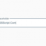 Animated Floating Input Placeholder In Pure CSS
Can you help me to make it work without the ‘required’ in the html?