


A pure CSS/CSS3 solution to create floating placeholder labels for input fields, which based on the concept from Matt D. Smith.
Basic Usage:
Create a label for the input field.
<input type="text" name="first-name" required/>
<label for="first-name">First name</label>
Style the input field and input label.
form input {
  display: block;
  position: absolute;
  -moz-box-sizing: border-box;
  box-sizing: border-box;
  width: 100%;
  border: 0;
  top: 1.2em;
  background: none;
  z-index: 1;
  padding: 1px;
  font-size: 1em;
  font-family: "roboto", Helvetica, Arial;
  letter-spacing: 0.012em;
}
form label {
  font-family: "roboto", Helvetica, Arial;
  display: block;
  position: absolute;
  margin-top: 2px;
  padding: 1px;
  letter-spacing: 0.012em;
  color: #ACACAC;
  font-size: 1em;
  -webkit-animation-name: labelIn;
  animation-name: labelIn;
  -webkit-animation-duration: 0.35s;
  animation-duration: 0.35s;
  -webkit-animation-direction: reverse;
  animation-direction: reverse;
  -webkit-animation-fill-mode: forwards;
  animation-fill-mode: forwards;
  -webkit-animation-timing-function: cubic-bezier(0.77, 0, 0.175, 1);
  animation-timing-function: cubic-bezier(0.77, 0, 0.175, 1);
}
Create the animations for the floating label using CSS3 animations and keyframes.
form input {
  display: block;
  position: absolute;
  -moz-box-sizing: border-box;
  box-sizing: border-box;
  width: 100%;
  border: 0;
  top: 1.2em;
  background: none;
  z-index: 1;
  padding: 1px;
  font-size: 1em;
  font-family: "roboto", Helvetica, Arial;
  letter-spacing: 0.012em;
}
form label {
  font-family: "roboto", Helvetica, Arial;
  display: block;
  position: absolute;
  margin-top: 2px;
  padding: 1px;
  letter-spacing: 0.012em;
  color: #ACACAC;
  font-size: 1em;
  -webkit-animation-name: labelIn;
  animation-name: labelIn;
  -webkit-animation-duration: 0.35s;
  animation-duration: 0.35s;
  -webkit-animation-direction: reverse;
  animation-direction: reverse;
  -webkit-animation-fill-mode: forwards;
  animation-fill-mode: forwards;
  -webkit-animation-timing-function: cubic-bezier(0.77, 0, 0.175, 1);
  animation-timing-function: cubic-bezier(0.77, 0, 0.175, 1);
}
See Also:
 Animated Input Labels with Pure CSS/CSS3
 CSS Only Floating Label For Form Fields
 Gmail Login Inspired Animated Placeholder In CSS
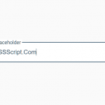 Animated Floating Input Placeholder In Pure CSS
 Create Bootstrap 4 Form Controls With Floating Labels
 Pure CSS Floating Label Pattern For Bootstrap
 Pure JavaScript Float Label Pattern For Form Fields – float-labels.js
 Float Label Pattern Implemented In JavaScript – Floatl