


icheck-material is a CSS/CSS3 library that lets you beautify & animate the regular checkboxes and radio buttons with Material Design styles.
See also:
How to use it:
Install the icheck-material package.
# NPM
$ npm install icheck-material --save
Import the icheck-material.
import './icheck-material.min.css';
<link href="icheck-material.css" rel="stylesheet" type="text/css">
Create Material Design styled checkboxes & radio buttons:
<div class="icheck-material-red">
  <input type="checkbox" checked id="red" />
  <label for="red">red</label>
</div>
<div class="icheck-material-red">
  <input type="radio" id="red1" name="red" />
  <label for="red1">red 1</label>
</div>
<div class="icheck-material-red">
  <input type="radio" checked id="red2" name="red" />
  <label for="red2">red 2</label>
</div>
To make the checkboxes & radio buttons inline, just add the class ‘icheck-inline’ to the parent container.
<div class="icheck-material-red icheck-inline">
  <input type="checkbox" checked id="red" />
  <label for="red">red</label>
</div>
<div class="icheck-material-red icheck-inline">
  <input type="radio" id="red1" name="red" />
  <label for="red1">red 1</label>
</div>
<div class="icheck-material-red icheck-inline">
  <input type="radio" checked id="red2" name="red" />
  <label for="red2">red 2</label>
</div>
Changelog:
v1.0.1 (09/22/2019)
- Fixed Issue: Checkbox is not checked when click on the “background area”
See Also:
 Material & iOS Style Checkbox & Radio Inputs With Pure CSS
 Material Design Inspired Custom Html Inputs with CSS & Javascript
 Material Design Inspired Check & Radio Click Effects with CSS3
 Custom Checkboxes And Radio Buttons For Bulma Framework
 Create Stunning Checkboxes And Radio Buttons With Magic-Input CSS Library
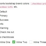 Pretty Checkbox & Radio Inputs with Bootstrap and awesome-bootstrap-checkbox.css
 Convert Checkboxes & Radio Buttons Into Grouped Buttons – boxed-check.css
 Custom Checkboxes, Radio Buttons, Switches In Pure CSS