


toggle-checkbox-radio is a CSS library to create customizable, scalable checkboxes, radio buttons, and toggle switches using pure CSS.
How to use it:
1. Download the package and insert the main stylesheet toggle-checkbox-radio.min.css from the dist folder.
<link href="/path/to/dist/toggle-checkbox-radio.min.css" rel="stylesheet" />
2. Create custom Checkboxes, Radio Buttons, Switches. Possible themes:
- Primary
- Secondary
- Info
- Warning
- Danger
- Light
- Dark
<!-- Checkbox -->
<label><input type="checkbox" class="checkbox color-primary" checked /> Primary</label>
<label><input type="checkbox" class="checkbox color-secondary" checked /> Secondary</label>
<label><input type="checkbox" class="checkbox color-info" /> Info</label>
<label><input type="checkbox" class="checkbox color-warning" /> Warning</label>
<label><input type="checkbox" class="checkbox color-danger" checked /> Danger</label>
<label><input type="checkbox" class="checkbox color-light" checked /> Light</label>
<label><input type="checkbox" class="checkbox color-dark" /> Dark</label>
<label><input type="checkbox" class="checkbox color-primary" disabled checked /> Primary checked disabled</label>
<label><input type="checkbox" class="checkbox color-secondary" disabled /> Secondary disabled</label>
<!-- Radio Button -->
<label><input name="radio1" type="radio" class="radio color-primary" /> Primary</label>
<label><input name="radio1" type="radio" class="radio color-secondary" /> Secondary</label>
<label><input name="radio1" type="radio" class="radio color-info" /> Info</label>
<label><input name="radio1" type="radio" class="radio color-warning" /> Warning</label>
<label><input name="radio1" type="radio" class="radio color-danger" /> Danger</label>
<label><input name="radio1" type="radio" class="radio color-light" /> Light</label>
<label><input name="radio1" type="radio" class="radio color-dark" /> Dark</label>
<label><input name="radio1" type="radio" class="radio color-info" disabled checked /> Info checked disabled</label>
<label><input name="radio1" type="radio" class="radio color-secondary" disabled /> Secondary disabled</label>
<!-- Switches -->
<label><input type="checkbox" class="toggle color-primary" /> Primary</label>
<label><input type="checkbox" class="toggle color-secondary" /> Secondary</label>
<label><input type="checkbox" class="toggle color-info" checked /> Info</label>
<label><input type="checkbox" class="toggle color-warning" checked /> Warning</label>
<label><input name="radio2" type="radio" class="toggle color-danger" /> Danger</label>
<label><input name="radio2" type="radio" class="toggle color-light" /> Light</label>
<label><input name="radio2" type="radio" class="toggle color-dark" /> Dark</label>
<label><input name="radio2" type="radio" class="toggle color-warning" disabled checked /> Warning checked disabled</label>
<label><input name="radio2" type="radio" class="toggle color-secondary" disabled /> Secondary disabled</label>
3. Apply the Outline style.
<input type="checkbox" class="checkbox color-primary is-outline" checked /> Primary
4. Apply the Material style.
<input type="checkbox" class="checkbox color-primary is-material" checked /> Primary</label>
5. Determine the size with the following CSS classes.
- is-large: large
- is-small: small
<input type="checkbox" class="checkbox color-primary is-large" checked /> Primary</label>
<input type="checkbox" class="checkbox color-primary is-small" checked /> Primary</label>
6. Enable animations.
<input type="checkbox" class="checkbox color-primary has-animation" checked /> Default nimation</label>
See Also:
 Create Stunning Checkboxes And Radio Buttons With Magic-Input CSS Library
 CSS/CSS3 Only Custom Checkboxes, Radios And Switches – el-checkbox
 CSS Only Interactive Toggle Switches – toggle-switch.css
 Custom Checkboxes And Radio Buttons For Bulma Framework
 CSS Switch Control Extension For Bulma Framework
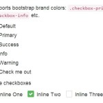 Pretty Checkbox & Radio Inputs with Bootstrap and awesome-bootstrap-checkbox.css
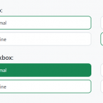 Convert Checkboxes & Radio Buttons Into Grouped Buttons – boxed-check.css
 CSS Only Switch Style Checkboxes