


| Author: | pglejzer |
|---|---|
| Views Total: | 8,403 views |
| Official Page: | Go to website |
| Last Update: | July 25, 2025 |
| License: | MIT |
Preview:

Description:
A JavaScript library to create a customizable, beautiful, mobile-friendly time picker component inspired by Google Material design system.
It provides a clean, modern UI for time input that works across vanilla JS and popular frameworks like React, Angular and Vue.js.
Features:
- 9 Built-in Themes: Material, Crane, Dark, Glassmorphic, Cyberpunk, AI, and additional theme variations.
- TypeScript Support: Full type definitions with IntelliSense integration for improved development experience.
- Inline Mode Functionality: Always-visible timepicker without modal overlay for embedded use cases.
- API Methods: Rich method library and event system for programmatic control.
- Accessibility Compliance: ARIA-compliant implementation with keyboard navigation support.
- Server-Side Rendering Compatible: Works with Next.js, Nuxt, and other SSR frameworks without hydration issues.
- Lightweight Bundle: Minimal footprint with tree-shaking support for optimized production builds.
How to use it:
1. Install the timepicker-ui package with NPM.
# Yarn
$ yarn add timepicker-ui
# NPM
$ npm i timepicker-ui --save
2. Import it into your project.
import { TimepickerUI } from "timepicker-ui";
import "timepicker-ui/main.css"; // Don't forget the main CSS
// Browser & CDN <link href="https://cdn.jsdelivr.net/npm/[email protected]/dist/css/index.min.css" rel="stylesheet"> <script type="module"> import { TimepickerUI } from "https://cdn.jsdelivr.net/npm/[email protected]/+esm"; </script>
3. The library requires box-sizing: border-box; to be set globally. Most CSS resets or frameworks already do this, but if you’re not using one, add this to your main stylesheet to prevent layout issues.
*,
*::before,
*::after {
  box-sizing: border-box;
}
4. Insert a time input into the document.
<div class="example">
  <input class="timepicker-ui-input" value="12:00 AM" />
</div>
5. Initialize the time picker.
const element = document.querySelector('.timepicker-ui-input');
const myTimePicker = new TimepickerUI(element);
6. Activate the time picker on the time input. That’s it.
myTimePicker.create();
7. Enable the Mobile layout.
const myTimePicker = new TimepickerUI(element,{
      mobile: true
});
8. Display a switch button inside the time picker that allows the user to switch between Desktop and Mobile layouts.
const myTimePicker = new TimepickerUI(element,{
      enableSwitchIcon: true
});
9. Set the theme you prefer.
- basic: The default theme, based on Google’s standard Material Design.
- crane-straight: A theme inspired by Google’s Crane design system, featuring straight edges.
- crane-radius: Also based on the Crane design system, but with rounded corners for a softer look.
- m3: A theme that implements the newer Material Design 3 (also known as Material You) style.
- dark: A classic dark mode theme, ideal for low-light interfaces or matching dark application shells.
- glassmorphic: A modern theme that applies a frosted-glass effect to the timepicker background.
- pastel: A theme with soft, muted pastel colors for a lighter, more subtle UI.
- ai: A futuristic theme with a design inspired by artificial intelligence aesthetics.
- cyberpunk: A high-contrast, neon-style theme reminiscent of the cyberpunk genre.
const myTimePicker = new TimepickerUI(element,{
      theme: 'crane-radius'
});
10. All available configuration options.
/**
* @description Set custom text to AM label
* @default "AM"
*/
amLabel?: string;
/**
* @description Turn on/off animations on picker on start/close
* @default true
*/
animation?: boolean;
/**
* @description Set default selector to append timepicker inside it. Timepicker default append to `body`
* @default ""
*/
appendModalSelector?: string;
/**
* @description Turn on/off backdrop
* @default true
*/
backdrop?: boolean;
/**
* @description Set custom text to cancel button
* @default "CANCEL"
*/
cancelLabel?: string;
/**
* @description Edit hour/minutes on the web mode.
* @default false
*/
editable?: boolean;
/**
* @description Turn on/off scroll if timepicker is open
* @default false
*/
enableScrollbar?: boolean;
/**
* @description Turn on/off icon to switch desktop/mobile
* @default false
*/
enableSwitchIcon?: boolean;
/**
* @description Set custom text to time label on mobile version
* @default "Enter Time"
*/
mobileTimeLabel?: string;
/**
* @description Turn on/off focus to input after close modal
* @default false
*/
focusInputAfterCloseModal?: boolean;
/**
* @description Set custom text to hour label on mobile version
* @default "Hour"
*/
hourMobileLabel?: string;
/**
* @description Set default template to switch desktop.This options is using by default material design icon
* @default "<i class='material-icons timepicker-ui-keyboard-icon'> keyboard </i>"
*/
iconTemplate?: string;
/**
* @description Set default template to switch mobile. This options is using by default material design icon
* @default "<i class='material-icons timepicker-ui-keyboard-icon'> schedule </i>"
*/
iconTemplateMobile?: string;
/**
* @description Set increment hour by `1`, `2`, `3` hour
* @default 1
*/
incrementHours?: number;
/**
* @description Set increment minutes by `1`, `5`, `10`, `15` minutes
* @default 1
*/
incrementMinutes?: number;
/**
* @description set custom text to minute label on mobile version
* @default "Minute"
*/
minuteMobileLabel?: string;
/**
* @description Turn on/off mobile version
* @default false
*/
mobile?: boolean;
/**
* @description Set custom text to ok label
* @default "OK"
*/
okLabel?: string;
/**
* @description Set custom text to pm label
* @default "PM"
*/
pmLabel?: string;
/**
* @description Set custom text to time label on desktop version
* @default "Select Time"
*/
timeLabel?: string;
/**
* @description Turn on/off switch to minutes by select hour
* @default true
*/
switchToMinutesAfterSelectHour?: boolean;
/**
* @description Set theme to timepicker. Available options: `basic`, `crane-straight`, `crane-radius`, `m3`.
* The offical version of Material Design 3 is still not avaialbe for the WEB version.Theme `m3` has been added
* based on the design what you can find [here](https://m3.material.io/components/time-pickers/overview).
* If new version M3 will be released this design will get improve.
* @default "basic"
*/
theme?:
| 'basic'
| 'crane-straight'
| 'crane-radius'
| 'm3'
| 'dark'
| 'glassmorphic'
| 'pastel'
| 'ai'
| 'cyberpunk';
/**
* @description Set type of clock, it contains 2 versions: `12h` and `24h`.
* @default false
*/
clockType?: '12h' | '24h';
/**
* @description - The `hours` and `minutes` are arrays which accept strings and numbers to block select hours/minutes.
* - The `interval` key allow only string with interval values i.e., if you have 24h clockType the string can be 03:00 - 15:00, 01:20 - 05:15, 02:03 - 06:55 etc.. On the other hand if you have 12h clockType the string can be i.e 01:30 PM - 6:30 PM, 02:00 AM - 10:00 AM, 02:30 AM - 10:30 PM. It is important to remember that first hour in the interval option should be less that the second value if you want to block values from AM to PM and if you are using interval with 24h clockType.
* - If the interval key is set, the hours/minutes keys are `ignored`.
* @example
disabledTime: {
minutes: [1,2,4,5,55,23,"22","38"],
hours: [1,"3","5", 8],
interval: "10:00 AM - 12:00 PM",
}
* @default undefined
*/
disabledTime?: {
minutes?: Array<string | number>;
hours?: Array<string | number>;
interval?: string;
};
/**
* @description Set current time to the input and timepicker.\
* If this options is set to `true` it's gonna update picker with toLocaleTimeString() and input with value based on your location.
* This option also allows to put object with properties.
* @example
currentTime: {
time: new Date(),
updateInput: true,
locales: "en-US",
preventClockType: false
};
* @example currentTime: true
* @default undefined
*/
currentTime?:
| {
/**
* The `time` key allows to put any valid date to update picker.
* @requires
* If the `updateInput` is set to `false/undefined` and the default value from the input not exist, the `time` key value will be displayed in the picker.
*
* If the `updateInput` is set to `false/undefined` but the default value from the input exist, the `time` key will be ignored.
*/
time?: Date;
/**
* The `updateInput` key is set to `true` it's going update input value with set time key.
*/
updateInput?: boolean;
/**
* The `locales` key can change language from `toLocaleTimeString()`.
*/
locales?: string | string[];
/**
* The `preventClockType` key if is set to `true` it's `force` the clockType option to set value "12h" or "24h" based on your location
* with current time and `locales` key value is ignored.
*/
preventClockType?: boolean;
}
| boolean;
/**
* @description Set focus trap to the modal element to all elements with tabindex in the picker
* @default true
*/
focusTrap?: boolean;
/**
* @description Set delay to clickable elements like button "OK", "CANCEL" etc. The value has to be set in milliseconds.
* @default 300
*/
delayHandler?: number;
/**
* @description Custom ID for the timepicker instance. Useful for identifying specific instances when using multiple timepickers.
* If not provided, a random UUID will be generated.
* @example id: "my-timepicker-1"
* @default undefined
*/
id?: string;
/**
* @description Enable inline mode for always-visible timepicker
* If enabled is true, containerId must be provided and the timepicker will be rendered inside the specified container instead of as a modal.
* The timepicker will not open on input click and will be always visible.
* @example
* inline: {
* enabled: true,
* containerId: "timepicker-container",
* showButtons: false,
* autoUpdate: true
* }
* @default undefined
*/
inline?: {
/**
* @description Enable or disable inline mode
*/
enabled: boolean;
/**
* @description ID of the container element where the timepicker should be rendered (required when enabled is true)
*/
containerId: string;
/**
* @description Show or hide OK/CANCEL buttons in inline mode
* @default false
*/
showButtons?: boolean;
/**
* @description Automatically update input value when time changes (real-time updates)
* @default true
*/
autoUpdate?: boolean;
};
/**
* @description Add additional custom CSS class to the timepicker wrapper element. The default 'timepicker-ui' class is always added.
* This allows multiple timepickers on the same page to have additional custom classes for styling or targeting.
* @example cssClass: "my-custom-timepicker"
* @default undefined
*/
cssClass?: string;
/**
* @description Callback triggered when the timepicker opens
* @example onOpen: (data) => console.log('Picker opened!', data)
*/
onOpen?: TimepickerEventCallback;
/**
* @description Callback triggered when user cancels the timepicker
* @example onCancel: (data) => console.log('Cancelled', data)
*/
onCancel?: TimepickerEventCallback;
/**
* @description Callback triggered when user confirms the time selection (clicks OK)
* @example onConfirm: (data) => console.log('Time confirmed', data)
*/
onConfirm?: TimepickerEventCallback;
/**
* @description Callback triggered during interaction with the clock (real-time updates)
* @example onUpdate: (data) => console.log('Time updated', data)
*/
onUpdate?: TimepickerEventCallback;
/**
* @description Callback triggered when hour selection mode is activated
* @example onSelectHour: (data) => console.log('Hour mode selected', data)
*/
onSelectHour?: TimepickerEventCallback;
/**
* @description Callback triggered when minute selection mode is activated
* @example onSelectMinute: (data) => console.log('Minute mode selected', data)
*/
onSelectMinute?: TimepickerEventCallback;
/**
* @description Callback triggered when AM is selected
* @example onSelectAM: (data) => console.log('AM selected', data)
*/
onSelectAM?: TimepickerEventCallback;
/**
* @description Callback triggered when PM is selected
* @example onSelectPM: (data) => console.log('PM selected', data)
*/
onSelectPM?: TimepickerEventCallback;
/**
* @description Callback triggered when invalid time format is detected in input
* @example onError: (data) => console.log('Invalid format:', data.error)
*/
onError?: TimepickerEventCallback;
12. More API methods
// create the timepicker
myTimePicker.create();
// open the timepicker
myTimePicker.open();
// close the timepicker
myTimePicker.close();
// destroy
myTimePicker.destroy();
// get the current value
myTimePicker.getValue();
// set time
myTimePicker.setValue("18:30");
// Get the DOM element
myTimePicker.getElement();
// update options
myTimePicker.update({ options: newOptions });
13. Event handlers.
myTimePicker.addEventListener('timepicker:open', (event) => console.log(event.detail));
myTimePicker.addEventListener('timepicker:cancel', (event) => console.log(event.detail));
myTimePicker.addEventListener('timepicker:confirm', (event) => console.log(event.detail));
myTimePicker.addEventListener('timepicker:update', (event) => console.log(event.detail));
myTimePicker.addEventListener('timepicker:select-minute', (event) => console.log(event.detail));
myTimePicker.addEventListener('timepicker:select-hour', (event) => console.log(event.detail));
myTimePicker.addEventListener('timepicker:select-am', (event) => console.log(event.detail));
myTimePicker.addEventListener('timepicker:select-pm', (event) => console.log(event.detail));
myTimePicker.addEventListener('timepicker:error', (event) => console.log(event.detail));
Changelog:
v3.0.0/1 (07/25/2025)
- Inline Mode: Always-visible timepicker without modal overlay
- Instance Management: getById(), destroyAll(), and custom instance IDs
- Callback System: Direct callback functions instead of manual event listeners
- New Themes: Added dark, glassmorphic, pastel, ai, cyberpunk
- Enhanced API: getValue(), setValue(), improved destroy()
- SSR Compatibility: Better support for server-side rendering
- TypeScript Improvements: Complete type definitions and better IntelliSense
- Event Names: All events now use timepicker: prefix
- Destroy Behavior: .destroy() no longer removes input from DOM
- Theme Options: Some theme names have changed
- API Changes: Some method signatures have been updated
- Styles are no longer auto-loaded You must now explicitly import CSS files.
v2.6.1 (11/18/2021)
- Added new value to the property theme called m3. Theme m3 based on the new Material Design v3.
v2.6.0 (11/17/2021)
- changed invoke of close() method. These method has to invoke with double parentheses close()(). The first parentheses doesn’t have any parameters, the second has the same what had in the previous method.
- added delayHandler prop to avoid delay on buttons
- fixed problem with 0NaN error when using touch input.
v2.5.0 (05/07/2021)
- fixed problem with focusTrap with React about eval error
v2.4.4 (04/02/2021)
- fixed problem with focusTrap with React about eval error
v2.4.3 (04/02/2021)
- fixed problem with minutes option in currentTime
- added focusTrap to turn off/on focus traping on picker. The default value is set to true
- added possibility to open picker by click enter if input is focused
v2.4.2 (03/30/2021)
- fixed problem with currentTime about displaying the wrong hour in the picker
- fixed problem with editable option when switch during desktop/mobile options
- added OptionTypes to allows to import types from package
v2.4.1 (03/26/2021)
- added new currentTime option
- fixed landscape on the mobile view
v2.4.0 (03/23/2021)
- added new update method
- added new destroy method
- added new option disabledTime that allows to set to timepicker disabled time
- updated a methods open, close with new parameters and callbacks
v2.3.0 (03/06/2021)
- bugfixes
- changed option name from
selectLabelTimetolabelTime - added UMD version
- added new options
mobileTimeLabelto change time label on mobile version
v2.1.1 (01/24/2021)
- fix problem with transition and add new version 2.1.1
v2.0.2 (01/21/2021)
- fix problem with close event
v2.0.1 (01/18/2021)
- Everything was rewritten to TypeScript.
- Fixed problems with move events on mobile.
- Fixed problem with keyboard icon click on mobile.
11/05/2020
- v1.2.0
See Also:
 Material Inspired Date & Time Picker – simplePicker
 Material Design Date Time Picker In Vanilla JavaScript
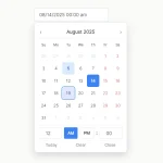 Accessible Customizable Date/Time/Date Picker for Modern Web App – FDatepicker
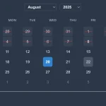 Powerful, Customizable JavaScript Date Picker – Datelite
 Material Design 3 Date Picker with Vanilla JS & Bootstrap 5
 Lightweight Material Design 3 CSS Framework – GMX.css
 Easy Datetime & Date Range Pickers in Vanilla JavaScript
 Simple Interactive Snackbar & Toast Notification In Vanilla JavaScript – notifyjs
it doesn’t work in a simple vanilla website, i tried to use timepicker-ui.js without success. It seems that the plugin is not really vanilla javascript because it can only work with obese framework like nodes etc.
I added the UMD version since 2.3.0 version and this package also is available in the cdnjs https://cdnjs.com/libraries/timepicker-ui which you can use this library without installation.