


A feature-rich dialog popup JavaScript library for creating modal windows & alert boxes with cool CSS3 animations.
Key Features:
- Responsive design.
- Works perfectly on both desktop and mobile.
- 9 CSS3 powered transition effects.
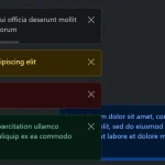
- 4 pre-builtin themes (types).
- Auto dismisses just like a toast notification.
How to use it:
1. Get started by adding the following JavaScript and CSS files to the page.
<link rel="stylesheet" href="easy-modal.min.css" />
<script src="easy-modal.min.js"></script>
2. Create a new modal window or alert box as follows:
var modalBox = new SimplyModal({
    title: "Modal Box",
    content: "Modal Description"
});
var alertBox = new SimplyModal({
    title: "Alert Box",
    content: "Alert Description",
    type: "alert"
});
3. Open the modal window or alert box.
modalBox.open();
alertBox.open();
4. Apply a CSS3 animation to the popup box. All possible animations:
- ‘fadein’
- ‘slideRight’
- ‘slideBottom’
- ‘fall’
- ‘flid3d’
- ‘flid3dVertical’
- ‘scale’
- ‘folding’
- ‘rotateLeft’
var modalBox = new SimplyModal({
    title: "Modal Box",
    content: "Modal Description",
    className: 'flid3dVertical'
});
5. Determine the type of the popup box. All possible types:
- ‘error’
- ‘info’
- ‘warn’
- ‘succes’
var modalBox = new SimplyModal({
    title: "Modal Box",
    content: "Modal Description",
    modalTypeClass: 'warn'
});
6. More configuration options:
var modalBox = new SimplyModal({
    // auto open on page load
    autoOpen: false,
    // shows close button
    closeButton: true,
    closeText: 'X'

    // max/min width
    maxWidth: '',
    minWidth: '',
    // shows background overlay
    overlay: true,
    overlayClass: 'easy-modal-overlay',
    // auto dimisses after a timeout
    setTimeOut: false,

});
See Also:
 Advanced Alert Notification System For Bootstrap 5 – AvalynxAlert.js
 Create Dynamic Draggable Alert/Confirm Popups – webcimes-modal
 Customizable Alert/Confirm Modal Library – modal-alert.js
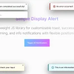 Lightweight JavaScript Notification System – Simple Display Alert
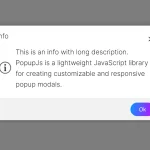 Minimal Alert & Confirmation Modals in JavaScript – PopupJs.js
 Sleek Toast & Growl Alert Notification Library – Nostfly.js
 Create Custom Stylish Dialogs with SnapDialog JavaScript Library
 Create iOS-Style Popups & Notifications With Popup JS Library