


A robust and versatile JavaScript notification library that helps you add custom, animated, toast-style notifications to your websites or web applications.
The library offers six different notification types: success, info, warning, danger, dark, and light. You can also control whether notifications are stacked or displayed one at a time and whether they should automatically dismiss after a certain amount of time.
In addition, you can easily control the position of your notifications, allowing you to display them in any corner of the screen.
How to use it:
1. Download and import the nolert-notify.
# NPM
$ npm i @nolert/notify
import "@nolert/notify/dist/style.min.css";
import notify from "@nolert/notify";
// OR
<script src="./dist/script.min.js"></script>
2. Show a default notification message on the page.
NolertNotify.trigger({
  message: "A Basic Notification"
});
3. Set the notification type: “info” | “success” | “warning” | “danger” | “dark” | “light”.
NolertNotify.trigger({
  message: "A Basic Notification",
  type: "dark",
});
4. Determine the position of the notifications: “top” | “bottom” | “top-left” | “top-right” | “bottom-left” | “bottom-right”.
NolertNotify.trigger({
  message: "A Basic Notification",
  position: "bottom-right",
});
5. Determine whether to show icons inside the notifications.
NolertNotify.trigger({
  message: "A Basic Notification",
  iconType: "danger", // "info" | "success" | "warning" | "danger"
  noIcon: false,
});
6. Determine whether to auto-dismiss the notifications after a timeout.
NolertNotify.trigger({
  message: "A Basic Notification",
  autoClose: true,
  closeIn: 3000,
  closeButton: true,
});
7. You can also config the notifications globally:
notify.setConfig({
  // "solo" | "stack"
  display: "stack",
  // custom CSS styles
  cssOverrides: {
    borderRadius:"4px",
    zIndex:100
  },
  // "info" | "success" | "warning" | "danger" | "dark" | "light"
  type: "info",
  // "top" | "bottom" | "top-left" | "top-right" | "bottom-left" | "bottom-right"
  position: "top",
  // true | false
  autoClose: true,
  // true | false
  closeButton: true,
  // in ms
  closeIn: 3000,
  // "info" | "success" | "warning" | "danger"
  iconType: "info",
  // show icon or not
  noIcon: false,

});
See Also:
 Framework-Agnostic Toast Notifications with TypeScript – NotifyX
 Advanced Toast/Tooltip/Popover/Confirm/Modal Notification Library – toast-anchor
 Developer-Friendly Toast Alerts in JavaScript – Toast-JS
 Modern Toast Popup JavaScript Library – EggyJS
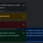 Advanced Alert Notification System For Bootstrap 5 – AvalynxAlert.js
 SVG Gooey Toast Notification Library – Physics Toast
 Modern JavaScript Toast Notification & Modal Popup Library – JSPT
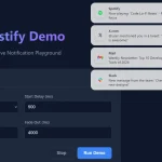 Lightweight Toast & Growl Notifications Inspired by macOS – Toastify