


A Javascript & CSS/CSS3 based range replacement created by thebabydino to create a pretty range slider with gradient bar, glowing effect and metal handler.
How to use it:
Load the necessary modernizr.js in your document.
<script src="modernizr.js"></script>
Create a normal range input as follow.
<input type='range' min='0' value='30' max='100'>
The required CSS/CSS3 styles.
input[type='range'] {
  box-sizing: border-box;
  overflow: visible;
  position: absolute;
  -webkit-appearance: none;
  top: 50%;
  left: 50%;
  width: 20em;
  height: 1.25em;
  padding: 0 0.5em;
  border-radius: 0.625em;
  transform: translate(-50%, -50%);
  box-shadow: inset 0 -1px 1px #9daabb, inset 0 1px 0.125em #0f1110;
  background: linear-gradient(to right top, #474747, #202020);
  /* Firefox & Chrome/ Opera need this,
     otherwise font-size is smaller */
  font-size: 1em;
  cursor: pointer;
  /* wish I could style this asshole */
}
input[type='range']::-webkit-slider-runnable-track {
  -webkit-appearance: none;
  z-index: -1;
  /* fix Firefox WTF */
  border: none;
  /* because IE */
  height: 2px;
  /* because IE & Chrome/ Opera */
  border-radius: 1px;
  transform: translateY(-1px);
  box-shadow: 0 2px #111;
  background: #4c4c4c;
}
.js input[type='range']::-webkit-slider-runnable-track {
  /* only Firefox & Chrome/ Opera */
  background-image: linear-gradient(90deg, #ffff00, #ff1493);
  background-repeat: no-repeat;
  background-size: 75% 100%;
}
input[type='range']::-webkit-slider-thumb {
  -webkit-appearance: none;
  margin-top: -.5em;
  /* weird shit, Chrome */
  z-index: 1;
  border: none;
  width: 1.25em;
  height: 1.25em;
  border-radius: 50%;
  background: linear-gradient(-45deg, #777777, rgba(119, 119, 119, 0) 65%) 100% 0, linear-gradient(45deg, #777777, rgba(119, 119, 119, 0) 65%), linear-gradient(-135deg, #777777, rgba(119, 119, 119, 0) 65%) 100% 100%, linear-gradient(135deg, #777777, rgba(119, 119, 119, 0) 65%) 0 100%, linear-gradient(-45deg, rgba(119, 119, 119, 0) 35%, #777777) 100% 0, linear-gradient(45deg, rgba(119, 119, 119, 0) 35%, #777777), linear-gradient(-135deg, rgba(119, 119, 119, 0) 35%, #777777) 100% 100%, linear-gradient(135deg, rgba(119, 119, 119, 0) 35%, #777777) 0 100% #ddd;
  background-repeat: no-repeat;
  background-size: 50% 50%;
  background-size: 56% 56%;
  /* fix Chrome/ Opera */
}
input[type='range']::-moz-range-track {
  z-index: -1;
  /* fix Firefox WTF */
  border: none;
  /* because IE */
  height: 2px;
  /* because IE & Chrome/ Opera */
  border-radius: 1px;
  transform: translateY(-1px);
  box-shadow: 0 2px #111;
  background: #4c4c4c;
}
.js input[type='range']::-moz-range-track {
  /* only Firefox & Chrome/ Opera */
  background-image: linear-gradient(90deg, #ffff00, #ff1493);
  background-repeat: no-repeat;
  background-size: 75% 100%;
}
input[type='range']::-moz-range-thumb {
  z-index: 1;
  border: none;
  width: 1.25em;
  height: 1.25em;
  border-radius: 50%;
  background: linear-gradient(-45deg, #777777, rgba(119, 119, 119, 0) 65%) 100% 0, linear-gradient(45deg, #777777, rgba(119, 119, 119, 0) 65%), linear-gradient(-135deg, #777777, rgba(119, 119, 119, 0) 65%) 100% 100%, linear-gradient(135deg, #777777, rgba(119, 119, 119, 0) 65%) 0 100%, linear-gradient(-45deg, rgba(119, 119, 119, 0) 35%, #777777) 100% 0, linear-gradient(45deg, rgba(119, 119, 119, 0) 35%, #777777), linear-gradient(-135deg, rgba(119, 119, 119, 0) 35%, #777777) 100% 100%, linear-gradient(135deg, rgba(119, 119, 119, 0) 35%, #777777) 0 100% #ddd;
  background-repeat: no-repeat;
  background-size: 50% 50%;
  /* Firefox-only, it won't work in IE
     and it's messed up in Chrome */
  cursor: ew-resize;
}
input[type='range']::-ms-track {
  z-index: -1;
  /* fix Firefox WTF */
  border: none;
  /* because IE */
  height: 2px;
  /* because IE & Chrome/ Opera */
  border-radius: 1px;
  transform: translateY(-1px);
  box-shadow: 0 2px #111;
  background: #4c4c4c;
  color: transparent;
}
input[type='range']::-ms-thumb {
  z-index: 1;
  border: none;
  width: 1.25em;
  height: 1.25em;
  border-radius: 50%;
  background: linear-gradient(-45deg, #777777, rgba(119, 119, 119, 0) 65%) 100% 0, linear-gradient(45deg, #777777, rgba(119, 119, 119, 0) 65%), linear-gradient(-135deg, #777777, rgba(119, 119, 119, 0) 65%) 100% 100%, linear-gradient(135deg, #777777, rgba(119, 119, 119, 0) 65%) 0 100%, linear-gradient(-45deg, rgba(119, 119, 119, 0) 35%, #777777) 100% 0, linear-gradient(45deg, rgba(119, 119, 119, 0) 35%, #777777), linear-gradient(-135deg, rgba(119, 119, 119, 0) 35%, #777777) 100% 100%, linear-gradient(135deg, rgba(119, 119, 119, 0) 35%, #777777) 0 100% #ddd;
  background-repeat: no-repeat;
  background-size: 50% 50%;
}
input[type='range']::-ms-fill-lower {
  background: linear-gradient(90deg, #ffff00, #ff1493);
}
input[type='range']::-ms-fill-upper {
  background: transparent;
}
input[type='range']::-ms-tooltip {
  display: none;
}
input[type='range']:focus {
  outline: none;
  box-shadow: inset 0 -1px 1px #9daabb, inset 0 1px 0.125em #0f1110, 0 0 1em cyan;
}
.js input[type='range']:focus /deep/ #thumb:before {
  box-shadow: inset 0 -1px 1px #9daabb, inset 0 1px 0.125em #0f1110, 0 0 1em cyan;
}
.js input[type='range'] /deep/ #thumb:before {
  position: absolute;
  left: 100%;
  margin-left: 1.5em;
  padding: 0 0.5em;
  width: 3em;
  height: 1.66667em;
  border-radius: 0.83333em;
  box-shadow: inset 0 -1px 1px #9daabb, inset 0 1px 0.125em #0f1110;
  background: linear-gradient(to right top, #474747, #202020);
  font: 0.75em / 1.66667em verdana, sans-serif;
  text-align: right;
  content: "75%";
}
The JavaScript to enable the pretty range slider.
var s = document.createElement('style'),
    r = document.querySelector('[type=range]');
document.body.appendChild(s);
/* IE doesn't need the JS part & this won't work in IE anyway ;) */
r.addEventListener('input', function() {
  var val = this.value + '% 100%';

  s.textContent =
    '.js input[type=range]::-webkit-slider-runnable-track{background-size:' + val + '}' +
    '.js input[type=range]::-moz-range-track{background-size:' + val + '}';
  s.textContent += '.js input[type=range] /deep/ #thumb:before{content:"' + this.value + '%"}'
}, false);
See Also:
 Responsive & Touch-enabled Range Slider In Vanilla JavaScript – rangeSlider
 Accesible Range Slider Custom Element
 Build Custom Circular Range Sliders with CircularRange Web Component
 Accessible Dual-Handle Range Slider Library – range-slider.js
 Accessible Dual-Thumb Range Slider for Web & Mobile – DoubleRange
 Modern Range Sliders Based On Native Range Inputs – dual-range-input
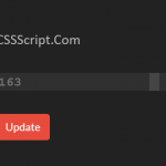 Highly Customizable Range Slider In JavaScript – Slider89.js
 Interactive Range Slider with Tooltip Using Pure CSS