


Yet another pure CSS responsive table solution that transforms a normal html table into several separated tables in mobile view.
How to use it:
Use the data-label attribute to specify the header for each table cell.
<td data-label="First Name">Bob</td>
<td data-label="Last Name">Smith</td>
<td data-label="School">Northeastern University</td>
<td data-label="Major">Computer Science</td>
The core CSS styles for the responsive table view.
/*Mobile View*/
@media only screen and  (max-width: 760px) {
td, tr { display: block; }
/* Hide table headers (but not display: none;, for accessibility) */
thead tr {
  position: absolute;
  top: -9999px;
  left: -9999px;
}
tr { border: 1px solid #E74C3C; }
tr + tr { margin-top: 1.5em; }
td {
  /* make like a "row" */
  border: none;
  border-bottom: 1px solid #eee;
  position: relative;
  padding-left: 50%;
  background-color: #F8D9D5;
  text-align: left;
}
td:before {
  content: attr(data-label);
  display: inline-block;
  line-height: 1.5;
  margin-left: -100%;
  width: 100%;
  white-space: nowrap;
}
}
See Also:
 Make Bootstrap 5 Tables More Readable On Mobile Devices – AvalynxTable.js
 Tiny Responsive Table Web Component – table-saw
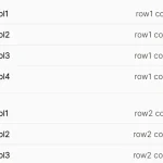 Pure CSS Responsive Solution – fluid-table.css
 Responsive Table Extension For Bulma Framework
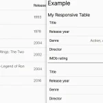 Responsive Accessible Table In Pure CSS
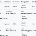 Collapse Overflowing Table Columns Into A Dropdown – Podtablejs
 Responsive Table For Bootstrap 5 Framework
 Add Scroll Shadows To Wide HTML Tables – TableScrollShadow
I wonder if this method still workable if one of my table column is a select tag or checkbox?
this is simple and direct but how to convert it to support RTL pages?
thank you :-)
Your website could use less ad and more content.?