


A pure CSS solution to create responsive, accessible, mobile-friendly HTML tables that look great on all devices.
This solution features a unique approach to mobile optimization, collapsing each table row into its own section with the column heading on the left and the value on the right. What’s more, the behavior of the table through a screen reader remains the same as it would on desktop devices, thanks to the role assigned to each element. This ensures that users with disabilities can easily navigate your table without sacrificing the mobile-friendly layout.
How to use it:
1. Add the CSS class ‘responsive-table’ to the HTML table.
<table class="responsive-table" role="table">
  ...
</table>
2. Add the CSS class ‘responsive-table__heading’ to the cells.
<table class="responsive-table" role="table">
  <caption>My top 6 favourite movies</caption>
  <thead role="rowgroup">
    <tr role="row">
      <th role="columnheader" scope="col">Title</th>
      <th role="columnheader" scope="col">Release year</th>
      <th role="columnheader" scope="col">Genre</th>
      <th role="columnheader" scope="col">Director</th>
      <th role="columnheader" scope="col">IMDb rating</th>
    </tr>
  </thead>
  <tbody>
    <tr role="row">
      <td role="cell"><span class="responsive-table__heading" aria-hidden="true">Title</span>Jurassic Park</td>
      <td role="cell"><span class="responsive-table__heading" aria-hidden="true">Release year</span>1993</td>
      <td role="cell"><span class="responsive-table__heading" aria-hidden="true">Genre</span>Action, Adventure, Sci-Fi</td>
      <td role="cell"><span class="responsive-table__heading" aria-hidden="true">Director</span>Steven Spielberg</td>
      <td role="cell"><span class="responsive-table__heading" aria-hidden="true">IMDb rating</span>8.1 out of 10</td>
    </tr>
    <tr role="row">
      <td role="cell"><span class="responsive-table__heading" aria-hidden="true">Title</span>Halloween</td>
      <td role="cell"><span class="responsive-table__heading" aria-hidden="true">Release year</span>1978</td>
      <td role="cell"><span class="responsive-table__heading" aria-hidden="true">Genre</span>Horror</td>
      <td role="cell"><span class="responsive-table__heading" aria-hidden="true">Director</span>John Carpenter</td>
      <td role="cell"><span class="responsive-table__heading" aria-hidden="true">IMDb rating</span>7.8 out of 10</td>
    </tr>
    <tr role="row">
      <td role="cell"><span class="responsive-table__heading" aria-hidden="true">Title</span>Saw</td>
      <td role="cell"><span class="responsive-table__heading" aria-hidden="true">Release year</span>2004</td>
      <td role="cell"><span class="responsive-table__heading" aria-hidden="true">Genre</span>Horror</td>
      <td role="cell"><span class="responsive-table__heading" aria-hidden="true">Director</span>James Wan</td>
      <td role="cell"><span class="responsive-table__heading" aria-hidden="true">IMDb rating</span>7.6 out of 10</td>
    </tr>
    <tr role="row">
      <td role="cell"><span class="responsive-table__heading" aria-hidden="true">Title</span>The Lord of the Rings: The Two Towers</td>
      <td role="cell"><span class="responsive-table__heading" aria-hidden="true">Release year</span>2002</td>
      <td role="cell"><span class="responsive-table__heading" aria-hidden="true">Genre</span>Adventure</td>
      <td role="cell"><span class="responsive-table__heading" aria-hidden="true">Director</span>Peter Jackson</td>
      <td role="cell"><span class="responsive-table__heading" aria-hidden="true">IMDb rating</span>8.7 out of 10</td>
    </tr>
    <tr role="row">
      <td role="cell"><span class="responsive-table__heading" aria-hidden="true">Title</span>Anchorman: The Legend of Ron Burgundy</td>
      <td role="cell"><span class="responsive-table__heading" aria-hidden="true">Release year</span>2004</td>
      <td role="cell"><span class="responsive-table__heading" aria-hidden="true">Genre</span>Comedy</td>
      <td role="cell"><span class="responsive-table__heading" aria-hidden="true">Director</span>Adam McKay</td>
      <td role="cell"><span class="responsive-table__heading" aria-hidden="true">IMDb rating</span>7.2 out of 10</td>
    </tr>
    <tr role="row">
      <td role="cell"><span class="responsive-table__heading" aria-hidden="true">Title</span>Train to Busan</td>
      <td role="cell"><span class="responsive-table__heading" aria-hidden="true">Release year</span>2016</td>
      <td role="cell"><span class="responsive-table__heading" aria-hidden="true">Genre</span>Horror</td>
      <td role="cell"><span class="responsive-table__heading" aria-hidden="true">Director</span>Sang-ho Yeonn</td>
      <td role="cell"><span class="responsive-table__heading" aria-hidden="true">IMDb rating</span>7.6 out of 10</td>
    </tr>
  </tbody>
</table>
3. Add the following CSS snippets into your document.
/* Responsive table styling */
.responsive-table {
  margin-bottom: 0;
  width: 100%;
}
thead {
  border: 0;
  clip: rect(0 0 0 0);
  -webkit-clip-path: inset(50%);
  clip-path: inset(50%);
  height: 1px;
  margin: 0;
  overflow: hidden;
  padding: 0;
  position: absolute;
  white-space: nowrap;
  width: 1px;
}
tbody tr {
  display: block;
  margin-bottom: 1.5em;
  padding: 0 0.5em;
}
tbody tr td {
  display: block; /* browsers that don't support flex */
  display: flex;
  justify-content: space-between;
  min-width: 1px;
  text-align: right;
}
@media all and (-ms-high-contrast: none) { /* IE11 flex fix */
  tbody tr td {
    display: block;
  }
}
.responsive-table__heading {
  font-weight: 700;
  padding-right: 1em;
  text-align: left;
  word-break: initial;
}
@media (max-width: 768px) {
  tbody tr td {
    padding-right: 0;
  }
  tbody tr td:last-child {
    border-bottom: 0;
  }
  tbody tr {
    border-bottom: 3px solid grey;
  }
}
@media (min-width: 769px) {
  thead {
    clip: auto;
    -webkit-clip-path: none;
    clip-path: none;
    display: table-header-group;
    height: auto;
    overflow: auto;
    position: relative;
    width: auto;
  }

  tbody tr {
    display: table-row;
  }

  tbody tr td {
    display: table-cell;
    text-align: left;
  }

  .responsive-table__heading {
    display: none;
  }
}
See Also:
 Make Bootstrap 5 Tables More Readable On Mobile Devices – AvalynxTable.js
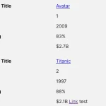 Tiny Responsive Table Web Component – table-saw
 Pure CSS Responsive Solution – fluid-table.css
 Responsive Table Extension For Bulma Framework
 Collapse Overflowing Table Columns Into A Dropdown – Podtablejs
 Responsive Table For Bootstrap 5 Framework
 Add Scroll Shadows To Wide HTML Tables – TableScrollShadow
 Convert HTML Table To Card View On Mobile Using JavaScript