


Yet another CSS only responsive table solution to converts the normal wide HTML table into grouped blocks on mobile.
How to use it:
Add the ‘data-label’ attribute to the table headers as follows:
<table class="responsive">
  <thead>
    <tr>
      <th>#</th>
      <th>code</th>
      <th>name</th>
      <th>actions</th>
    </tr>
  </thead>
  <tbody>
    <tr>
      <td data-label="#">1</td>
      <td data-label="code">101</td>
      <td data-label="name">john doe</td>
      <td data-label="actions"><ul class="actions">
          <li> <a href="#">view</a> </li>
          <li> <a href="#">edit</a> </li>
          <li> <a href="#">delete</a> </li>
        </ul></td>
    </tr>
    <tr>
      <td data-label="#">2</td>
      <td data-label="code">102</td>
      <td data-label="name">jane doe</td>
      <td data-label="actions"><ul class="actions">
          <li> <a href="#">view</a> </li>
          <li> <a href="#">edit</a> </li>
          <li> <a href="#">delete</a> </li>
        </ul></td>
    </tr>
    <tr>
      <td data-label="#">3</td>
      <td data-label="code">103</td>
      <td data-label="name">anonymous other</td>
      <td data-label="actions"><ul class="actions">
          <li> <a href="#">view</a> </li>
          <li> <a href="#">edit</a> </li>
          <li> <a href="#">delete</a> </li>
        </ul></td>
    </tr>
  </tbody>
</table>
Then insert the responsive-table.css in the document’s head section. Done.
<link rel="stylesheet" href="styles/responsive-table.css">
See Also:
 Make Bootstrap 5 Tables More Readable On Mobile Devices – AvalynxTable.js
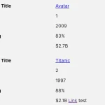 Tiny Responsive Table Web Component – table-saw
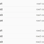 Pure CSS Responsive Solution – fluid-table.css
 Responsive Table Extension For Bulma Framework
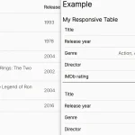 Responsive Accessible Table In Pure CSS
 Collapse Overflowing Table Columns Into A Dropdown – Podtablejs
 Responsive Table For Bootstrap 5 Framework
 Add Scroll Shadows To Wide HTML Tables – TableScrollShadow