


A simple, responsive, mobile-friendly sliding navigation system for both desktop and mobile. Built using pure HTML/CSS.
How to use it:
Create a header navigation for your webpage & webapp.
<header class="header">
  <nav>
    <ul>
      <li><a href="#">Link 1</a></li>
      <li><a href="#">Link 2</a></li>
      <li><a href="#">Link 3</a></li>
      <li><a href="#">Link 4</a></li>
      <li><a href="#">Link 5</a></li>
    </ul>
  </nav>
</header>
Create a menu toggle bar that will appear on mobile devices.
<input type="checkbox" class="toggle-nav" id="toggle-nav">
<div class="mobile-bar">
  <label for="toggle-nav"></label>
</div>
Style the modal menu toggle bar.
.toggle-nav { display: none; }
.mobile-bar {
  z-index: 5;
  position: relative;
  height: 60px;
  background-color: #E53935;
  -webkit-box-shadow: 0px 1px 5px rgba(0,0,0,0.3);
  box-shadow: 0px 1px 5px rgba(0,0,0,0.3);
}
.mobile-bar label {
  position: absolute;
  top: 0;
  left: 10px;
  width: 60px;
  height: 60px;
  text-align: center;
  cursor: pointer;
  -webkit-transition: -webkit-transform 500ms ease;
  transition: -webkit-transform 500ms ease;
  transition: transform 500ms ease;
  transition: transform 500ms ease, -webkit-transform 500ms ease;
}
.mobile-bar label:after {
  content: "\2630";
  font-size: 2em;
  color: #eee;
  line-height: 60px;
  -webkit-backface-visibility: hidden;
  backface-visibility: hidden;
  -webkit-transition: 500ms ease;
  transition: 500ms ease;
}
.toggle-nav:checked ~ .container { /* when the checkbox is checked the container slide-down */
  -webkit-transform: translateY(270px);
  transform: translateY(270px);
  -webkit-transform: translate3d(0, 270px, 0);
  transform: translate3d(0, 270px, 0);
}
.toggle-nav:checked + .mobile-bar label {
  -webkit-transform: rotate(180deg);
  transform: rotate(180deg);
}
.toggle-nav:checked + .mobile-bar label:after { color: black; }
Style the header navigation.
.header { background-color: #E53935; }
.header ul {
  font-size: 1.2em;
  font-weight: 100;
  text-align: center;
  text-transform: uppercase;
}
.header a {
  display: block;
  padding: 15px;
  border-bottom: 1px solid #eee;
  color: #eee;
  -webkit-transition: background-color 300ms;
  transition: background-color 300ms;
}
.header a:active { background-color: #D32F2F; }
Make it fully responsive.
/** Viewport >= 730px **/
@media (min-width: 730px) {
.mobile-bar { display: none; }
.toggle-nav:checked ~ .container {
  -webkit-transform: translateY(0);
  transform: translateY(0);
}
.header ul { font-size: 1.1em; }
.header li,  .header a { display: inline-block; }
.header li { margin-right: -6px; /* fix the inline-block margin gap */ }
.header a {
  padding: 10px 45px;
  border-bottom: none;
}
.header a:hover { background-color: #D32F2F; }
}
See Also:
 Responsive Dropdown/Off-canvas Navigation In Vanilla JavaScript – Menue
 Responsive Mobile Menu Using CSS Flexbox – ftwnav
 Flexible Mobile Hamburger Navigation With 4 Styles – Kin Menu
 Responsive CSS Only Header Navigation – Luxbar
 Multi-level Toggle Responsive Navigation Menu using Pure CSS
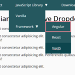 WCAG Compliant Responsive Dropdown Navigation – accessible-menu
 Accessible Dropdown Nav With Vanilla JavaScript – Clicky Menus
 Responsive Accessible Dropdown Menu Template with Vanilla JavaScript