


A pure CSS implementation of a cool tabs component with a fancy 3D cube flip animation based on CSS3 3D transforms.
How to use it:
Create tabbed navigation and content as follows.
<div class="perspective">
  <label class="tab" for="tab-one">Tab 1</label>
  <label class="tab" for="tab-two">Tab 2</label>
  <label class="tab" for="tab-three">Tab 3</label>
  <input type="radio" name="tabs" id="tab-one">
  <input type="radio" name="tabs" id="tab-two">
  <input type="radio" name="tabs" id="tab-three">
  <div class="cube">
    <div class="tab-content">
      <h1>Tab 1</h1>
      <p>THIS IS AWESOME</p>
    </div>
     <div class="tab-content">
      <h1>Tab 2</h1>
      <p>THIS IS COOL</p>
    </div>
    <div class="tab-content">
      <h1>Tab 3</h1>
      <p>THIS IS SWEET</p>
    </div>
  </div>
</div>
Style the tabbed interface.
.perspective {
  -webkit-perspective: 76em;
  perspective: 76em;
  -webkit-perspective-origin: 50% 50px;
  perspective-origin: 50% 50px;
  width: 494px;
  margin: 0 auto;
  color: #fff;
  text-align: center;
}
input { display: none; }
.tab {
  position: absolute;
  width: 80px;
  height: 70px;
  background: pink;
  right: 0;
  line-height: 70px;
  font-weight: 300;
}
.tab:nth-child(1) {
  top: -5px;
  background: #06D6A0;
}
.tab:nth-child(2) {
  top: 69px;
  background: #1B9AAA;
}
.tab:nth-child(3) {
  top: 143px;
  background: #EF476F;
}
.cube {
  position: relative;
  margin: 60px auto 0;
  width: 300px;
  height: 200px;
  -webkit-transform-origin: 0 100px;
  -ms-transform-origin: 0 100px;
  transform-origin: 0 100px;
  -webkit-transform-style: preserve-3d;
  transform-style: preserve-3d;
  -webkit-transition: -webkit-transform 0.5s ease-in;
  transition: transform 0.5s ease-in;
}
.tab-content {
  width: 300px;
  height: 200px;
  position: absolute;
}
.tab-content h1 {
  font-size: 25px;
  margin: 75px 0 10px;
  font-weight: 300;
}
.tab-content p { font-size: 12px; }
.tab-content:nth-child(2) {
  -webkit-transform: translateZ(100px);
  transform: translateZ(100px);
  background: #1B9AAA;
}
.tab-content:nth-child(1) {
  -webkit-transform: rotateX(-270deg) translateY(-100px);
  transform: rotateX(-270deg) translateY(-100px);
  -webkit-transform-origin: top left;
  -ms-transform-origin: top left;
  transform-origin: top left;
  background: #06D6A0;
}
.tab-content:nth-child(3) {
  -webkit-transform: rotateX(-90deg) translateY(100px);
  transform: rotateX(-90deg) translateY(100px);
  -webkit-transform-origin: bottom center;
  -ms-transform-origin: bottom center;
  transform-origin: bottom center;
  background: #EF476F;
}
Active the tabbed interface using radio button hack.
#tab-one:checked ~ .cube {
  -webkit-transform: rotateX(-90deg);
  transform: rotateX(-90deg);
}
#tab-two:checked ~ .cube {
  -webkit-transform: rotateX(0deg);
  transform: rotateX(0deg);
}
#tab-three:checked ~ .cube {
  -webkit-transform: rotateX(90deg);
  transform: rotateX(90deg);
}
See Also:
 CSS-Only Inverted Corner Tabs With Anchor Positioning
 Animated Tabs Component In Pure CSS – Tabsy CSS
 Convert Sectioned Contents Into Tabs – tinytabs
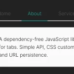 Lightweight Pure JavaScript Tabs With URL Persistence – Tabzy.js
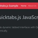 Dynamic External Content Tabs with Quicktabs.js
 Create Accessible Tabs with Pure CSS and Semantic HTML
 Accessible Tabs Component – tab-container
 Simple Fast Vanilla JavaScript Tabs