


Just another pure CSS implementation of the text typing animation using pseudo elements and CSS3 animations. Also can be used as a text rotator with a character typing effect.
How to use it:
Wrap your text into span elements following the structure like this:
<p class="demo">
  <span class="demo-item"><span class="demo-item_inner">CSS3</span></span>
  <span class="demo-item"><span class="demo-item_inner">JavaScript</span></span>
  <span class="demo-item"><span class="demo-item_inner">HTML5</span></span>
</p>
The core CSS / CSS3 styles.
.demo,
.demo-item {
  height: 80px;
}
.demo {
  overflow: hidden;
  background-color: #2a2a28;
  color: #fff;
}
.demo-item {
  position: relative;
  font-size: 1.5em;
  padding-top: .75em;
  animation: animatetotop 6s steps(3) infinite;
}
.demo-item_inner,
.demo-item-overlay {
  display: inline-block;
}
.demo-item_inner {
  position: relative;
  line-height: 1;
}
.demo-item_inner:after {
  content: "";
  position: absolute;
  top:-1px;right:0;bottom:-2px;left:0;
  border-left: 1px solid #fff;
  background-color: #2a2a28;
  animation: animatetoright 1s steps(10) infinite alternate;
}
Create the text typing & rotating animations in the CSS.
@keyframes animatetoright {
  0% {
    left: 0;
    margin-right: auto;
  }
  100% {
    left: 100%;
    margin-left: .6em;
    margin-right: -.6em;
  }
}
@keyframes animatetotop {
  0% {
    top: 0;
  }
  100% {
    top: -240px;
  }
}
See Also:
 Advanced Typewriter Animation Library – TypeFX.js
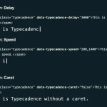 Natural Typing Animations In JavaScript – Typecadence
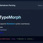 Text Typing Animations with Real-time Markdown/HTML Rendering – TypeMorph
 Create Scroll-Triggered Letter Animations – AniLet.js
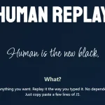 Create Realistic Typing Animations With Human Replay
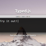 Highly Configurable Text Typing Library – typed.js
 Create Smooth Looping Typewriter Effects with Typewriter.js
 Easy Text Typing and Deleting JavaScript Library – TextScript.js