


Searchable is an ultra-lightweight vanilla JavaScript library that adds real-time search functionality to HTML tables.
You just include the script, add a class to your table, and it works.
Features:
- Tiny footprint: 1.46KB minified (824 bytes gzipped) means no bundle bloat.
- Auto-initialization: Add
class="searchable"and the search button appears automatically. - Real-time filtering: Filters table rows as you type with case-insensitive matching.
- Zero dependencies: Pure vanilla JavaScript with no external libraries required.
- Dynamic content support: Works with JavaScript-generated tables and DOM updates.
- Multi-language support: Ships with 29 language translations for placeholder and empty state text.
- Modern CSS requirements: Uses CSS
:has()pseudo-class (Chrome 105+, Firefox 121+, Safari 15.4+). - Customizable UI: Configure button position, icons, placeholder text, and input styling per table or globally.
How To Use It:
1. Download the Searchable package and load the following JS & CSS files in the document.
<link rel="stylesheet" href="./dist/searchable.min.css" />
<script src="./dist/searchable.min.js"></script>
<!-- Or from a CDN -->
<link href="https://cdn.jsdelivr.net/gh/tofsjonas/searchable@latest/dist/searchable.min.css" rel="stylesheet" />
<script src="https://cdn.jsdelivr.net/gh/tofsjonas/searchable@latest/dist/searchable.min.js"></script>
2. The library includes translations for 29 languages. To use a specific language, include the files from the language-specific folder. Here’s an example using French:
Supported language codes:
ar,cs,da,de,el,en,es,fi,fr,he,hi,hu,id,it,ja,ko,nl,no,pl,pt,ro,ru,sv,th,tr,uk,vi,zh.
<link href="/dist/fr/searchable.css" rel="stylesheet" />
<script src="/dist/fr/searchable.min.js"></script>
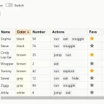
3. Add class="searchable" to any table that has proper <thead> and <tbody> structure. The search button appears in the top-right corner of the table automatically. Click it to show the search input field. Type to filter rows in real time.
<table class="searchable">
  <thead>
    ...
  </thead>
  <tbody>
    ...
  </tbody>
</table>
4. Control whether the search button appears on the left or right side:
<table class="searchable sb-left"></table> <!-- left side -->
<table class="searchable"></table> <!-- right side (default) -->
5. Override the icon for all searchable tables with CSS:
<table class="searchable" data-sb-icon="🔍"></table>
<table class="searchable" data-sb-icon="Search"></table>
6. Override the icon for all searchable tables with CSS:
.searchable::before {
  content: 'FIND' !important;
}
7. Add custom CSS classes to the search input for 3rd-party framework integration.
<!-- Bootstrap -->
<table class="searchable" data-sb-input-class="form-control"></table>
<!-- Or throught JS -->
<script
  data-sb-input-class="form-control bg-light"
  src="/dist/searchable.min.js">
</script>
8. Set a default placeholder for all tables:
<table class="searchable" data-sb-placeholder="Filter products..."></table>
<!-- Or through JS -->
<script
  data-sb-placeholder="Type to search"
  src="/dist/searchable.min.js">
</script>
9. Override the empty state message with CSS:
<table class="searchable" data-sb-empty="No matches found"></table>
/* Global *
.searchable thead::after {
  content: 'No results match your search' !important;
}
10. Here’s a table configured with multiple custom options:
<table
  class="searchable sb-left"
  data-sb-icon="FIND"
  data-sb-placeholder="Search products..."
  data-sb-input-class="custom-input"
  data-sb-empty="No products found">
  <thead>
    <tr>
      <th>Name</th>
      <th>SKU</th>
      <th>Stock</th>
    </tr>
  </thead>
  <tbody>
    <tr>
      <td>Widget Pro</td>
      <td>WGT-001</td>
      <td>45</td>
    </tr>
    <tr>
      <td>Gadget Max</td>
      <td>GDG-002</td>
      <td>12</td>
    </tr>
  </tbody>
</table>
FAQs:
Q: Does this work with tables that get updated after page load?
A: Yes. The library monitors for new table cells and updates their search attributes automatically. When you add rows dynamically via JavaScript, the search functionality picks them up on the next search input event. The async attribute-setting process handles this behind the scenes.
Q: Can I use this with Bootstrap or Tailwind CSS classes?
A: Yes. Use the data-sb-input-class attribute to add framework classes to the search input. For example: data-sb-input-class="form-control" for Bootstrap or data-sb-input-class="px-4 py-2 border rounded" for Tailwind. You can also style the input with your own CSS targeting .searchable thead input.
Q: What browsers are supported?
A: Searchable requires CSS :has() support. This means Chrome 105+, Firefox 121+, and Safari 15.4+. Older browsers won’t work because the library depends on this CSS feature for performance. Check [caniuse.com/css-has](https://caniuse.com/css-has) for current browser compatibility.
Related Resources:
Changelog:
v0.2.0 (04/14/2026)
- The search icon can now be positioned inside the table using CSS
v0.1.1 (11/17/2025)
- bugfix: data-sb-input-class works
See Also:
 Add Sortable and Filterable Functionalities to HTML Tables with the Action Table Web Component
 Filter Table Data Using Form Controls – SV-Filtable
 Easy Table Pager & Filter In JavaScript – ECJSTable
 Generate A Filterable Data Table From JSON – ModernTable
 Minimal Table Filtering In JavaScript – TableFilter.js
 Dynamic Sortable Filterable Data Table In Pure JavaScript – simpleTable
 Create Pagination And Filter For HTML Table – Ligne PaginateJs
 Generate Customizable Heat Maps For Date-based Activities – Heat.js