


A minimal clean responsive navigation system that transforms the regular navbar into a toggleable dropdown menu when the screen size reaches a breakpoint specified in the CSS media queries.
How to use it:
1. Create the HTML for the responsive navbar.
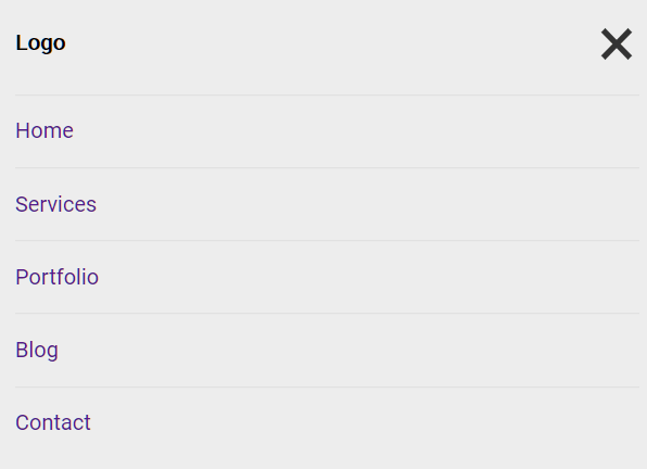
<div class="nav-wrap">
  <div id="logo">
    Logo
  </div>
  <div id="nav-icon"></div>
  <div id="top-nav">
    <ul class="menu">
      <li><a href="#">Home</a></li>
      <li><a href="#">Services</a></li>
      <li><a href="#">Portfolio</a></li>
      <li><a href="#">Blog</a></li>
      <li><a href="#">Contact</a></li>
    </ul>
  </div>
</div>
2. The basic CSS styles for the navbar.
.nav-wrap {
  background: rgba(0,0,0,.05);
  max-width: 1200px;
  margin: 0 auto;
  padding: 20px;
  display: flex;
  justify-content: space-between;
  flex-wrap: wrap;
}
#logo {
  font-weight: bold;
  line-height: 33px;
}
ul.menu {
  margin: 0;
  padding: 0;
  list-style: none;
  line-height: 33px;
}
ul.menu li {
  display: inline-block;
  margin: 0 10px;
}
ul.menu a {text-decoration: none;}
#nav-icon {
  display: none;
  cursor: pointer;
  width: 34px;
  height: 34px;
}
#nav-icon {
  background-image: url("menu-ham-black.svg");
  background-repeat: no-repeat;
  background-size: cover;
}
#nav-icon:hover {
  /*background-image: url("menu-ham-red.svg");*/
}
3. Collapse the navbar into a vertical dropdown menu. Feel free to override the breakpoint as per your needs.
@media screen and (max-width: 728px) {
  #nav-icon {
    display: block;
  }
  #nav-icon.menu-close {
    background-image: url("menu-close-black.svg");
  }
  #top-nav {
    flex-basis: 100%;
    margin-top: 20px;
    display: none;
    /*background: rgba(0,0,0,.1);*/
  }
  #top-nav.nav-active {
    display: block;
  }
  ul.menu li {
    display: block;
    margin: 0 0;
    border-top: 1px solid rgba(0,0,0,.05);
  }
  ul.menu a {
    display: block;
    padding: 10px 0;
  }
  ul.menu a:hover {
    color: red;
  }
}
4. Enable the hamburger button to toggle the dropdown menu on mobile devices.
let menuIcon = document.getElementById('nav-icon'); // div#nav-icon [hamburger and close icon, svg]
let topNav = document.getElementById('top-nav');
// when hamburger icon is clicked
menuIcon.addEventListener('click', function(){
  // div#top-nav add class .nav-active
  topNav.classList.toggle('nav-active');
  // change menu icon from menu-ham-black to menu-close-black.svg (in CSS background)
  menuIcon.classList.toggle('menu-close');
});
See Also:
 WCAG Compliant Responsive Dropdown Navigation – accessible-menu
 Accessible Dropdown Nav With Vanilla JavaScript – Clicky Menus
 Responsive Accessible Dropdown Menu Template with Vanilla JavaScript
 Modern One Page Scroll Web Template with Responsive Nav
 Responsive Dropdown/Off-canvas Navigation In Vanilla JavaScript – Menue
 Responsive Sliding Hamburge Menu System
 Responsive Sticky Mega Menu – SnazzyMenu.js
 Responsive Dropdown Mega Menu In JavaScript