


Table-Fluid is a super tiny (less than 1kb) JavaScript-powered responsive table solution that can make your HTML more readable in mobile view.
It detects screen width using CSS media queries and transforms your wide HTML table into a two-column table on small screens.
See Also:
How to use it:
1. Add the stylesheet table-fluid.css to the head of the document.
<link rel="stylesheet" href="dist/css/table-fluid.css" />
2. Add the table-fluid.js script to the end of the document.
<script src="dist/js/table-fluid.js"></script>
3. Attach the Table-Fluid function to your HTML table and done.
<table class="table-fluid">
  <thead>
  <tr>
    <th>№</th>
    <th>Organization</th>
    <th>ASN</th>
    <th>Name</th>
    <th>Port</th>
  </tr>
  </thead>
  <tbody>
    ...
  </tbody>
</table>window.tableFluid('.table-fluid');Changelog:
v1.2.3 (03/20/2021)
- Added CSS Variables Support
v1.2.0 (03/12/2021)
- Update
v1.2.0 (03/12/2021)
- Added CSS Variables Support
v1.1.5 (03/10/2021)
- Update
v1.1.3 (03/09/2021)
- Added variable $table-row-gap-mobile.
See Also:
 Make Bootstrap 5 Tables More Readable On Mobile Devices – AvalynxTable.js
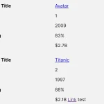 Tiny Responsive Table Web Component – table-saw
 Pure CSS Responsive Solution – fluid-table.css
 Responsive Table Extension For Bulma Framework
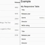 Responsive Accessible Table In Pure CSS
 Collapse Overflowing Table Columns Into A Dropdown – Podtablejs
 Responsive Table For Bootstrap 5 Framework
 Add Scroll Shadows To Wide HTML Tables – TableScrollShadow