


jTabs is a bare bones, responsive JavaScript tabs component which allows switching between tabbed panels in an easy way. The component also has the ability to convert the normal tabs into a vertical accordion interface on small screens.
How it works:
- take DOM-container as parameter
- search tabs and sections
- and switch them
How to use it:
Link to the core JavaScript file as this:
<script src="jtabs/jtabs.js"></script>
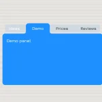
The basic html structure for the tabs and tabbed sections.
<main class="tabs-js">
  <div class="tabs-buttons">
    <button class="tabs-buttons__btn  tabs-buttons__btn--active  btn-js">Tab 1</button>
    <button class="tabs-buttons__btn  btn-js">Tab 2</button>
    <button class="tabs-buttons__btn  btn-js">Tab 3</button>
  </div>
  <div class="tabs-sections">
    <div class="tabs-sections__section  tabs-sections__section--active  tab-js  tab-active-js">
      <p>Section 1</p>
    </div>
    <div class="tabs-sections__section  tab-js">
      <p>Section 2</p>
    </div>
    <div class="tabs-sections__section  tab-js">
      <p>Section 3</p>
    </div>
  </div>
</main>
Call the function jTabs and done. Reuired parameter: container. Additional parameters: activeBtnClass, activeTabClass.
jTabs('.tabs-js', 'tabs-buttons__btn--active', 'tab-active-js');Style the tabs component using you own CSS styles.
.tab-js { display: none; }
.tab-active-js { display: block; }
.tabs-header {
  font-size: 25px;
  text-align: center;
  margin: 3rem auto;
}
.centering-layer {
  width: 100%;
  max-width: 800px;
  margin: 2rem auto;
}
.tabs-buttons { font-size: 14px; }
.tabs-buttons__btn {
  display: block;
  width: 100%;
  text-decoration: none;
  font-weight: bold;
  border: 2px solid #4EC6DE;
  border-bottom-width: 0;
  color: #333;
  background-color: #fff;
  outline: none;
  padding: 12px 20px;
  cursor: pointer;
  transition: background-color .3s;
}
.tabs-buttons__btn:hover, .tabs-buttons__btn--active {
  color: #fff;
  background-color: #4EC6DE;
}
.tabs-sections {
  padding: 10px 20px;
  border: 2px solid #4EC6DE;
}
Make it responsive and more user-friendly on small screen devices.
@media screen and (min-width: 640px) {
.tabs-buttons { font-size: 0; }
.tabs-buttons__btn {
  width: auto;
  display: inline-block;
  font-size: 14px;
}
.tabs-buttons__btn:not(:last-child) { margin-right: 5px; }
}
See Also:
 CSS-Only Inverted Corner Tabs With Anchor Positioning
 Animated Tabs Component In Pure CSS – Tabsy CSS
 Convert Sectioned Contents Into Tabs – tinytabs
 Lightweight Pure JavaScript Tabs With URL Persistence – Tabzy.js
 Dynamic External Content Tabs with Quicktabs.js
 Create Accessible Tabs with Pure CSS and Semantic HTML
 Accessible Tabs Component – tab-container
 Simple Fast Vanilla JavaScript Tabs