


Slackie.css is a pure CSS implementation of a responsive, mobile-friendly site navigation inspired from Slack.com.
How to use it:
Include the Slackie.css in the head section of the html document.
<link href="dist/slackie.css" rel="stylesheet">
Include the Font Awesome 4 for menu toggle icons (Optional).
<link rel="stylesheet" href="font-awesome.min.css">
Create a desktop navigation like this:
<nav role="navigation" class="desktop-slackie">
  <a href="#" class="logo">
      Brand
  </a>
  <a href="#" class="slackie-action-btn">
      Action Button
  </a>
  <a href="#mobile-nav" class="mobile-nav-trigger icon">
      <i class="fa fa-plus"></i>
  </a>
  <ul>
      <li><a href="#">Home</a></li>
      <li><a href="#">About</a></li>
      <li><a href="#">Contact</a></li>
  </ul>
</nav>
Create a mobile navigation like this:
<nav role="navigation" id="mobile-nav" class="mobile-slackie">
  <a href="##" class="logo">Brand</a>
  <a href="#close" class="close-slackie-mobile">
    <i class="fa fa-close"></i>
  </a>
  <ul>
  <li><a href="##">Home</a></li>
  <li><a href="##">About</a></li>
  <li><a href="##">Contact</a></li>
  </ul>
  <a href="##" class="slackie-action-btn">
  Action Button
  </a>
</nav>
That’s it.
See Also:
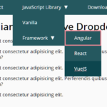 WCAG Compliant Responsive Dropdown Navigation – accessible-menu
 Accessible Dropdown Nav With Vanilla JavaScript – Clicky Menus
 Responsive Accessible Dropdown Menu Template with Vanilla JavaScript
 Modern One Page Scroll Web Template with Responsive Nav
 Responsive Dropdown/Off-canvas Navigation In Vanilla JavaScript – Menue
 Responsive Sliding Hamburge Menu System
 Responsive Sticky Mega Menu – SnazzyMenu.js
 Responsive Dropdown Mega Menu In JavaScript