


Toastry is a lightweight, zero‑dependency JavaScript library that creates Sonner‑style stacked toast notifications.
It supports default, success, error, warning, info, and loading states, plus swipe dismissal, action buttons, promise feedback, and global stack limits.
Features:
- Stacks multiple messages in a compact card pile that expands on hover.
- Supports default, success, error, warning, info, and loading notification states.
- Dismisses messages through swipe gestures, close buttons, or JavaScript calls.
- Tracks promise states from loading through success or error feedback.
- Renders optional descriptions, custom icon images, and action buttons.
- Supports top-right, top-left, bottom-right, and bottom-left placement.
- Limits visible cards and removes older messages when the stack reaches its cap.
- Adjusts viewport offsets and card width for smaller screens.
- Uses CSS custom properties for colors, borders, typography, and controls.
How To Use It:
Installation
Install Toastry from npm.
npm install @oddsrabbit/toastry
Import the default toast function in your application entry file. Toastry injects its stylesheet when the first notification appears.
import toast from '@oddsrabbit/toastry';
Or load the browser build directly when your page does not use a bundler.
<script src="https://unpkg.com/@oddsrabbit/toastry@1/dist/toastry.js"></script>
<script>
  toast.info('Site preferences loaded.');
</script>
Basic Usage
Call toast() with a title string to display a default notification. The call returns a numeric ID for later dismissal.
import toast from '@oddsrabbit/toastry';
const toastId = toast('Workspace settings saved.', {
  description: 'Your new preferences are now active.',
});
console.log(toastId);
Default notifications inherit the global duration. The default duration is 4 seconds.
Advanced Usages
Set Global Stack Behavior
Configure Toastry before the first toast appears.
import toast from '@oddsrabbit/toastry';
toast.configure({
  position: 'top-right',
  duration: 4500,
  maxVisible: 3,
  maxToasts: 6,
});
maxVisible controls the collapsed stack. Hovering over the stack expands the stored notifications that remain below the maxToasts limit.
Show Promise Progress
toast.promise() keeps the original promise intact, so you can still await or return it.
import toast from '@oddsrabbit/toastry';
function saveProfile(profileData) {
  return toast.promise(
    fetch('/api/profile', {
      method: 'POST',
      headers: {
        'Content-Type': 'application/json',
      },
      body: JSON.stringify(profileData),
    }).then(async (response) => {
      if (!response.ok) {
        throw new Error('Profile update failed.');
      }
      return response.json();
    }),
    {
      loading: 'Saving profile changes...',
      success: (profile) => `${profile.displayName} has been updated.`,
      error: (error) => error.message,
    }
  );
}
Add an Undo Action
The action button runs its callback and then dismisses the notification.
import toast from '@oddsrabbit/toastry';
function archiveTask(taskId) {
  toast.warning('Task moved to archive.', {
    description: 'You can restore it before the notification closes.',
    duration: 8000,
    action: {
      label: 'Undo',
      onClick() {
        restoreTask(taskId);
        toast.success('Task restored.');
      },
    },
  });
}
Control a Persistent Loading Toast
toast.loading() stays visible until you dismiss it manually.
import toast from '@oddsrabbit/toastry';
async function uploadReport(file) {
  const loadingId = toast.loading('Uploading report...');
  try {
    await sendReport(file);
    toast.success('Report uploaded.');
  } catch (error) {
    toast.error('Report upload failed.', {
      description: error.message,
    });
  } finally {
    toast.dismiss(loadingId);
  }
}
Configuration Options
Per-toast options apply to toast() and the typed helpers.
description(string): Secondary text displayed below the title.duration(number): Display time in milliseconds. Set it to0to keep a standard toast on screen.icon(string): Image URL for a custom icon. It replaces the built-in status icon.action(object): Action button configuration.action.label(string): Button text.action.onClick(function): Callback that runs after the action button receives a click.type('default' | 'success' | 'error' | 'warning' | 'info' | 'loading'): Notification type for directtoast()calls.
Global options apply through toast.configure().
position('bottom-right' | 'bottom-left' | 'top-right' | 'top-left'): Viewport corner for the notification stack. The default isbottom-right.duration(number): Default display duration in milliseconds. The default is4000.maxVisible(number): Maximum cards visible in a collapsed stack. The default is3.maxToasts(number): Maximum stored notifications before Toastry dismisses older cards. The default is5.
API Methods
// Display a default toast and receive its numeric ID.
const messageId = toast('Changes saved.', {
  description: 'The dashboard now shows the latest data.',
});
// Display a success toast.
toast.success('Team member invited.');
// Display an error toast.
toast.error('Unable to load billing information.');
// Display a warning toast.
toast.warning('Your session expires soon.');
// Display an informational toast.
toast.info('A new version is available.');
// Display a persistent loading toast.
const loadingId = toast.loading('Generating export...');
// Track an async operation through loading, success, and error states.
const exportResult = toast.promise(createExport(), {
  loading: 'Preparing export...',
  success: (result) => `${result.fileName} is ready.`,
  error: (error) => error.message,
});
// Dismiss one notification.
toast.dismiss(messageId);
// Dismiss every current notification.
toast.dismiss();
// Set global toast defaults.
toast.configure({
  position: 'bottom-left',
  duration: 5000,
  maxVisible: 4,
  maxToasts: 8,
});
CSS Custom Properties
Override the variables below in your own stylesheet to match an existing design system.
root {
  --toastry-bg: #ffffff;
  --toastry-border: #e5e5e5;
  --toastry-text: #171717;
  --toastry-text-muted: #6b7280;
  --toastry-text-faint: #9ca3af;
  --toastry-accent: #2563eb;
  --toastry-success: #16a34a;
  --toastry-error: #dc2626;
  --toastry-warning: #f59e0b;
  --toastry-close-hover-bg: #f3f4f6;
  --toastry-action-border: #e5e7eb;
  --toastry-action-border-hover: #d1d5db;
  --toastry-spinner-track: #e5e7eb;
  --toastry-font: system-ui, -apple-system, sans-serif;
}
A dark color scheme only needs variable overrides.
@media (prefers-color-scheme: dark) {
-root {
    --toastry-bg: #1c1c1c;
    --toastry-border: #333333;
    --toastry-text: #f5f5f5;
    --toastry-text-muted: #a1a1aa;
    --toastry-text-faint: #71717a;
    --toastry-close-hover-bg: #2a2a2a;
    --toastry-action-border: #3f3f46;
    --toastry-action-border-hover: #52525b;
    --toastry-spinner-track: #3f3f46;
  }
}
Alternatives:
- Framework-Agnostic Toast Notifications with TypeScript – NotifyX
- shadcn/ui Sonner-style Toast Notification Library – toast-queue
- Developer-Friendly Toast Alerts in JavaScript – Toast-JS
- Modern Toast Popup JavaScript Library – EggyJS
- Opinionated Toast Component For React – Sonner
- 10 Best Toast Notification JavaScript Libraries
FAQs:
Q: Why do older notifications disappear during rapid updates?
A: Toastry removes older cards after the active stack exceeds maxToasts. Raise that value with toast.configure() when your workflow produces several related messages.
Q: Can Toastry render HTML inside a toast?
A: No. Titles, descriptions, and action labels use text output. Use plain text messages and keep detailed information inside your page UI.
Q: How do I change the position of existing toasts?
A: Call toast.configure({ position: 'top-right' }) before creating new toasts. Already visible toasts stay in their original position. To move all future toasts, configure the position early in your app’s startup.
Q: Does Toastry work with React or Vue?
A: Yes. Import the library and call toast() directly from event handlers, lifecycle methods, or composables. No framework‑specific wrapper is required.
Q: How can I use a custom icon instead of the built‑in type icons?
A: Pass an image URL to the icon option when creating any toast. The provided image replaces the default SVG icon for that toast.
See Also:
 Framework-Agnostic Toast Notifications with TypeScript – NotifyX
 Advanced Toast/Tooltip/Popover/Confirm/Modal Notification Library – toast-anchor
 Developer-Friendly Toast Alerts in JavaScript – Toast-JS
 Modern Toast Popup JavaScript Library – EggyJS
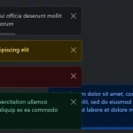 Advanced Alert Notification System For Bootstrap 5 – AvalynxAlert.js
 SVG Gooey Toast Notification Library – Physics Toast
 Modern JavaScript Toast Notification & Modal Popup Library – JSPT
 Lightweight Toast & Growl Notifications Inspired by macOS – Toastify