Responsive Navigation Bar With Flexbox And JavaScript – simply-nav
A simple, lightweight, sticky, fully responsive, mobile-compatible navigation system built using JavaScript and CSS flexbox.


A simple, lightweight, sticky, fully responsive, mobile-compatible navigation system built using JavaScript and CSS flexbox.

A set of 17+ accessible, fully responsive, and mobile-friendly header navbar templates for modern web app design.

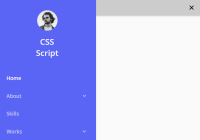
A modern, responsive, mobile-first site navigation that collapses nav items into a sidebar off-canvas menu on mobile.
A responsive navbar system that collapses items in a horizontal multi-level menu into a mobile-friendly sidebar navigation with dropdowns on the mobile.

A CSS-only responsive navigation component that collapses the regular horizontal navbar into a hamburger toggle button on mobile.

A responsive sticky navbar that coverts the nav items into a full-width off-canvas menu with a hamburger toggle button.

A minimal clean responsive navigation system that transforms the regular navbar into a toggleable dropdown menu when the screen size reaches a breakpoint specified in the CSS media queries.
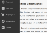
A CSS only responsive fixed sidebar navigation that collapses into a bottom nav bar on mobile devices.

Animenu is a lightweight responsive dropdown navigation system that collapses the horizontal navbar into a hamburger toggle menu on mobile devices.

navigataur.css is a pure CSS responsive navigation solution that converts the regular navbar into a dropdown menu with a toggle button when the screen size reaches a specific breakpoint.