Pure CSS Responsive Navbar – navigataur.css

navigataur.css is a pure CSS responsive navigation solution that converts the regular navbar into a dropdown menu with a toggle button when the screen size reaches a specific breakpoint.


navigataur.css is a pure CSS responsive navigation solution that converts the regular navbar into a dropdown menu with a toggle button when the screen size reaches a specific breakpoint.
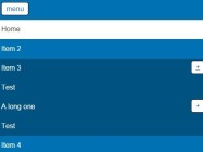
A simple vanilla JavaScript responsive multilevel menu that performs as a dropdown reveal menu on smaller screen devices.

Omega.js uses CSS media queries to detect the screen size and collapse the regular navbar into a hamburger sidebar navigation (aka. off-canvas navigation).

A responsive, cross-platform hamburger header navigation written in vanilla JavaScript and CSS/CSS3.

The Collapsible library automatically collapsible the nav items into a dropdown menu with a hamburger toggle button, when there’s not enough screen space.

A Responsive Header Navigation that collapses the horizontal navbar into a dropdown menu by altering the flex-direction property on small screens.

Priority Nav Scroller is a pure JavaScript plugin to create a fully responsive, arbitrarily-prioritized navigation menu following the Priority+ Navigation pattern.
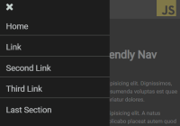
Yet another responsive, cross-platform navigation system that converts the horizontal menu into an off-screen hamburger navigation on the mobile device.

A responsive navigation that uses JavaScript and CSS3 to convert the horizontal menu into a toggleable dropdown list when the screen size is less than a specific breakpoint.

CodeHim Menu is a responsive navigation system for all devices. Written in HTML and CSS.