CSS Only Responsive Dropdown Menu – JMenu
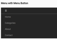
JMenu is a pure CSS responsive menu which automatically collapses the regular drop-down navbar into a mobile-friendly sliding menu with or without the toggle button.


JMenu is a pure CSS responsive menu which automatically collapses the regular drop-down navbar into a mobile-friendly sliding menu with or without the toggle button.
A smart responsive sticky navbar that automatically slides down and hides as you scroll down or up the webpage.
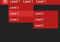
This is a CSS only responsive, multi-level menu that expands the hamburger toggle button into a horizontal drop-down nav on desktop or an off-canvas side menu on mobile.

A JavaScript responsive navigation system which transforms the regular horizontal menu into a togglable fullscreen menu on mobile devices.

Yet another responsive, mobile-friendly hamburger navigation menu for your cross-platform web pages. Implemented with pure HTML and CSS/CSS3.

This is a minimal responsive navigation that transforms the horizontal menu into to a fullscreen toggle menu with fade in and out animations.
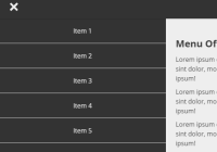
A CSS only responsive menu that transforms the normal horizontal site navigation into an off-canvas push menu on mobile devices.

A simple, responsive, mobile-friendly sliding navigation system for both desktop and mobile. Built using pure HTML/CSS.

A Vanilla JavaScript responsive dropdown menu that will be converted into a hamburger toggle menu on small screen devices.

A fully responsive, CSS-only navigation that breaks down into a hamburger dropdown menu when the viewport size is smaller than a specified breakpoint.