


The ragrid.css provides an easy and convenient way to create a responsive, flexbox-based grid layout for your modern web project. Fully customizable via attributes instead of CSS classes.
Install the ragrid.css:
# Yarn
yarn add ragrid
# NPM
$ npm install ragrid
How to use it:
Import the ragrid.css into your project.
<link rel="stylesheet" href="css/ragrid.css">
Create a basic flexbox grid as this:
<section grid>
  ...
</section>
Set the alignment using the following attributes:
- horizontally-aligned: left, center, right
- vertically-aligned: top, center, bottom, baseline
<section
  grid
  horizontally-aligned="right"
  vertically-aligned="top">
  ...
</section>
Set the distribution:
- horizontally-distributed: between, around, equal
- vertically-distributed: between, equal,
<section
  grid
  horizontally-distributed="equal"
  vertically-distributed="around">
  ...
</section>
See Also:
 Responsive Masonry Layouts with CSS Grid and Mason-it.js
 Responsive CSS Masonry Grid Layout – Grid Overflow
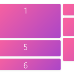 Minimal Masonry Web Layout In Pure JavaScript – MiniMasonry.js
 Easy Responsive Masonry Grid Library – Stackgrid
 Minimalist Masonry Gallery Layout With CSS Grid – mm-masonry.css
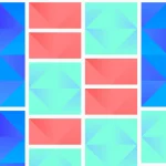 Tiny Responsive Masonry Grid Library – stack-up.js
 Simple Masonry Grid Layout With Flexbox – simple-masonry.js
 Mosaic Tiling With Image Lazy Loading – mosaicLayout